
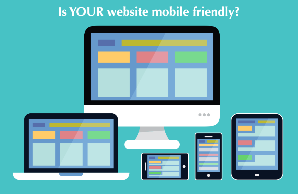
Is your website mobile friendly?
According to Google’s Webmaster Blog, “To improve the mobile search experience, after January 10, 2017, pages where content is not easily accessible to a user on the transition from the mobile search results may not rank as highly.”
What does this mean for your business?
If you want to rank highly on Google’s search results, your website has to be considered mobile friendly.
What does mobile friendly even mean?
When you open a business’s website on your phone and you have to pinch the screen to zoom in so that you can read it, that is indicative of a non-mobile friendly site. The website does not distinguish how it shows up based upon the device on which it is being viewed. If you make it more difficult for someone on your website to access information, they are much more likely to leave.
Why did Google do this?
According to Marketing Land, 60% of consumers time is spent browsing the internet on their mobile devices. Additionally, 75% of people will search on their phone for a business that they want to connect with (Google Partners).
Google wants to make browsing the internet as easy and as safe as possible for the average web user. Therefore, they are going to return websites in the search results that they believe exhibit these traits. If you are not one of these websites, your ranking position is likely to drop.
Even worse, if your competition IS one of those mobile friendly websites, their position is likely to rise.
What do I need to know about Google’s mobile friendly algorithm?
Important updates to be aware of are (Search Engine Land):
- The new mobile friendly algorithm was rolled out in January 2017
- It is an on or off algorithm, which means that you are 100% mobile friendly or you are not
- It will be on a page-by-page basis
How do I know if my site is mobile friendly?
Google has released a tool where you can check your site for mobile friendliness: https://search.google.com/test/mobile-friendly
If you have employed one of the following techniques, your website will be considered mobile friendly:
- Adaptive Design: Your website changes the content served based on the viewing device.
- Responsive Design: Your website has a fluid layout that changes based on the viewing device.
- Mobile-Only site: You have a separate mobile site that shows only on mobile devices. This is no longer recommended because Google indexes your mobile site only.
What should I do if my website is not mobile friendly? I want to be returned highly in the search results!
If you do not have a mobile friendly website, there are four options to explore.
- Additions to Existing Website: You can make responsive additions to your existing website that will allow the site to account for the viewing device.
- Website Redesign: You can redesign your website as a responsive website, which will ensure that it shows properly on all devices. Additionally, you can add in other changes for other Google updates, such as the new SSL requirement.
- Create a Separate Mobile Site: You can keep your site as is and have a mobile site that is served only to mobile users. Again, this is not recommended because Google now indexes your mobile site only.
- Do Nothing: If you do not want to rank highly on Google’s search algorithm, then you can leave your site as is.
Need help implementing options one, two or three? Contact IFTS, Inc. for more details.