We’re a few months into 2025 and it may feel like all your New Year’s goals have been forgotten or put on the back burner… BUT It’s never too late though to try something new and start building fresh client engagement!
Of course, every year it seems there’s a new social media trend or hack to be trying.
It’s overwhelming, but …Lawyers, don’t let this stop you!
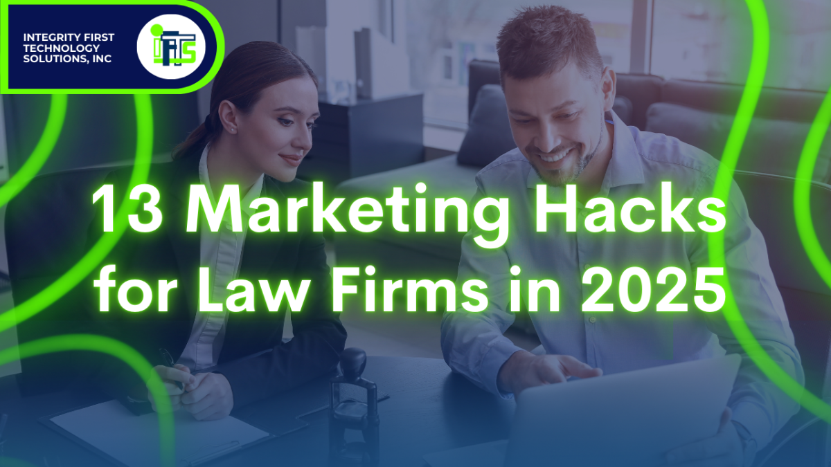
I’ve gathered 10 of the most effective, cutting-edge marketing strategies for your firm in 2025!
And the best part? You don’t need a tech expert or a massive budget to make them work.
Hack #1 - Build Credibility With Client Testimonials and Online Reviews
For law firms, trust is everything.
Potential clients want proof that you can handle their legal issues effectively. Sometimes it’s hard to feel out a company when all they have are questionable reviews from 10 years ago lining their website. New clients want to see faces and REAL profiles to feel a connection.
The best way to establish this credibility is through client testimonials and fresh online reviews.
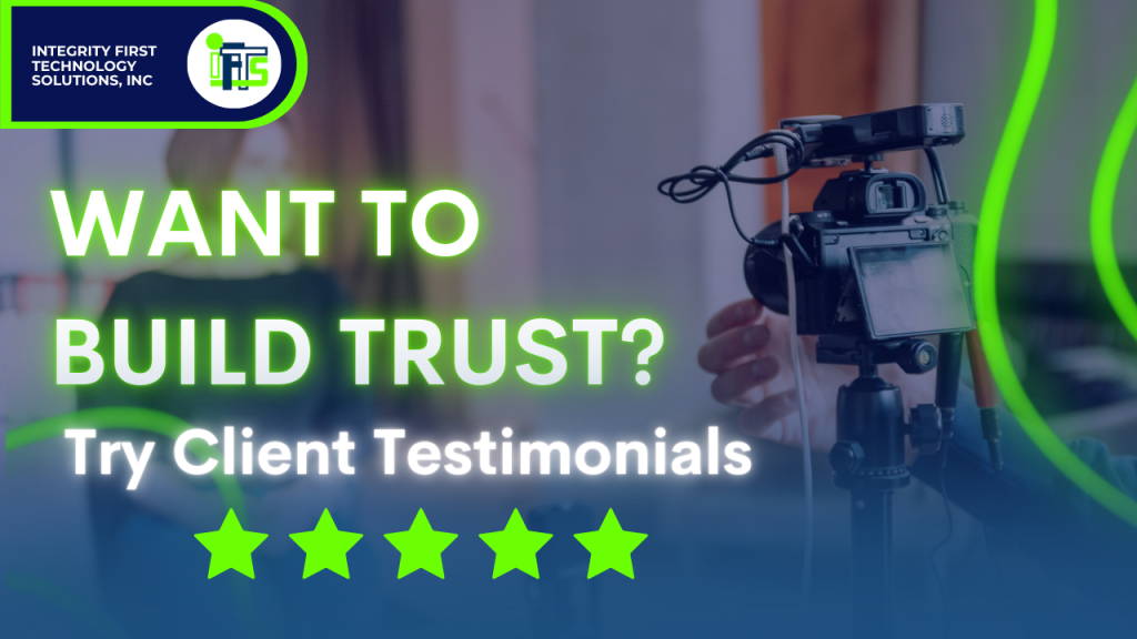
Client Testimonials
Client testimonials are KEY to showing authenticity and credibility. A GREAT way of sharing these is by making videos to post on your social media or embedding them in your website.
Okay… Client testimonials VIDEOS?
These may seem difficult to tackle and many customers are not keen on showing their faces on camera. How else can you go about making these videos?
It’s SO simple. Using Canva, I was able to create 3 different types of FACELESS testimonial videos for you to try! No need for professional footage or flawless backdrops. Clients can send in voice recording or iPhone video–You do the rest!
Want to learn exactly how to make these faceless testimonial videos in under 10 minutes? Click HERE and have the directions sent right to your inbox!
Online Reviews
Have you ever looked at someone else’s online presence and all you saw were old reviews? It doesn’t leave you feeling very good about the company.
That’s why making sure you ask for reviews from trusted customers is so important. Clients want to see that you’re still improving and growing in the moment.
Worried about how to ask for those reviews? Watch our YouTube video all about it.
The two most important platforms for reviews are:
- Google Business Profile (Boosts search rankings and attracts organic traffic)
- Avvo (Trusted legal directory where potential clients actively search for attorneys)
Google reviews help your SEO, and once you hit 100 reviews, your star rating will appear in Google Ads, increasing click-through rates.

Where should you showcase reviews?
- Your website
- Social media (LinkedIn, Facebook, Instagram)
- Google Business Profile
- Email campaigns
If you need help streamlining the process, set up an automated review request system.
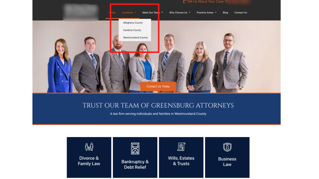
Hack #2 - Use Google Business Profile for Maximum Visibility
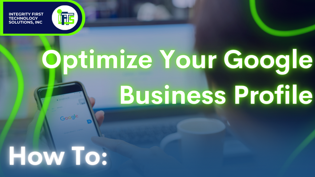
One of the first things a client does is a general Google search for law firms in their area. A handful will pop up but which one do they click on and TRUST first?
The firm that shoots up to the top of the search page with a Google Maps result.
Appearing in Google Maps results is essential for local law firms. Factors influencing your ranking include:
- Proximity to searchers
- Review quality and quantity
- Profile completeness
- Local citations (mentions from other local websites)
To optimize your Google Business Profile, ensure that:
- Your name, address, and phone number exactly match your website and legal directories.
- Your business categories and services are filled out completely.
- You regularly post updates, case results (anonymized), and blog links.
- You upload high-quality photos of your office and team.
For a ranking boost, build local backlinks, such as:
- A feature on your local bar association’s website
- Mentions in local newspapers or legal blogs
- Sponsorships of local events or scholarships
Doing these extra steps to ensure you pop up FIRST will set you ahead of the competition.
Hack #3 - Use Google’s Q&A Feature to Boost SEO
A little-known SEO trick: Google allows you to ask and answer your own questions on your Google Business Profile. Yep. That’s right–Don’t wait for questions to come to boost your searchability but instead get on top of it right now.
List the top 10 questions your firm gets and answer them in 3-5 sentences, using your target keywords and location (e.g., “How much does a divorce lawyer in Chicago cost?”). This creates a keyword-rich FAQ section directly on Google, improving your visibility.
It’s easy, fast, and can be done today.
Hack #4 - Get Creative With Social Posting

Ok so the truth is… Most people aren’t searching for a lawyer until they urgently need one. How can you stay top-of-mind? By creating short, informative video ads answering common legal questions—while ensuring compliance with legal advertising ethics.
Examples:
- “What should I do after a car accident?” (Personal Injury)
- “How do I prepare for a custody battle?” (Family Law)
- “What are my rights if I’m arrested?” (Criminal Defense)
Another option would be to build your relatability. Some companies focus too much on posting content solely based on the product they are hoping to sell. The thing is: Your clients are not constantly seeking what you’re selling… Instead you need to become a friendly face.
Creating funny, entertaining, and relevant content means your current and future clients can watch your EVERYDAY (plus they’ll remember you when it matters most).
Examples:
- Interview different attorneys in the office with an interesting question of the day
- Office tour
- Day In The Life
- Games/Challenges/Dance videos
People love to laugh and they love to see a more relatable side to a profession that is mostly serious. Trying out new content trends and videos could be a great way to freshen up your content and make a name for yourself on social media.
Post these videos on:
- Your website
- YouTube
- Facebook & Instagram Ads (budget: $5/day)
When the need for a lawyer arises, your firm will be the trusted expert they remember.
Hack #5 - Make Your Ads Stand Out
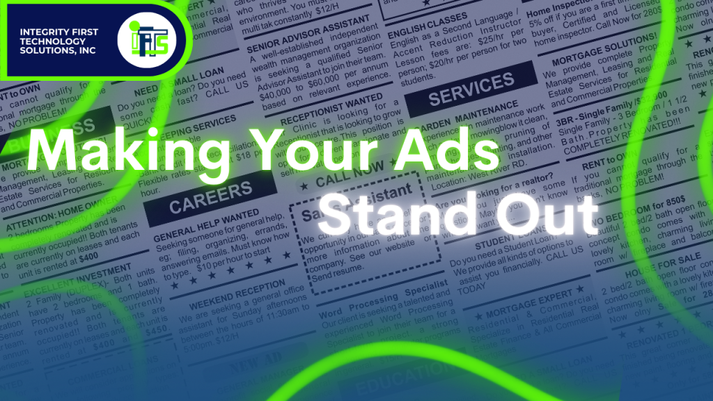
The legal industry is competitive, so your ads need to grab attention immediately. With attention spans growing shorter everyday–the average person doom scrolling online needs something out of the box to capture it.
Here’s how:
- Use contrasting colors: If running ads on Facebook (blue interface), add red or yellow banners to your video.
- Call out your audience: Start with “Are you facing a DUI charge in Miami?” instead of a generic intro.
- Use pattern interrupts: Show something visually striking—a courtroom setting, a lawyer holding a law book, or a dramatic text overlay.
Here’s a Quick bonus for everyone reading this far!-If you don’t have time for social media and want it done right, we offer a $99 deal that covers a month’s worth of social media. Click HERE for more!
Hack #6 - Don’t Give Up On Potential Clients
The majority of legal prospects won’t convert on their first visit to your site. Use retargeting ads to stay in front of them until they’re ready.
Two ways to retarget on Meta (Facebook & Instagram):
- Meta Pixel: Tracks website visitors and shows them ads later (best for desktop users).
- Video View Retargeting: Targets people who have watched at least 25%-50% of your legal tip videos.
Example Strategy:
- Run 3-5 FAQ video ads to local audiences.
- Retarget those who watch at least 25% with an ad featuring a free consultation offer.
Hack #7 - Upgrade Your Business Card
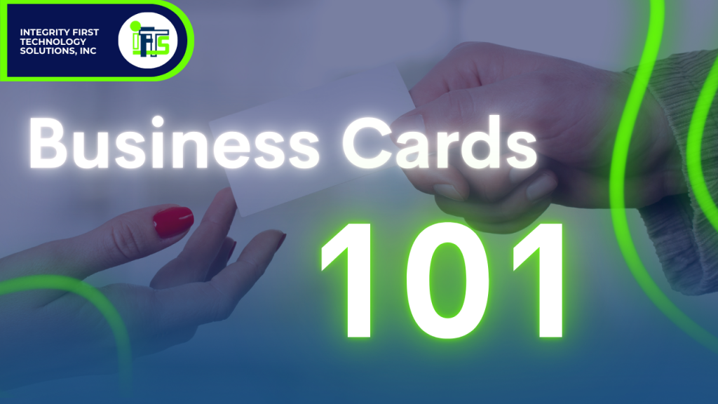
Forget cheap paper business cards. Use high-quality plastic cards (like credit cards) with your photo on them.
Why?
- People remember faces, not just names.
- They feel bad throwing away a premium card, so they keep it.
- Clients like to know you invest in yourself–So you’ll invest in them.
Consider having two versions:
- Luxury plastic cards for potential clients.
- Standard paper cards for networking events.
Hack #8 - Update Your Voicemail
Never let potential clients hear a generic voicemail message. Instead, include this phrase at the end:
“I will call you back within 15 minutes.”
Even if you can’t always respond that fast, this urgency dramatically increases the chances that they leave a message instead of calling a competitor.
Hack #9 - Use Psychological Triggers to Win Clients
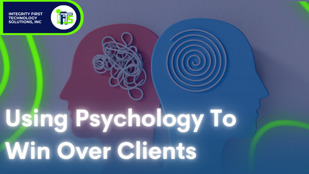
People hire lawyers that make them feel good! Use these psychological marketing tricks to build confidence quickly:
- Give a compliment at the start of every consultation (e.g., “That’s a great question—most people don’t think to ask that!”).
- Use social proof: Mention similar cases you’ve won.
- Create urgency: Highlight filing deadlines or statute of limitations deadlines to prompt action.
Hack #10 — Add an AI Chatbot to Your Website
I obviously can’t touch on trending marketing hacks for 2025 without talking about AI! AI is booming in today’s marketing world — and whether you love it or are still a bit skeptical, one thing is certain: if your law firm’s website isn’t using AI, you’re missing out.
Your website should be working for you 24/7, answering questions, engaging visitors, and helping convert them into clients. By adding an AI-powered chatbot, you can:
- Answer FAQs in real time
- Collect leads
- Book consultations while you sleep
- Keep visitors on your site longer (which also helps SEO!)
Seriously — what are you doing without it?!

Two Simple Tools to Start With:
LawDroid
LawDroid is designed specifically for law firms. It can handle legal-specific FAQs, client intake, and scheduling.
ChatBot.com
This platform works for any industry and is extremely user-friendly for beginners.
✨ Pro Tip: Add a welcome prompt like: “Hi there! Have a legal question? I can help or connect you with an attorney!” to instantly encourage interaction.
Hack #11 - Lead Magnets + Automated Email Follow-ups
Now look, I know email marketing is a thing of the past and you may feel you’ve already mastered it — But don’t underestimate its power — even in 2025, it remains one of the most effective ways to nurture relationships and turn cold leads into paying clients.
Try these two steps to ensure your email marketing is still effective in 2025:
Step #1:
Start by creating a lead magnet — a valuable, free resource that solves a specific problem for your potential clients. Examples include:
- The Ultimate Guide to Personal Injury Claims
- 5 Things You Should Never Say After a Car Accident
- Free Contract Checklist for Small Business Owners
Once you’ve created this lead magnet, offer it on your website in exchange for an email address. Use a clean, simple sign-up form (tools like Mailchimp, HubSpot, or ConvertKit make this easy).
Step #2
Set up an automated email sequence to follow up with that lead over the next few weeks or months. The key is to stay top-of-mind without being spammy. Your email sequence can look something like this:
- Email 1 (Immediately after download): Thank them for downloading and introduce your firm.
- Email 2 (2–3 days later): Share a helpful blog post or quick video related to their legal needs.
- Email 3 (1 week later): Highlight a client success story or testimonial.
- Email 4 (2 weeks later): Offer to answer any questions and invite them to book a free consultation.
- Email 5 (1 month later): Share another resource or legal update.
The best part? Once it’s set up, this system works for you 24/7 — continually nurturing leads while you focus on your clients.
Pro Tip:
Make sure your emails feel personal and human — use their first name, keep the tone conversational, and include a real photo of you or your team in the signature.
Hack #12 - Use AI to Generate Content Ideas

To stay at the top of your game, you’ll need to admit you might not always be up to speed on the latest social trends or design aesthetics — and that’s okay! AI can help you stay current, consistent, and ahead of the curve.
Use AI tools like ChatGPT or Jasper to:
- Generate blog post ideas
- Write social captions
- Brainstorm video scripts
- Get keyword suggestions for SEO
Quick heads-up! — AI is a fantastic tool for sparking ideas and jumpstarting content creation, but don’t lean on it so much that you lose authenticity. Visitors can spot an overload of AI-generated visuals or text from a mile away. Use AI in moderation, and always pair it with your unique voice and human touch. Stay intentional and thoughtful as you gather ideas and imagery!
Hack #13 - Take Action Today
Don’t let your looming new years goals go to waste… Marketing success isn’t about knowing—it’s about doing. Choose one strategy from this list and implement it within the next 24 hours. One step at a time, one more strategy everyday, and you can still reach your marketing goals for the year.
Need help? We specialize in law firm marketing, from SEO to PPC to social media strategy to content creation. Contact us today for a free consultation!
Get the Top 3 Social Media Post Templates for Law Firms to Grow Your Following and Get New Clients
Engage with prospects and save time with your FREE Canva template kit. This kit features the top 3 social media posts for law firms and directions on how to brand them for your own firm in 5 minutes or less.

Enter your email below and get the templates sent directly to your inbox along with an instructional video on how to make personalized edits.