Are you answering the same legal questions over and over again? What if those repetitive questions could become one of your most powerful client attraction tools?
Well today you’ll learn exactly how to identify, structure, and leverage legal FAQs that your ideal clients are actually searching for—not just what your competitors think they’re searching for.
The Three Critical Mistakes Law Firms Make with FAQ Content
Most law firms unintentionally sabotage their FAQ efforts by making three major mistakes:
Answering questions that are too technical. Dense legal explanations overwhelm readers and push them away.
Using legal jargon that confuses potential clients. Potential clients don’t speak “legalese.” If your language feels intimidating, they’ll bounce.
Failing to create an emotional connection.Without empathy, your answers feel cold—and potential clients won’t take the next step toward hiring you.
Why FAQs Outperform Other Types of Marketing Content
In my experience working with law firms, well-crafted FAQ content consistently outperforms other forms of marketing.
Attorneys who build strategic FAQ systems report:
Higher engagement from potential clients.
Better conversion rates compared to traditional blog posts or ads.
Why? Because you’re directly addressing the specific, real-world concerns people have when deciding whether to hire an attorney.
Introducing the FAQ Formula
To create FAQs that truly attract high-value clients, use what I call the FAQ Formula:
Empathy → Education → Example → Call to Action
Let’s break it down:
Step 1: Identify High-Intent Questions
Not all questions are created equal. Focus on high-intent questions—the ones people search when they’re close to hiring an attorney.
Instead of answering, “What is personal injury law?”, answer:
“How much is my car accident case worth?”
“Should I accept the insurance company’s first offer?”
These types of questions show the person is already in decision-making mode, not just casually browsing.
Step 2: Craft Answers that Convert
Each answer should follow this flow:
Empathy: Acknowledge the emotions behind the question.
Education: Clearly explain what they need to know, in plain language.
Example: Share a quick (anonymous) story that shows your experience.
Call to Action: Offer a helpful next step without sounding pushy.
For example:
Weak answer: “Divorces typically take 6-12 months depending on complexity.”
High-converting answer: “We understand the uncertainty around divorce timelines can be stressful—you’re trying to plan your future while everything feels on hold. In Pennsylvania, uncontested divorces usually take 3-6 months, while contested divorces can stretch to 12-18 months. Recently, we helped a client complete their moderately complex divorce in just 4 months through strategic mediation, saving thousands in litigation costs. If you’d like a more specific timeline for your situation, our Divorce Timeline Assessment can help clarify your next steps.”
See how much more approachable—and persuasive—the second answer feels?
Why (and How) You Should Distribute Your FAQ Content Everywhere
Once you create your FAQ content, don’t stop at posting it on your website.
Maximize its reach by sharing it:
On your website (for SEO)
As a video on YouTube and Rumble (to build trust)
As short social media posts on LinkedIn, Facebook, Instagram
In email newsletters
On your Google Business Profile
One great FAQ can become five or more pieces of powerful marketing content.
Why Now Is the Perfect Time to Start
You might be thinking, “I don’t have time to create all this content.” That’s exactly why most lawyers aren’t doing it effectively—which leaves a wide-open opportunity for you to stand out.
If you’d like a shortcut, grab our free guide:
60 High-Converting FAQ Templates for Lawyers — including templates across multiple practice areas and the exact formulas for structuring answers that attract high-value clients
As we delve into Part 2 of our exploration of the top social media posts for law firms, we continue to uncover engaging content strategies that can elevate your online presence. In today’s competitive legal landscape, effective social media use is essential for connecting with potential clients, showcasing your expertise, and fostering community engagement.
Now, let’s explore the remaining nine post types that can further enrich your content strategy. These posts will not only enhance your visibility but also encourage interaction and engagement with your audience, ultimately guiding them to consider your firm when they need legal assistance.
Part 2: Posts 10-18
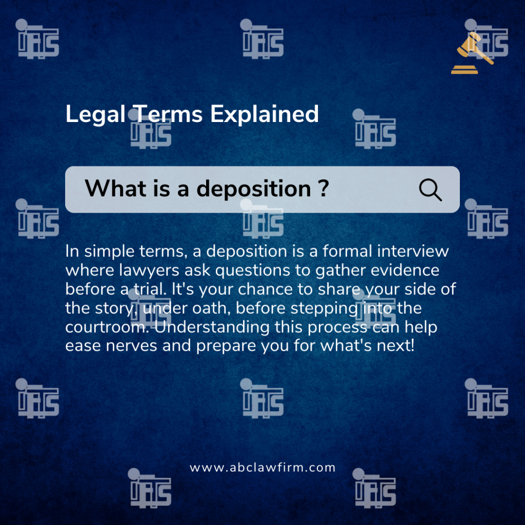
10. Quick Legal Definitions
Why It Works: Educating your audience through bite-sized, digestible explanations positions your firm as a trusted resource, helping potential clients feel more comfortable and informed when navigating legal matters. This not only showcases your expertise but also helps demystify the legal process, making your services feel more accessible. Clients are more likely to reach out when they feel they understand the basics of their legal situation.
Example Post: “What is a Deposition? 🤔 In simple terms, a deposition is a formal interview where lawyers ask questions to gather evidence before a trial. It’s your chance to share your side of the story, under oath, before stepping into the courtroom. Understanding this process can help ease nerves and prepare you for what’s next!
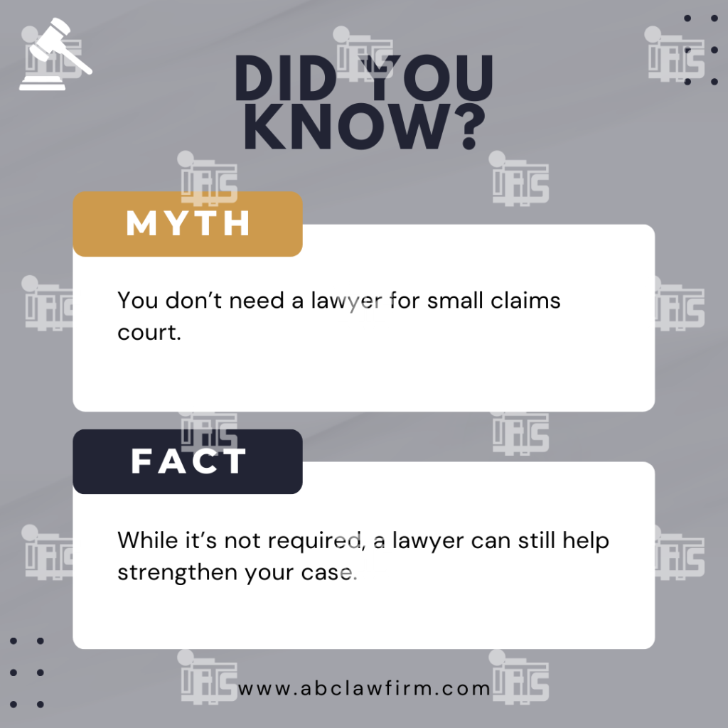
11. Legal Myths Debunked
Why it works: There’s a lot of misinformation about the law. By debunking common myths, you educate your audience and show that you’re a reliable source for accurate legal advice.
Example post: “Myth: You don’t need a lawyer for small claims court. Fact: While it’s not required, a lawyer can still help strengthen your case.”
12. Video Explainers
Why it works: Video content is one of the most engaging formats on social media. Short explainer videos covering common legal processes or frequently asked questions can capture attention and build rapport with potential clients.
Example post: “Watch this short video where we explain the process of filing a personal injury claim.”
13. Success Metrics
Why it works: Sharing your firm’s success in terms of case outcomes, settlements, or accolades can position you as a top performer in your field. Numbers and metrics are impressive and serve as social proof.
Example post: “Over 1,000 successful cases closed and $10 million in settlements for our clients last year!”
14. Client Resources
Why it works: Providing free resources such as guides, checklists, or templates related to your practice areas offers value to your followers. It shows that you care about helping people, even if they aren’t clients yet.
Example post: “Download our free checklist on how to prepare for a custody hearing.”
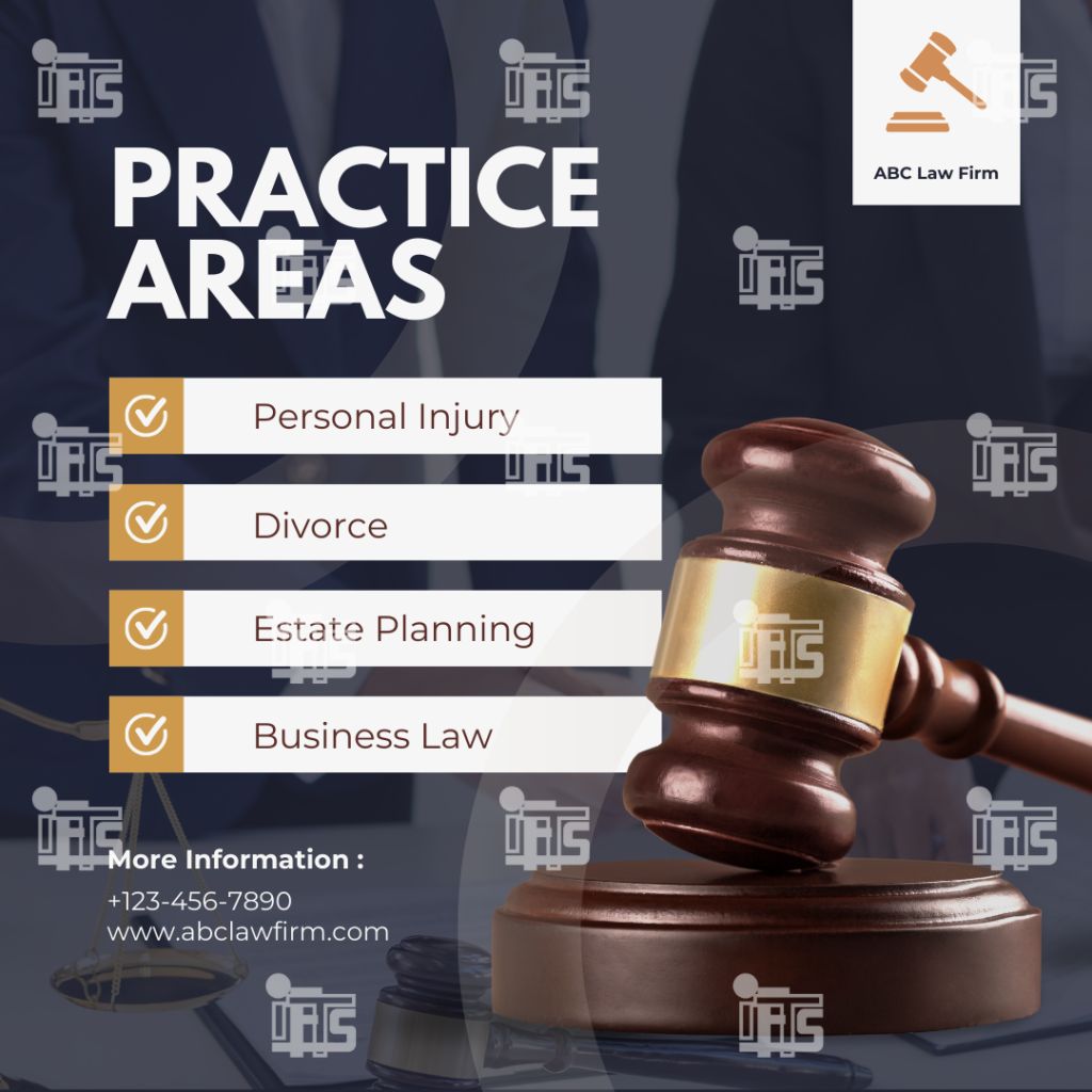
15. Practice Area Information
Why it works: Providing detailed information about your law firm’s practice areas helps potential clients understand the specific legal services you offer. This type of post clarifies what your firm specializes in and educates your audience on complex legal topics, showing that you’re equipped to handle their case.
Example post: “Did you know we specialize in both commercial and residential real estate law? Whether you’re buying a home or dealing with a business lease dispute, our team is here to help you navigate the legal process.”
16. Polls and Surveys
Why it works: Polls and surveys encourage interaction and are a quick way to get people talking. They help you gauge what’s on your audience’s mind and can provide valuable insights.
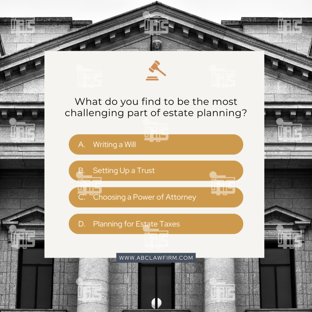
Example post: “What’s the legal issue you worry about the most? A) Divorce B) Personal Injury C) Estate Planning D) Business Law”
17. Law Firm Announcements
Why it works: Whether you’re announcing a new attorney joining the team, a new office location, or a new service, these posts keep your audience informed and excited about what’s happening at your firm.
Example post: “We’re excited to welcome [Attorney Name] to our family law team. With 20 years of experience, she’s a fantastic addition to our firm.”
18. Quotes and Motivational Posts
Why it works: Inspiring quotes, especially those related to justice or perseverance, can resonate with your followers and encourage sharing. They’re a simple way to build positive connections with your audience.
Example post: “Injustice anywhere is a threat to justice everywhere.” – Martin Luther King Jr.
Incorporating these additional post types into your law firm’s social media strategy can greatly enhance your online presence, engage your audience, and establish your firm as a credible source of legal information. From sharing practice area information to using engaging formats like polls and video explainers, these strategies help humanize your brand and foster a sense of community.
By diversifying your content, you not only provide value to your audience but also create opportunities for engagement that can lead to client inquiries and relationships. Embrace these social media post ideas, and watch your law firm thrive in the digital space!
In today’s digital age, a strong online presence is essential for law firms. Social media platforms offer an excellent opportunity to build relationships with potential clients, demonstrate expertise, and humanize your practice. Gone are the days when law firms could rely solely on word of mouth or traditional advertising to bring in new clients. Now, social media serves as a powerful tool to increase visibility, engage with the community, and provide valuable legal information.
Why Social Media Matters for Law Firms
A strong presence on social media isn’t just for restaurants or retail businesses—law firms stand to benefit greatly from being active on these platforms. Social media offers a unique opportunity for law firms to:
Build Brand Awareness: Regular posting increases visibility and keeps your firm top-of-mind for potential clients.
Showcase Expertise: Sharing legal tips, case studies, and news updates demonstrates your firm’s knowledge and experience in a particular area of law.
Humanize Your Brand: Behind-the-scenes content, attorney profiles, and community involvement posts help potential clients feel more connected to your firm on a personal level.
Boost Engagement: Posts like polls, live Q&A sessions, and infographics create opportunities for followers to engage with your content, which can lead to more inquiries.
Drive Traffic: Sharing blog posts and practice area information can direct followers to your website, where they can learn more about your services or even contact you for help.
So, what kind of content should law firms be posting? Below are 1-9 of the top 18 types of social media posts that will help provide useful information to your audience and boost engagement.
Part 1: Posts 1-9
1. Legal Tips
Why it works: Sharing legal tips provides your followers with valuable and practical information they can use in their everyday lives. It positions your firm as a helpful resource and can address common legal questions that potential clients may have. These bite-sized insights help build trust and keep your audience engaged.
Example post: “Did you know? In many states, personal injury claims must be filed within two years of the incident. Contact us today to learn more!”
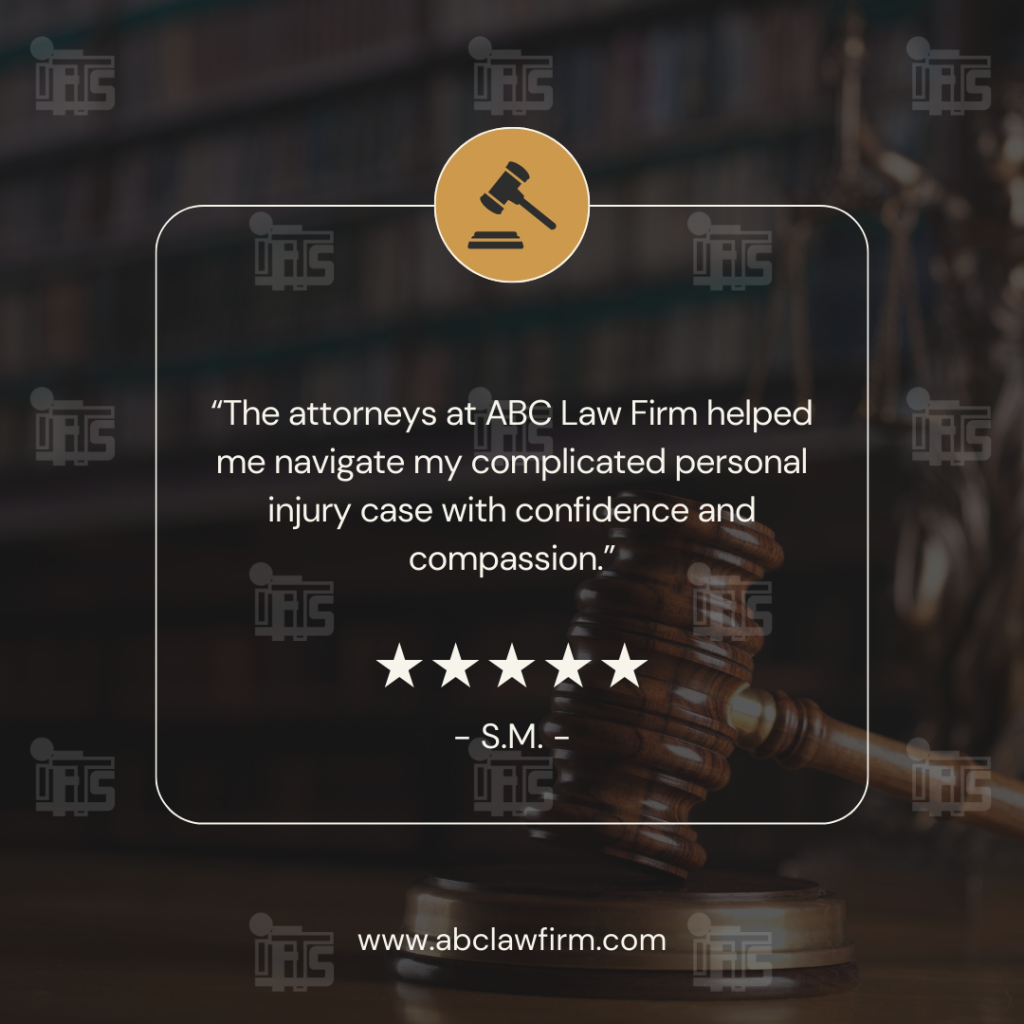
2. Client Testimonials
Why it works: Testimonials are social proof. Positive feedback from satisfied clients builds credibility and trust, especially in the legal industry where reputation matters. Testimonials can reassure potential clients that they are in good hands.
Example post: “’The attorneys at [Firm Name] helped me navigate my complicated divorce case with confidence and compassion.’ – Satisfied Client”
3. Attorney Profiles
Why it works: Your attorneys are the heart of your firm. By showcasing individual profiles, you humanize your team and help potential clients get to know the people who may be handling their case. Include their credentials, experience, and even a few fun personal facts.
Example post: “Meet Jane Doe, our lead family law attorney with over 15 years of experience. Fun fact: When she’s not in the courtroom, you can find her hiking in the Rockies!”
4. Case Studies
Why it works: Case studies highlight real-world success stories and allow potential clients to see how you’ve handled situations similar to theirs. These posts build trust by showing tangible outcomes.
Example post: “We helped a client recover $500,000 in damages after a workplace injury. Here’s how we did it…”
5. Legal News and Updates
Why it works: Posting legal news and updates positions your firm as a thought leader who stays on top of the latest developments. This keeps your audience informed on important changes that may affect them directly.
Example post: “Breaking: New legislation has passed that changes how personal injury cases are handled in our state. Here’s what you need to know…”
6. Office Behind-the-Scenes
Why it works: Behind-the-scenes posts show your firm’s culture and human side. These posts help build a connection with your audience by giving them a glimpse into the daily life of your practice.
Example post: “Here’s a snapshot of our team celebrating [Team Member’s] birthday at the office!”
7. Community Involvement
Why it works: Your involvement in local causes and charitable events shows your firm’s commitment to giving back. Community engagement helps to build a positive image for your firm and fosters goodwill.
Example post: “We’re proud to support [Local Charity] at this year’s fundraiser. Join us in making a difference!”
8. Blog Post Highlights
Why it works: If your firm is already creating blog content, sharing these posts on social media helps drive traffic to your website and keeps your followers informed on relevant legal topics.
Example post: “Check out our latest blog on estate planning basics and learn how to protect your assets for future generations.”
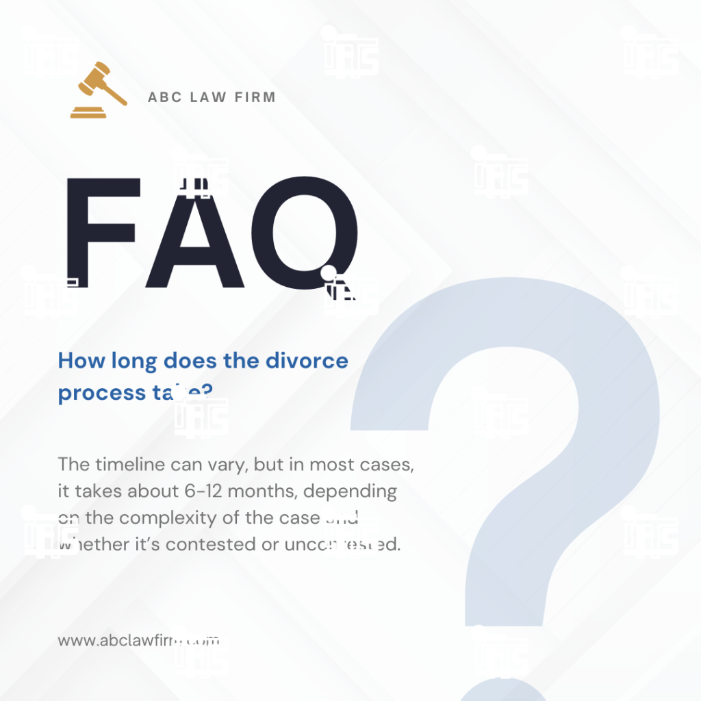
9. FAQs
Why it works: Addressing frequently asked questions helps clarify common legal issues and processes for your audience. It’s a great way to educate potential clients while addressing concerns that many people might have before contacting an attorney. This can also reduce the number of basic inquiries your firm receives, freeing up time for more complex consultations.
Example post: “FAQ: How long does the divorce process take? The timeline can vary, but in most cases, it takes about 6-12 months, depending on the complexity of the case and whether it’s contested or uncontested.”
Incorporating these nine types of social media posts into your strategy will help your law firm stay connected to your audience, establish trust, and ultimately, grow your client base. By diversifying your content with these post types, you’ll foster deeper connections with your audience, showcase your legal expertise, and encourage potential clients to engage with your law firm.