
Why Your Law Firm’s Website Isn’t Getting You Clients (And What Actually Works in 2026)

If you run a family law or estate planning firm with two to ten attorneys, and almost every new client still comes from a referral…while your website just sits there…this one’s for you.

Your website probably isn’t getting you clients, but it’s not for the reason you think. And fixing it takes a week, not four months.

The problem you can't see

Your website doesn’t get judged from your desk.

It’s eleven o’clock at night, and a woman in your county is sitting on the edge of her bed with her phone, trying to decide whether she needs a divorce attorney. She’s stressed. She’s tired. And she is one thumb-swipe away from choosing the firm down the street, not you.

Two things lose her, and neither one has anything to do with how good a lawyer you are.

First: the site is slow. On a phone. On a cell signal. Not on your office fiber. If it takes more than a few seconds to load, she’s gone…and there’s no notification. You will never know she was there.

Second: it looks dated. And this one matters more than people give it credit for, because she cannot evaluate your legal work. She’s never hired a lawyer before. She has no way to judge whether you’re good at custody cases. So she judges the one piece of evidence she has.

If your site looks dated, she assumes you are too.

That’s not an opinion about design. That’s a trust transfer.

And the reason you don’t know any of this is happening? 

The site looks fine to you. You pull it up on your desktop, on office wifi, and it loads instantly. Your website fails in the exact place you never look.

Under the hood, it’s usually the same four things:

  • It was built for a desktop, then squished down to sort of work on a phone
  • Somebody loaded in beautiful, enormous photos that nobody ever compressed
  • There’s no CDN, so every visitor pulls the whole site from one server, wherever that server happens to live
  • And there are moving pieces like sliders, fades, and rotating banners…that looked current in 2015 and now just add weight

A lot of these sites were built by office staff, or by somebody’s teenager who was “good with computers.” That’s not a knock. It kept the cost down and it got you a website when you needed one. It’s now an issue that just shows up on a phone.

It's a homework problem, not a design problem

Here’s the part nobody says out loud.

When a firm finally decides to fix the website, the project takes four to six months. Sometimes longer. And the instinct behind it is completely reasonable: you want to control every word on your site. Of course you do. It’s your name on the door, it’s your license, and there’s a bar association with opinions about what you claim.

But watch what that reasonable instinct does to the project.

You tell the designer you’ll write the practice-area pages yourself. Then you have a hearing. Then a client emergency. Then it’s Thursday and you’re six billable hours behind. Website content is priority number 47 on a list of 40 things. The designer emails to check in. You feel a little guilty. Two more weeks go by.

Four months later, you’ve got half a website and a vague sense that you failed at homework.

You didn’t. The process failed. It was built around a bottleneck – and the bottleneck is you, writing.

Then there’s the other version: the twenty-five-thousand-dollar agency build. Everybody owns a piece of it – a strategist, a copywriter, a designer, an account manager, and meetings to align the other meetings. The price tag becomes a little bit of a badge of honor: you spent $25K, so it must be good. What you actually bought is an amalgam of fifty people’s vision. Design by committee never works.  Trust us – we have see this more than once.

One more thing, and this is the one that changed how we do this. Almost every attorney asks for a site they can edit themselves, so they can make changes whenever they want. It adds build time and it adds cost.

In all the years we’ve been doing this, we have never had one attorney make a change. Not one.

So here’s the diagnosis: your website project doesn’t have a design problem. It has a homework problem. Take the homework out, and the whole thing takes a week.

Here is what actually works: talking, not writing

In practice, this is 4 steps.

Step one: the research happens before you’re involved. Before we ever get on a call, we pull what people in your county are actually typing into Google. Not what a keyword tool thinks lawyers should rank for – what your neighbors are asking at eleven at night. 

“What happens to the house in a divorce.” 

“Do I need probate if there’s a will.” 

Phrases exactly like those, attached to your county.

Step two: the Speak It To Me session. That’s a 30-to-60-minute interview, and it’s the only real time commitment in this. We’ve engineered the questions ahead of time so that when you answer them the way you’d answer a client in your conference room, you’re naturally saying the exact phrases people are searching for. You think you’re just talking. You’re writing your own SEO out loud.

No scary blank page staring back at you. No document waiting for you on a Sunday night.

Step three: the outline comes out of your transcript – and you approve it. Nothing text-wise is templated, and nothing is invented. We build the outline from what you actually said, send it to you, and you sign off before a single page gets built. You can read the finished copy word for word if you want to, but it’s pretty much what you said.

If you’ve read our post on the AI sanctions cases, you’ll recognize the rule: we never publish words that didn’t come from you.

Your total time on the whole project, start to finish: one to two hours. Ever.

Step four: we build it and it goes live. Eight pages – home, about, contact, testimonials, plus four pages of your choosing, which for most firms means practice-area pages written for the county you actually serve. 

One call to action, sitewide, worded identically everywhere. 

Click-to-call in the menu, because she’s on a phone. 

And a contact page with an email sequence behind it, so the person who fills out that form at eleven at night gets a response before you’re awake.

That last one matters more than it sounds. Most sites don’t email anybody back. That’s the gap where cases quietly die.

You also get an About Your Firm video and a client testimonial video, cut from the same session – so the person who lands on your homepage sees an actual human being, not a stock photo of a gavel.

Want to see the difference? Taczak Law, The Law Office of Brett Clancy, and Amanda Faher’s before-and-afters are on the One Week Website page. These firms did not need to become different law firms. They needed websites that better reflected the quality of the work they were already doing.

Could you do this yourself? Honestly - yes.

None of it is a secret. 

You could pull your own keyword data with ubersuggest, record yourself talking for forty minutes using Zoom or some other video recording software, get it transcribed or use a service like otter.ai, then hand it to a designer to “make it pretty.”

The reason it doesn’t happen isn’t that you don’t know how. It’s that the writing part is homework, and homework loses to billable work every single time. That’s not a character flaw. That’s just what running a practice does to a calendar.

How the IFTS One Week Website works

You start Monday. You launch the following Monday. One week. And the only thing that has ever broken that clock is the client delaying – which, honestly, kind of proves our point.

Then it keeps working after launch:

  • Local SEO Booster: your Google Business Profile optimized, Bing Places set up, up to fifty directory citations, a press release, and a visibility baseline so you can see where you started
  • Technology, handled: managed hosting, SSL, the CDN (remember the speed problem), backups, and updates
  • And the part we’d want to hear if we were you: we spend our own money – up to thirty dollars a month – advertising your video in your local market. Most companies launch your site and wait. We don’t.

The price, plainly: $350 a month for twelve months. $4,200 total. That’s less than the deposit on the four-month committee site – and yours is live next Monday.

Who this is for: solo and small firms – family law, estate planning, probate, business law – with a site that’s dated, slow, or was put together by whoever in the office was willing.

Who it’s not for: firms that want six stakeholders in every meeting. That’s a real thing some firms need. It just isn’t this.

The bottom line

Your website should reflect the firm you’ve actually built. You don’t need another year of telling yourself you’ll get to it, and you don’t need to write a single page. You need thirty to sixty minutes and something to say – and after twenty years of practice, you’ve got plenty.

See the before-and-afters full size and check whether your firm qualifies on the One Week Website page. It’s a short form, not a sales gauntlet – nothing to download, nothing gated. Start Monday. Launch next Monday.

Why Most Law Firm Websites Don’t Turn Visitors Into Clients (And How to Fix It)

If your law firm already has blog posts or FAQ pages, you may be sitting on content that should be generating new clients—but isn’t.

In most cases, the issue isn’t traffic.

It’s trust.

And that distinction matters more than most attorneys realize.

Let’s talk about why this is important.

The Real Problem: Attention Is Limited—and Trust Is Earned Quickly

Over the past decade, the way people consume information online has changed dramatically. Studies show that users typically spend only seconds deciding whether to stay on a page or leave. According to the Nielsen Norman Group, users often read only about 20–28% of the text on a webpage, preferring to scan rather than read word-for-word.

For law firms, this creates a major challenge.

Even if your website contains high-quality, informative content, most visitors:

  • Won’t read it fully
  • Won’t immediately trust it
  • And won’t convert into a consultation

Instead, they are comparing multiple firms at once, looking for signals that help them decide:

“Who do I trust with my case?”

These signals can sometimes come down to one sentence they read or a picture of the attorney that they like or relate to.

We see this all the time when reviewing law firm websites—excellent content that is buried in legal jargon or simply not presented in a way that builds trust quickly.

Why Video Changes Everything

One of the most effective ways to solve this problem is by turning your written content into video.

Video works because it aligns with how people prefer to consume information today:

  • It’s faster to process
  • It builds a personal connection
  • It conveys tone, confidence, and clarity

Research from Wyzowl consistently shows that video increases user engagement and trust, with a majority of consumers saying they prefer watching a video to learn about a service rather than reading about it.

For law firms specifically, this is critical.

Legal services are high-trust decisions. Prospective clients aren’t just evaluating your knowledge – they are evaluating:

  • Your communication style
  • Your confidence
  • Your personality
  • Whether they feel comfortable working with you

Video accelerates that decision-making process in a way text alone simply cannot.

A 5-Step System to Turn Your Content Into Clients

The good news is that you don’t need to create content from scratch.

Here’s a simple system to repurpose what you already have into a client-generating asset:

Step 1: Identify Your Top Client Questions That You See In Your Law Firm

Start by identifying the most common questions your clients ask.

You can find these in:

  • FAQ pages
  • Blogs
  • Intake calls
  • Emails from prospective clients
  • Form submits from the website

These questions are valuable because they reflect real search intent.

For example:

  • “Do I need a will or a trust?”
  • “What happens after a DUI arrest?”
  • “How long does a divorce take?”
  • “What is inheritance tax?”

These are exactly the types of queries potential clients are already typing into search engines.

Step 2: Turn Each Question Into a Short Video

Next, turn each question into a simple 60–90 second video.

Structure each video like this:

  1. Restate the question in plain language
  2. Provide 2–3 key points
  3. Explain the next step

The goal isn’t perfection—it’s clarity.

In fact, simpler videos often perform better because they feel more authentic and easier to understand.

And you don’t need expensive camera equipment to do it…the camera in your iPhone is now more than enough to get the quality that you need.

Step 3: Publish on YouTube With Local Optimization

Once your video is created, upload it to YouTube.

YouTube is owned by Google and functions as the second-largest search engine in the world. This means your videos can appear not only on YouTube, but also in Google search results.

To maximize visibility:

  • Include your location in the title
  • Use phrases your clients would search
  • Make sure the description explains what they will learn in the video

For example:

“Do You Need Help With a Will or Trust in Charleston, SC?”

This helps ensure your content is shown to people in your local market.

Step 4: Embed the Video on Your Website

After publishing, embed the video directly on your website.

Place it on:

  • Relevant blog posts
  • Service pages
  • FAQ pages

Ideally, position it near the top of the page.

Why this matters:

  • Increases time-on-site
  • Improves user engagement
  • Strengthens trust

According to research from HubSpot, video content can significantly increase the amount of time users spend on a page—a key factor in both conversion rates and search engine performance.

We’ve seen firms double or even triple their time-on-site simply by adding video to key pages.

Step 5: Distribute and Repurpose Your Content

Finally, share your video across multiple platforms.

This includes:

  • Posting the full video on social media
  • Creating short clips for LinkedIn, Facebook, and Instagram
  • Reusing the same content in multiple formats

This approach allows you to get significantly more value out of a single piece of content without constantly creating new material.

Want to Accelerate Your Results?

If you want faster results, you can run targeted ads using your videos.

This allows you to:

  • Reach potential clients in your local area
  • Retarget people who have already visited your website
  • Stay top-of-mind during the decision-making process

Paid distribution ensures your content doesn’t just exist—it gets seen.

The Bottom Line When It Comes To Video

Most law firms already have the content they need to attract new clients.

The problem isn’t the information—it’s the delivery.

By turning your existing content into video and distributing it strategically, you can:

  • Build trust faster
  • Increase engagement
  • Generate more consultations

And most importantly, position your firm as the obvious choice when someone is ready to hire.

Want Help Implementing This?

If you’re thinking, “This makes sense, but I don’t have time to do all of this,” you’re not alone.

We created a 30-day Law Firm Client Kickstarter System to handle this entire process for you.

We take your existing content, turn it into videos, and run everything—so you can see results quickly.

Learn more here: https://iftsdesign.com/kickstarter-kit

We only work with one law firm per area, so availability is limited.

What’s Next

In our next article, we’ll break down how law firms can get clients from YouTube—without filming every week (or at all).

Attorneys – Elevate Your Online Presence By Removing These NINE Key Elements From Your Law Firm’s Website

Are you tired of your website feeling more like a legal labyrinth that requires a map and guide than a client-friendly portal?

Are visitors on the site lost in a sea of legal jargon, unable to figure out what action to take?

Do you always have to tell people where information is on your website rather than them easily being able to find it?

Well, you are in the right place because your law firm website makeover starts now.

Picture this: a website that not only showcases your legal abilities but also captivates online visitors from the moment that they land on your site.  Imagine a digital platform that not only informs, but engages users, turning them from information seekers to eager clients that want to pay you for your services.

In today’s fast-paced digital landscape, where you get 50 milliseconds for a person to judge your website, make it count.  Your site is your virtual storefront, your best salesperson and your online greeter all rolled into one…it’s also your ticket to reaching a broader audience full of potential clients.

Here’s the kicker – in order for your website to thrive in the competitive world of online legal marketing, you have to ditch outdated tactics and embrace a fresh approach that speaks directly to your target audience.

So, if you are prepared to say good-bye to cookie-cutter sites and hello to an amazing new website that gets you clients, let’s get started!  It’s time to unleash the power of your legal acumen and make a lasting impression in the digital realm.

So, what are the 9 elements that you need to remove from your law firm’s website to accomplish all of this?

Element 1 To Remove - Unclear Brand Messaging

Make sure that your homepage communicates your firm’s specialty in a succinct way, right at the top of the page.  Don’t make site visitors guess what you do.  They need to know immediately that they are in the right place with the right firm.

Avoid using vague headlines like “Leading Law Firm” or “We Get You Legal Results Fast”.

Instead, opt for more descriptive statements such as “Expertise in Corporate Law For Startups” or “We Take Women Through Every Step Of A Divorce”.

If you can call out your ideal client and how you will help them, you will have great messaging that makes them want to learn more and stay on the site.

Element 2 To Remove - Ambiguous Navigation Labels

Site visitors need to know where to go on your website intuitively.

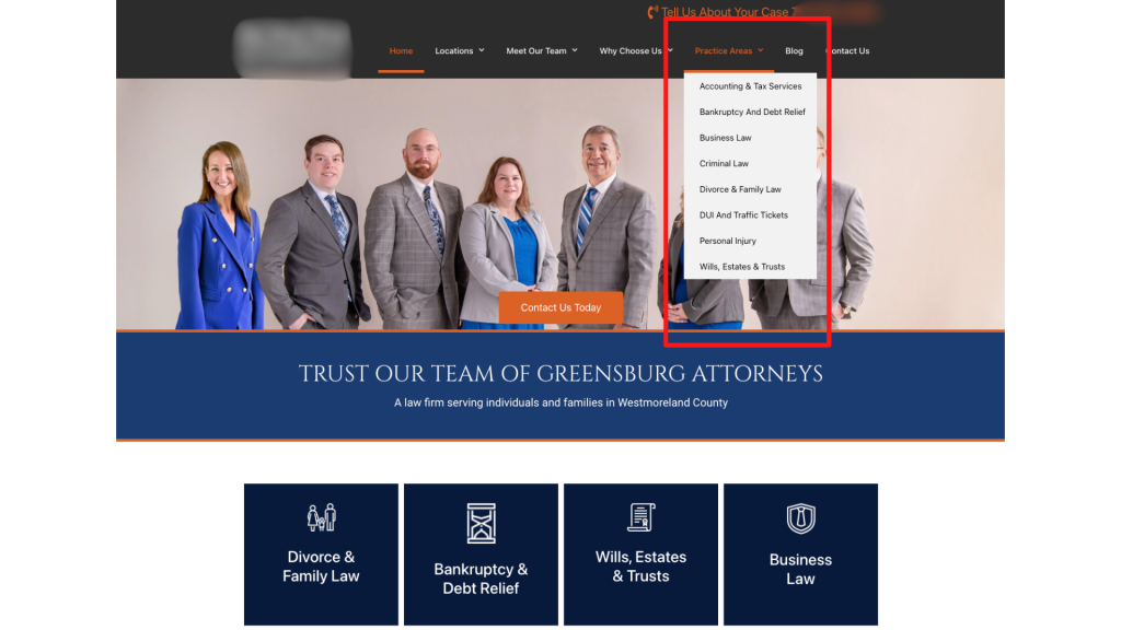
Instead of having a page that lists out all of your areas of practice, create one page per practice area.  Not only does this make navigation easier, but it helps with your website’s SEO as well by having keywords in the menu.

practice areas listed in menu

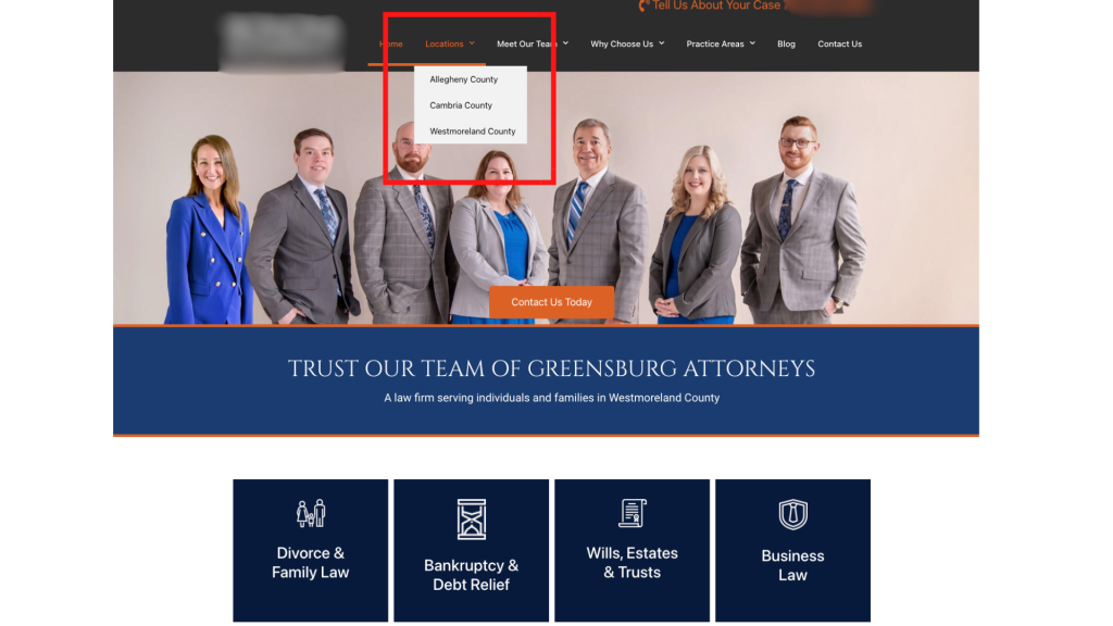
You should also do this with the areas that you serve.  Instead of having one page that talks about your service area, create independent pages for each of the cities or towns.  This makes it much easier for a site visitor to know that your firm is in his or her area and can help.

service areas listed in menu

Element 3 To Remove - Generic Subheadings On Website Pages

Get the attention of your visitors with specific subheadlines that engage them immediately.  

You want them to say “This firm is for me” when they are reading the text on your site.

Instead of using a header like “Our Services”, try something more descriptive like:

  • “Comprehensive Family Law Representation”
  • “Strategic Criminal Defense Tactics”
  • “Starting A Business in 7 Steps”

When you make the subheadings specific, it allows a site visitor to self identify as a potential client.

In addition, more specific subheaders are great for telling the search engines like Google what your firm does and should help with your site rankings.

Element 4 To Remove - Slideshow Overload

Avoid overwhelming your visitors with excessive slideshows with multiple slides.

Streamline your pages to highlight key services or unique selling points effectively. Important information should not be hidden in a slide that someone has to wait for.

Not only that, but slideshows do not do well with accessibility for anyone accessing your site with a disability, so they may not get the information that they need. 

Our bodies are hardwired to react to movement, so if you have a moving element on your website, it’s distracting.  You never want anything on your website to distract from your messaging and stop someone from hiring you.

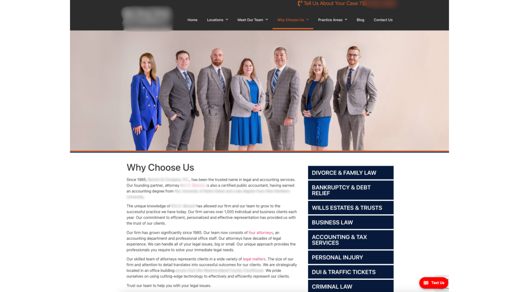
Element 5 To Remove - Inauthentic Imagery

Yes, stock images with pretty people and perfect lighting make your website pretty for YOU to look at.  Your web designer probably thinks that it is pretty too.

However, it comes across as really inauthentic and boring.

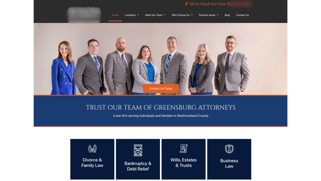
When people are looking for a lawyer, they want to be able to see YOU and your team.  People hire people, they don’t hire businesses.  They want to make a connection. Stock images make it impossible for a potential client to make a connection.

It doesn’t matter if the lighting is a bit off or you need to lose those extra 5 pounds, an authentic picture comes across as a human that they can trust.

Build trust with potential clients by using authentic images that reflect your firm’s identity.  Replace generic stock photos with genuine pictures of your team, office or clients (with consent of course) to convey credibility.

Bonus points if you let them know just a bit about your personal life, like sharing a picture of your dog or you at a local baseball game.  You’d be surprised by how many people connect with you in that way.

Element 6 To Remove - Social Media Distractions

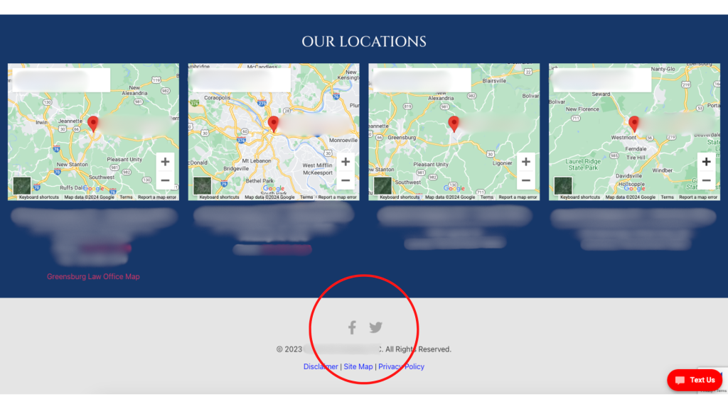
Have you ever noticed the websites that have the firm’s social media icons at the top of the page above the menu?

Well, I can guarantee you that they are losing more traffic than they would like.

By putting the social icons at the top of the page, you are just begging your visitors to click off of your page…and get sucked into the attention time sink that is social media. By the time that they are done checking their notifications and seeing the latest Reels, they may have completely forgotten that they started at your website.

Minimize this distraction by moving the social media icons to your footer and on your “Contact Us” page.  This prevents visitors from being redirected away from your site and maintains their focus on your legal services.  It also puts your social media pages at an easy to find spot.

Element 7 To Remove - Outdated Content

Keep your website relevant by updating or removing outdated content.

If your blog templates have dates on them, remove them.  If the date is important, put it in the title or the text.

Most legal articles will be evergreen, so you don’t want people to click away because the article is 10 years old.  If it’s still good information, they should read it.  Don’t make it easy for them to dismiss.

Element 8 To Remove - Unreadable Content Blocks

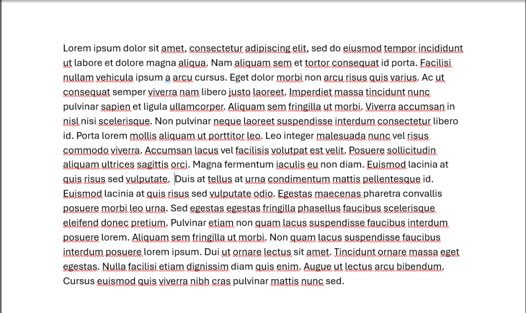
Which paragraph looks easier to read?

content block that is difficult to read
Option 1

or

easy-to-read content block
Option 2

I think that most people would agree that Option 2 is much easier to read than option 1.  It has whitespace and gives the eye somewhere to rest.

Improve readability by breaking up dense paragraphs.  Some of the ways that you can do this include:

  • Shorter sections
  • Utilizing bullet points
  • Use easy to understand headlines
  • Highlight or bold key points that you want to draw the eye to

See what I did above?  I just made that easier for you to read by breaking it up into bullet points.

You want to do your best to enhance the user experience by making information more digestible and accessible. 79% of people scan new pages that they come across, so the text needs to be formatted to grab their attention.  Blocks of text just won’t work.

Element 9 To Remove - Excessive Legal Jargon

Simplify your website’s language by eliminating excessive legal jargon that may alienate or confuse visitors. 

Yes, your content may sound “legal” or impress your colleagues, but that’s not who your website is for.  

When writing your content, ask yourself (just like in law school), cui bono, who benefits? 

If the answer to your question is not “My potential or current clients”, you know what to do.

Instead of bombarding potential clients with complex legalese, strive for clear and concise communication that everyone can understand. Remove dense paragraphs filled with technical terms and replace them with plain language that resonates with your target audience.

By cutting through the legal mumbo-jumbo, you’ll make your website more accessible and user-friendly, ultimately fostering stronger connections with potential clients through authenticity and trust building.

You can even try a tool like quillbot to rewrite sentences with a certain reading level in mind.

What Is Next For My Firm’s Website?

In conclusion, optimizing your law firm’s website is essential for staying competitive in today’s digital landscape. 

By removing outdated elements and enhancing user experience, you can create a more engaging and effective online presence that attracts and converts potential clients. 

Let’s recap the nine key areas we’ve discussed:

  1. Ensure clarity in your brand messaging and homepage headlines.
  2. Use specific navigation labels to guide visitors effectively.
  3. Craft engaging subheadings that capture attention and provide value.
  4. Streamline your homepage to prioritize essential information.
  5. Opt for authentic imagery that builds trust with potential clients.
  6. Minimize distractions by strategically placing social media links.
  7. Keep your website content relevant and up-to-date.
  8. Enhance readability by breaking up dense paragraphs and utilizing formatting.
  9. Simplify your language by eliminating excessive legal jargon.

By implementing these changes, you can transform your website into a powerful marketing tool that showcases your expertise and attracts your ideal clients.

Now, it’s time to take action! 

Review your website with a critical eye and identify areas for improvement based on the principles outlined in this article. Whether you choose to make small tweaks or undergo a complete overhaul, remember that every change you make contributes to a more user-friendly and effective online presence for your law firm. 

Don’t hesitate to reach out to IFTS, Inc. or call for assistance if needed.

Your website is your digital face to the world—it’s time to make it shine. Start implementing these strategies today and watch as your online presence grows and flourishes. 

Here’s to a brighter, more successful future for your law firm!