Are you spending money on digital ads and not getting the leads you want?
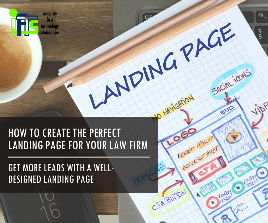
This could be due to the web page that you are sending people who clicked on your ad to. This page is called a “Landing Page”.
Creating a well-designed landing page for your painting company can be the answer to getting more leads. In this article, we are going to cover the basics on what a landing page is, and we’ll provide tips on how to optimize each section to increase conversions.
What Is A Landing Page?
A landing page is a standalone web page that is created specifically for advertising campaigns to send people to. This is literally where your visitors will “land” when they click on a digital ad.
The purpose of a landing page is to have one focused page where you tell your visitors why they should hire you for a specific job and how to start the process. You just want them to take one specific action.
How Does A Landing Page Convert Visitors?
While homepages are still very important website elements, they are usually not specific to one particular task. They are also designed to give your site visitors multiple avenues to explore your business.
With a landing page, you are able to control how visitors arrive on your site and direct them to do one thing. If they click on an ad for interior painting, they should see specific information about painting services. If they click on an ad for handyman services, they should see specific information about handyman services. This makes a landing page the very best place to send them when you want to convert higher percentages of visitors into leads.
With that said, here are 7 tips for creating the perfect landing page for your painting business that will help increase conversions:
1. Stick to One Call-To-Action (or CTA for short)
Your CTA is simply the action that you want your visitors to take. You will want to give this main action high priority on the page. The CTA should be the first thing that catches their eye when “landing” on your page.
Pro Tip: Most CTAs are a unique-colored button that reoccurs throughout your landing page. The wording for each button should be EXACTLY THE SAME.
When a visitor clicks on your ad and arrives at your landing page, you want to make their decision as easy as possible – don’t give them a number of actions to take. Keep the objective as simple and as clear as possible.
Whether your landing page objective is for visitors to give you a call, schedule a free consultation, or sign up for a newsletter, make it consistent across the board. Only focus on one action for them to take. The more choices they have, the harder it will be for them to make a decision.
Include your CTA at the end of each text block to guide them and tell your visitor what to do. You don’t want to leave them hanging wondering what’s next.
2. Match The Message of Your Landing Page to the Ad
Consistency is key here. If a visitor clicks on your ad, clearly something about it caught their attention. They click because it either fulfills a need of theirs or it found them at the right time. Regardless, they clicked because in that moment, they felt that it was worth their time!
This is called “Ad Congruity”.
Pro Tip: If your ad congruity is on point, Google actually lowers the cost per click when you run ads.
If your ad talks about a free consultation for exterior painting services, and your landing page talks about cabinet painting, you will not meet the visitor’s expectations. In this scenario, you are more likely to lose visitors than convert them because your landing page does not specifically align with your ad.
3. Offer and Emphasize Value
Every visitor to your landing page is most likely considering your company to take on their painting project. They are going to assess whether or not they believe you can provide value to them. Here is where you are going to focus on the client, not your firm.
In order to secure a conversion, you’ll need to offer something of value to your site visitors.
You only have a short amount of time to convince your site visitors that they have found what they have been looking for. Use this time wisely to reel them in with the benefits they will receive by working with you and be sure to focus on what’s in it for them. Emphasize how you will handle their project from start to finish.
If you want them to hire you as their painting crew, you need to show that you are worth the investment.
Pro Tip: Spin your language to talk about your customer. Minimize the amount of times you say “we” and instead, use “you” or “your”.
4. The Length of the Landing Page Matters
The length of your landing page depends on your end goal. Do you want your visitors to fill out a contact form? Do you want them to call you? Or do you just want to educate them?
For example, you may need more content if you are asking a visitor to call you, as opposed to downloading a brochure about your painting process. It takes a lot more effort to pick up the phone and schedule an estimate than it does to submit an email address for more information. Therefore, you will need to provide more information that will convince them your company is the perfect fit.
5. Add A Video to Your Landing Page
A study shows that having a relevant video on your landing page can help increase conversions by 86%.
Now, slapping any old video on your landing page isn’t going to be a shortcut to success. While incorporating video can be a total power move, it could also distract visitors from your CTA. This video needs to complement the rest of your landing page, tying everything together. Keep it short and to the point without making it the primary focal point of your landing page.
The best place for a video is partially above the fold of the page. Here, it will not distract from your CTA and value proposition, but it shows that you have even more value to offer as your visitor scrolls through your page.
6. Feature Supporting Proof
The best social proof will come from your clients. Include testimonials and quotes from real clients that talk about their experience with your company. When you talk about yourself, it’s usually seen as marketing fluff, but when someone else says it, it’s more powerful.
Did you know that 79% of consumers trust online reviews as much as a personal recommendation from friends or family? Having these reviews visible on your landing page will provide the validation that potential painting clients are looking for.
Pro Tip: Be sure to use reviews from 3rd party, reputable sites like Google or Facebook. These look much better than just having a client give you text to use on the website.
7. Optimize Your Form For Conversions
The number of fields required can make or break conversion rates. It is imperative that you collect as much information as possible so you are able to follow up with a potential client, however, if you ask for too much information, this will reflect poorly on those conversions.
We recommend using the following fields:
- Name
- Phone number
- Message (describe project)
Giving the option to leave a message allows the visitor to explain their project, creating a bridge between new clients and the person that will be leading their project. This will give you the opportunity to get a step ahead and learn what they are looking for before you schedule an estimate.
Landing pages are the way to go when it comes to converting as many visitors as possible into clients from online ad campaigns…and now you know all you need to know to get started!
But…how’s your website’s homepage? Is it optimized to convert visitors? We have a free 47-point homepage quick guide for painting companies that you can download and begin using today! Visit our guide’s landing page to get started (see how well a landing page works?).
Still not sure where to begin? Let us help you. Send me (Stacey Ivol) an email at si@iftsdesign.com or give IFTS, Inc. a call 412.715.6266 for a FREE consultation.