In today’s digital-first world, potential clients are increasingly seeking trustworthy, knowledgeable professionals online before making decisions.
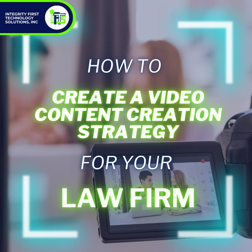
For attorneys, creating a video content strategy is not just a marketing trend—it’s an essential tool for building trust, showcasing expertise, and standing out in a competitive field. A well-executed video can provide you an edge over your competitors who rely solely on text-based content or static images, allowing you to connect with prospective clients in a more personal and impactful way.
However, a successful video content strategy doesn’t just happen overnight…
This guide will walk you through creating a robust video content specifically for your law firm. By the end, you’ll have actionable steps to position your firm as a trusted advisor and attract the right clients to your practice.
Why Video Content Matters for Attorneys
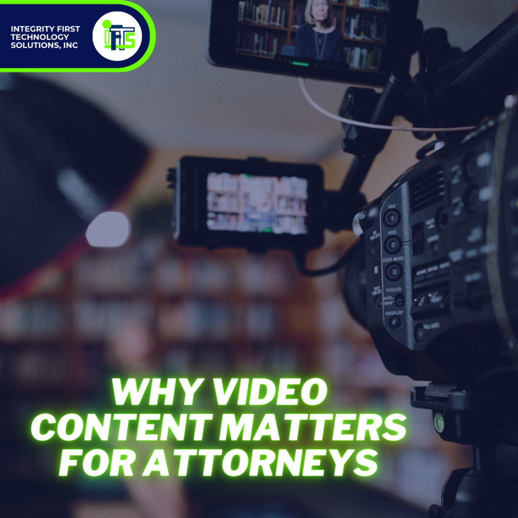
1. Builds Trust with Prospects
Legal services often require a high degree of trust.
A video allows potential clients to see you, hear your voice, and get a sense of your personality. This can be incredibly reassuring for someone deciding whether to hire you.
In fact, many people are more likely to trust an attorney they’ve “met” through video over one whose presence is limited to a static headshot and bio. By addressing client concerns and demonstrating your expertise on camera, you position yourself as approachable and credible—qualities that are invaluable when clients are choosing an attorney.
2. Sets You Apart from Competitors
The legal industry is saturated, and many attorneys still haven’t adopted video marketing.
By creating high-quality, informative videos, you differentiate yourself from competitors who rely solely on written content. A video provides a dynamic medium to tell your story, share client testimonials, and explain complex legal concepts in an accessible way.
3. Enhances Search Engine Optimization (SEO)
Search engines prioritize video content.
In fact, YouTube is the world’s second largest search engine (and Google owns it). Including video on your website or social media platforms can significantly improve your search rankings, driving more traffic to your practice’s online presence. Google’s algorithms favor video because it increases time spent on a page—a key factor in ranking. They also like to see you using their tools.
Steps to Develop a Video Content Strategy for Your Law Firm
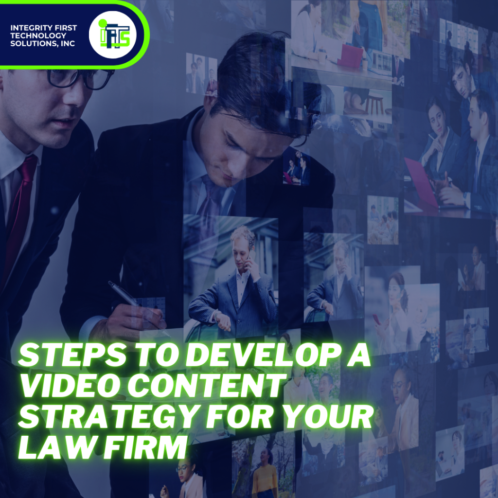
1. Define Your Firm’s Goals
Before creating any video content, identify what you want your firm to achieve. Common goals for attorneys include:
- Educating potential clients about legal processes
- Answer commonly asked questions
- Building trust and credibility
- Driving traffic to your website
- Generating leads
Align each video with a specific goal to ensure your efforts are focused and measurable.
2. Know Your Client
Your content should speak directly to your ideal client. Consider their needs, questions, and concerns. For example:
- Family law clients may want guidance on custody battles or divorce proceedings.
- Corporate clients might need advice on contracts or government compliance.
- Personal injury clients could benefit from an explanation of the claims process.
By understanding your audience’s pain points, you can create videos that resonate and provide real value. You’ll also let your audience get to know you.
3. Plan Your Content Topics
Develop a list of topics that align with your expertise and your audience’s needs. Here are a few ideas:
- “5 Things to Know Before Filing for Divorce”
- “How to Handle a DUI Charge in [Your State]”
- “Understanding Your Rights After a Workplace Accident”
- “First 5 Steps to Take When Starting a Business”
Aim for a mix of educational, FAQ-style, testimonial and client-centric videos to cover a broad range of interests.
4. Choose the Right Format
There are several video formats you can use to engage your audience. These include:
- Explainer Videos: Simplify complex legal concepts.
- Client Testimonials: Showcase real success stories to build credibility.
- Q&A Sessions: Answer frequently asked questions in a conversational tone.
- Behind-the-Scenes Videos: Humanize your practice by showing your team, office environment or office events, like parties.
5. Invest in Quality Production
While you don’t need a Hollywood-level production, quality matters. Here’s what to prioritize:
- Lighting and Sound: Ensure your videos are well-lit and free from background noise. Consider buying a microphone that will easily connect to your phone.
- Professional Editing: Clean edits, transitions, and on-screen text can elevate your content. Check out this article on costs associated with video editing and more for your firm
- Clear Messaging: Write a script or outline to stay concise and focused. You can use a teleprompter app on your phone to record the video easily
6. Optimize for Multiple Online Platforms
Your videos should be tailored for the platforms where your audience is active:
- Website: Embed videos on your homepage, service pages, testimonial pages or within blog posts.
- YouTube: Use this platform as your video hub and where you upload everything. Optimize titles, descriptions, and tags for SEO. Try using tools like SEMrush or ChatGPT to figure out the best keywords to target.
- Social Media: Share short, engaging clips on LinkedIn, Facebook, and Instagram. Want some ideas for what to post? Check out this article on law firm social posts.
- Email Campaigns: Include video links in newsletters or client outreach emails.
Each platform has its own best practices, so adjust your content accordingly. For example, keep LinkedIn videos professional and concise, while Instagram can be more casual and visually engaging.
How to Build Trust Through Video
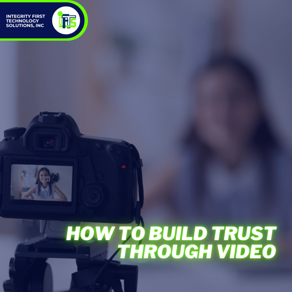
1. Be Authentic
Avoid using overly technical jargon or reading from a script robotically. The most effective marketing has a seventh-grade education level (or below).
Instead, speak naturally and convey genuine concern for your clients’ needs. Authenticity fosters trust and makes your content more relatable.
2. Showcase Your Expertise
Position yourself as an authority by sharing insights and actionable advice. This doesn’t mean giving away free legal consultations but rather addressing common concerns or misconceptions. For instance:
- Explain what to expect during a court appearance.
- Outline the steps in a legal process like estate planning.
- Talk about your opinion on an ongoing case that is in the news in your area
3. Include a Call-to-Action (CTA)
Every video should end with a clear next step for your audience. Examples include:
- “Visit our website to learn more.”
- “Schedule a free consultation today.”
- “Download our free guide on [topic].”
A strong CTA encourages viewers to take immediate action, moving them closer to becoming clients.
4. Leverage Testimonials
Client testimonials are incredibly powerful. Hearing from satisfied clients can reassure potential clients that they’re making the right choice. Consider creating video testimonials that highlight your expertise and successful outcomes.
Measuring Success and Refining Your Strategy
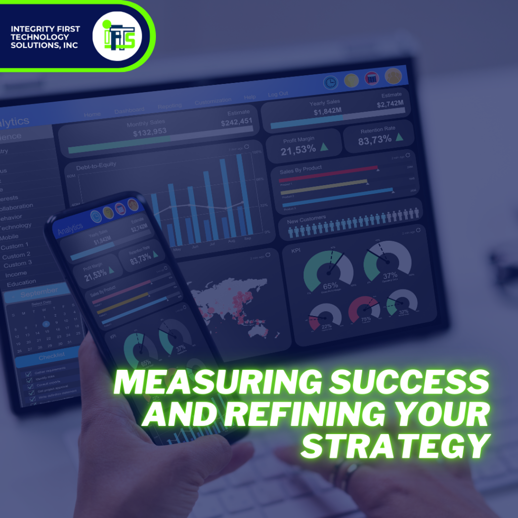
To ensure your video content strategy is effective, track its performance using these metrics:
- Views and Engagement: How many people are watching your videos? Are they liking, commenting, or sharing?
- Website Traffic: Is your video driving more visitors to your site?
- Lead Generation: Are viewers converting into consultations or inquiries?
- Phone Calls: Is your firm receiving more calls for consults?
Use analytics tools like YouTube Insights, Phone number tracking like CallRail, Google Analytics, and social media analytics to gather data.
Based on the results, refine your approach by experimenting with new topics, formats, video lengths, or social platforms.
Final Thoughts on Your Firm’s Video Content Strategy
In an industry where trust and expertise are paramount, video content offers attorneys a unique opportunity to connect with potential clients on a personal level. By creating a thoughtful, well-executed video content strategy, you can set yourself apart from competitors, build lasting relationships, and ultimately grow your practice.
Start small, focus on authenticity, and continuously improve based on feedback and performance. With the right approach, your videos can become a cornerstone of your marketing efforts, helping you reach and resonate with your target audience like never before.