
Remember when it was trendy to have scrolling banners, a website visitors counter, blinking text or Adobe Flash on your website?
Does your website still have those…or does it look like it was designed when boy bands were still cool?
If so, it is definitely time for an update.
Here are 6 more signs that it’s time to redo your website:
✅ Your Website Isn’t Responsive
Does your website look as good or better on a phone than it does on a desktop?
If not, it’s time for an update.

Your website should adapt and look good on all devices.
Why?
Well, first of all, this could actually be hurting you in the organic search rankings. Google has started to penalize websites that are not designed for mobile devices because they determine the rankings using the mobile version. If Google prioritizes a mobile-friendly website, you should, too. Unfortunately, the vast majority of painting businesses actually do the opposite.
Secondly, your customers will think that you don’t care about them having a good experience.
More of your customers are going to your website using their phones instead of a desktop than ever before. If they have to pinch, zoom and swipe their way through a non-optimized website, there is a good chance they’ll move on to the next painting company quickly.
If your website was built several years ago, even if it is responsive, it may not be as user-friendly on mobile devices as it could be. There has been a shift in both best practices, loading time acceptability and user expectations.
In order to determine whether or not your site is mobile-friendly, you can use Google’s own mobile-friendly test tool: https://search.google.com/test/mobile-friendly
✅ Your Website Isn’t Easy For Your Target Market To Navigate
Can your ideal client easily navigate your website?
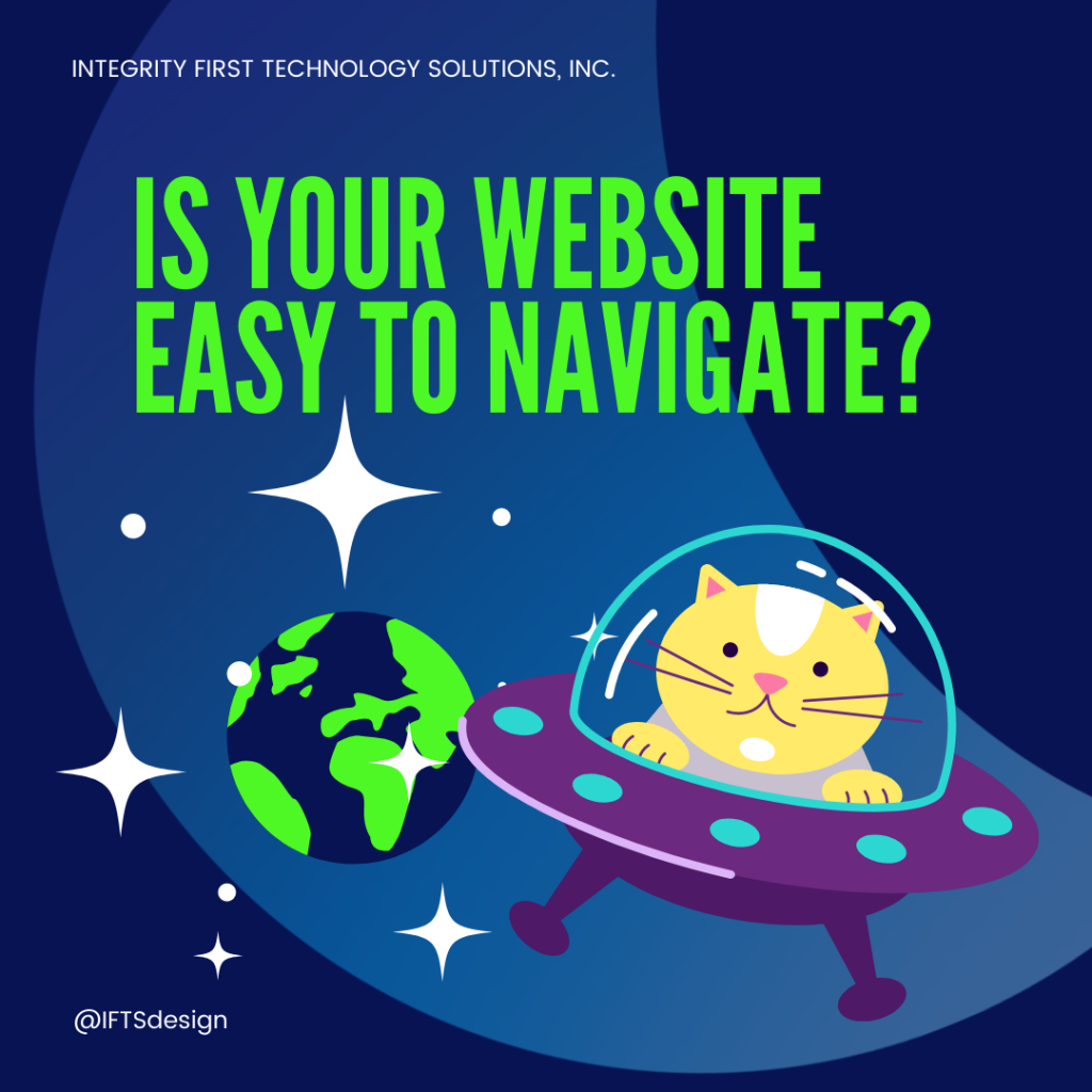
If not, it’s time for an update. A client should be able to get to any page they want within 3 clicks.
3 clicks is what the average person finds acceptable while browsing for information. In this increasingly fast-paced world where attention span is at a premium, prospects should find your website intuitive.
Typically, when business owners prioritize “pretty” websites over functionality and clever wordplay over straightforward descriptions, this is where you can lose people.
Some other common issues that we see:
- Menu isn’t mobile friendly
- Too many menu items
- Too few menu items
- Inability to navigate back a page or up a level
- Blogs with no navigation
- No site menu
If these are a problem on your site as well, you want to start thinking about a change.
✅ Your Website Isn’t Updated Regularly
When was the last time that you updated your website?
If you can’t remember, or if it was more than 3-4 years ago, it’s time for an update. You want to make the best first impression you can, and that includes what people think of your online properties as well. In fact, most people will judge a website within the first .05 seconds of seeing it.
An updated website is important for many reasons.
- Aesthetic trends change, so a layout or graphic scheme that was popular before may not be popular now. This can date your website.
- Security protocols will update or change, which may leave you vulnerable to hacking.
- Embedded code protocols from third parties (like YouTube or Rumble) will change as well, which could break the functionality on your website.
One way to evaluate your website is to compare it to your competition. Look at the websites of 5 local competitors. If all of them have nicer looking websites, it’s time to update yours.
Remember, people make assumptions about you based on what your website looks like. If it looks old or sloppy with broken functionality, they may assume that’s how your business is run as well.
You might not give much thought to an out-of-date website, but it’s the digital equivalent of a high end boutique with bad lighting or a law office with holes in the waiting room upholstery. Putting in no effort to the appearance suggests that you don’t care about how you come across to others.
Customers and prospects want to be cared about.
✅ Your Website Doesn’t Convert Visitors Into Clients
When someone visits your website, do they normally become a client?
If you don’t convert a decent percentage of website visitors into clients, it is time for a website update.
Having a website is essential for any business today. However, merely existing online is not enough. Your website’s purpose is to promote your company. It should be your BEST (and easiest to control) salesman.
A few ways that you can improve your conversion rate:
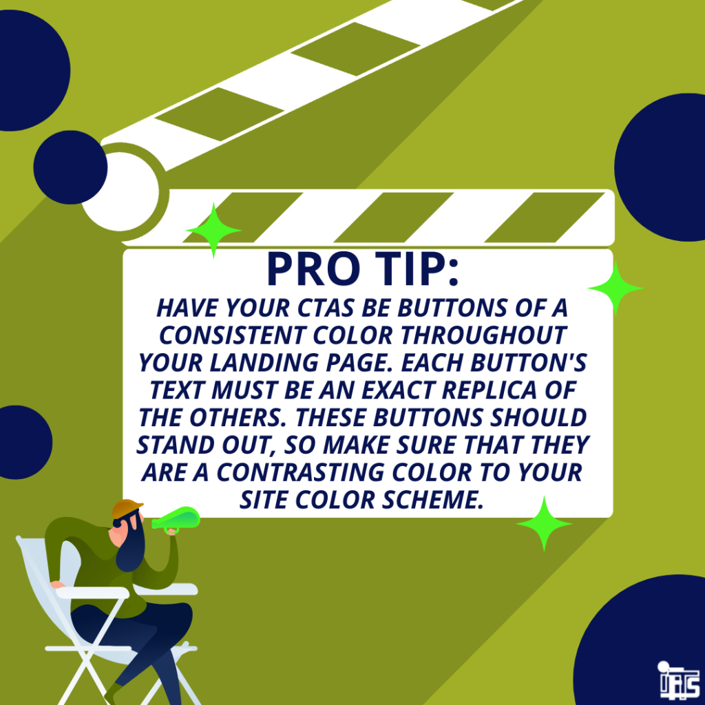
- Be sure to have clear calls to action that stand out on every page
- Be consistent in your messaging across all platforms
- Provide helpful content about your business as well as why someone should work with you
- Add your phone number and email address at the top of the website and make sure they are clickable
- Adding a chat bot makes it easy to ask questions and helps a prospect decide to go with your services on the spot
- A scheduler widget that allows a prospect to create their own appointment with you to accommodate a busy schedule
- Ask for only a small amount of information so it’s easy for a prospect to fill out a form and submit. The key is for you to get in touch quickly after the submission.
A good metric to look at if you have Google Analytics installed on your site is called Bounce Rate.
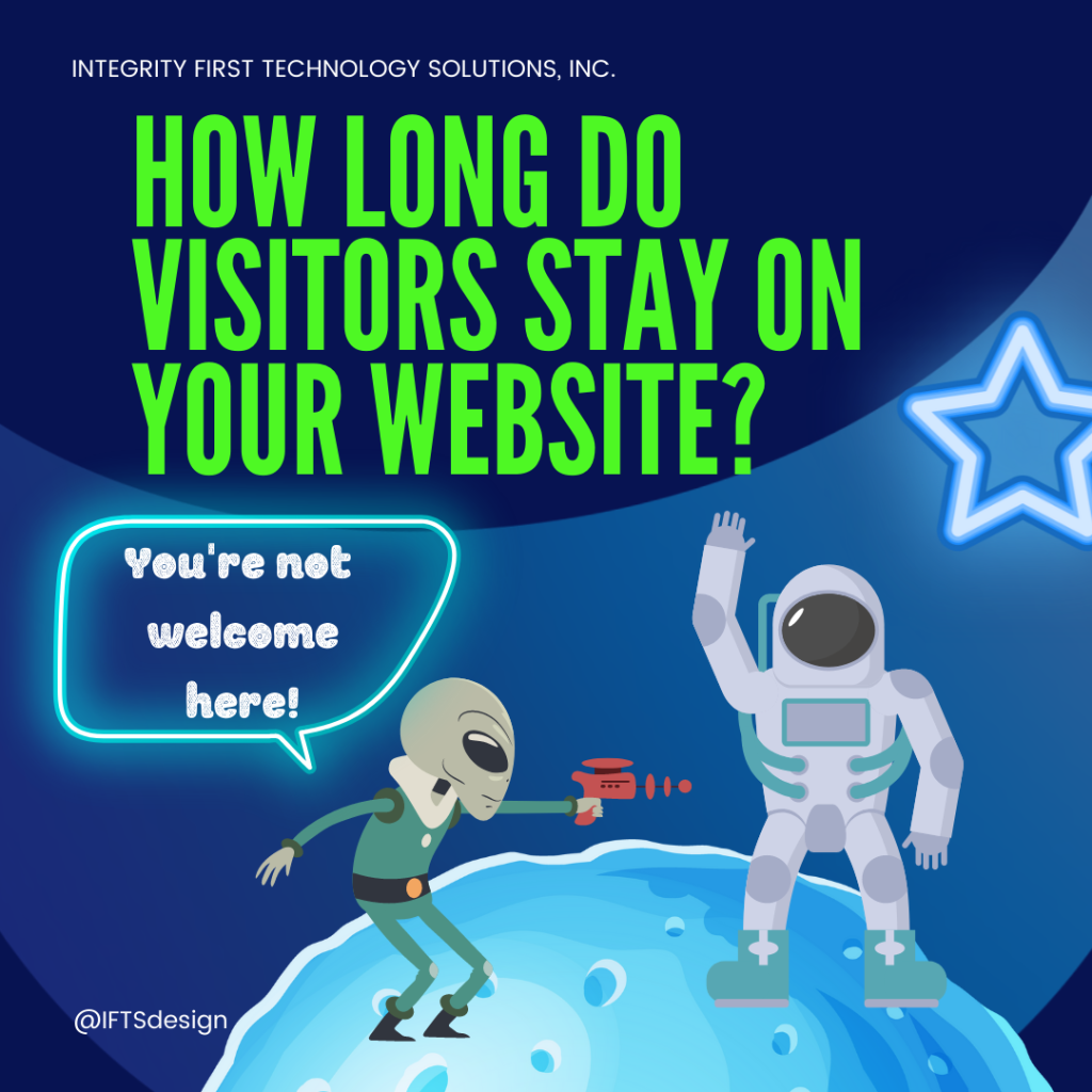
Bounce Rate tracks the percentage of first-time visitors that depart your webpage without navigating any further. While it’s normal for some pages to have a larger bounce rate than others, consistently high rates across the board indicate that something is wrong with your website.
✅ Your Website Doesn’t Follow Google’s Rules To Rank Well
Does your website play by Google’s SEO (search engine optimization) rules?
If you haven’t optimized your website in the past year or two, it’s time for an update. Google constantly is changing/adding to their SEO rules.
SEO lays the foundation for having your website rank well and show up on the first page of results. For more in depth information on SEO, check out this article from IFTS on “SEO for House Painting Companies”.
A few of the most important SEO rules:
- Your website should have an SSL certificate
- Load time for the site should be under 3 seconds
- Popular keywords associated with your business should be used in the URL, page titles and headers
- The meta description and page title field should be filled in
- There are no bugs in the website code
- There are no security vulnerabilities
While it is true that sometimes a combination of different approaches might solve these issues, if your website is more than a few years old, it is usually best to start from scratch. There is a limit to how many times you can fix a broken website by applying temporary fixes.
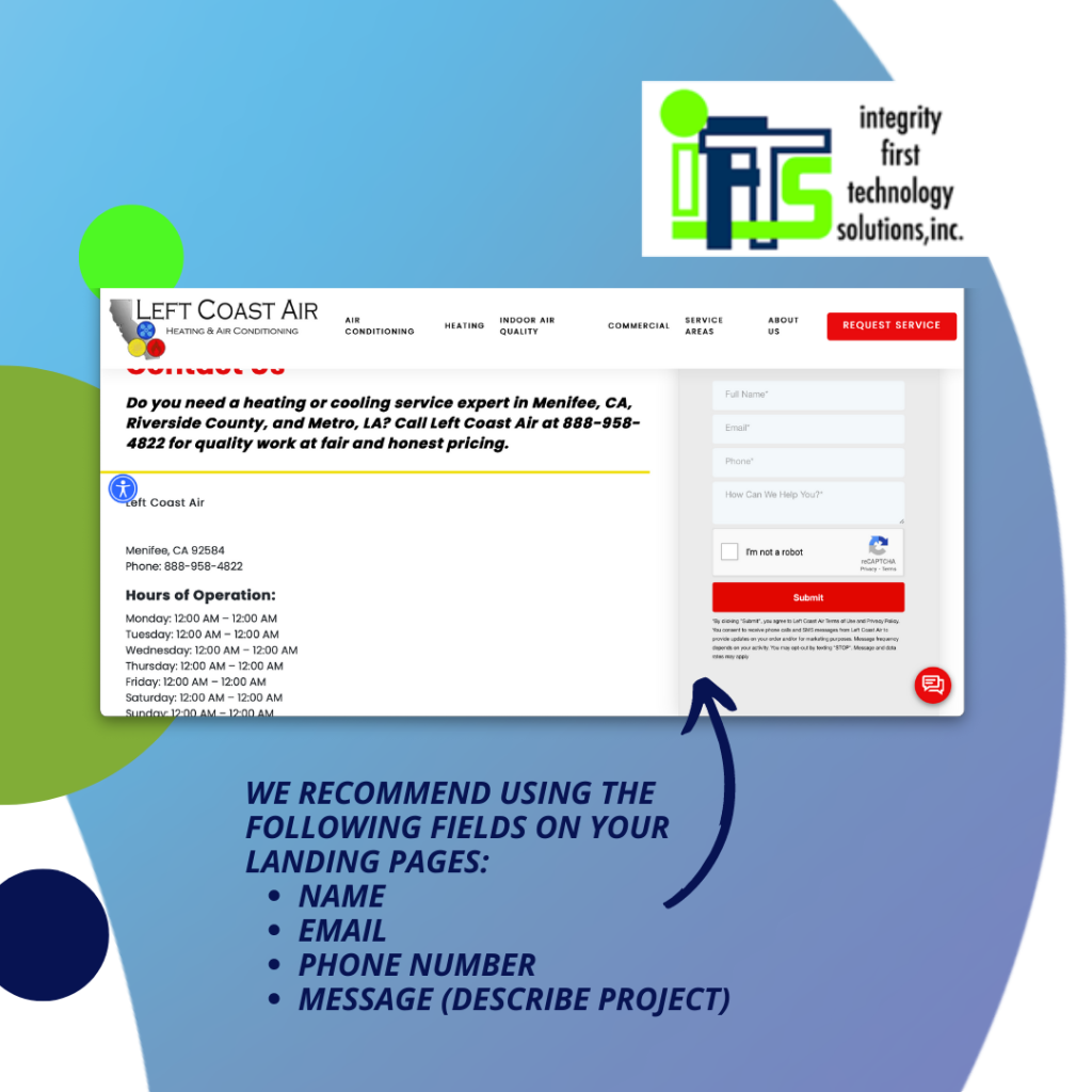
✅ Your Website Doesn’t Have Multiple Ways For People To Contact You
If I go to your website, are there multiple ways to get in touch with your business?
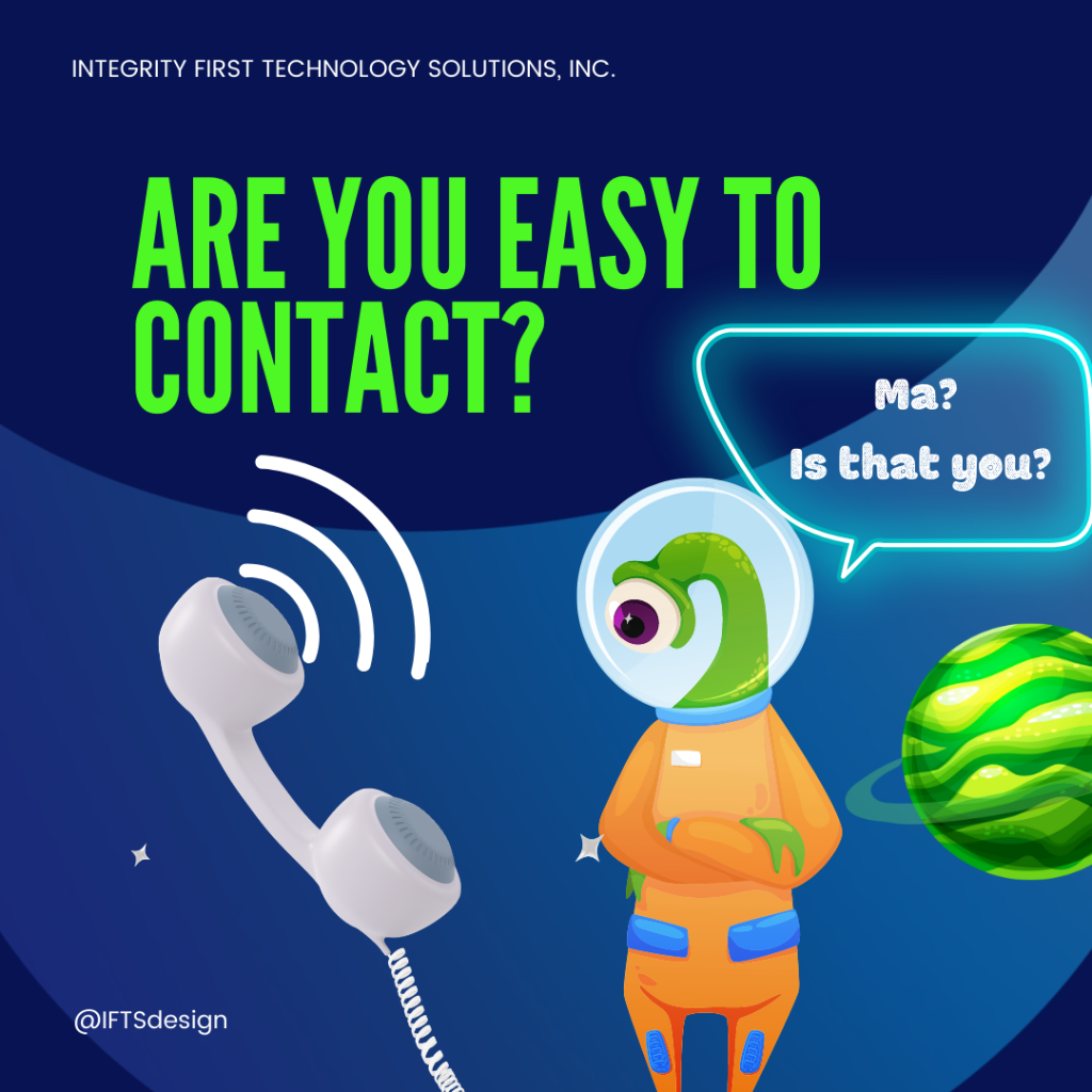
If you don’t have a phone number, a contact form and an email address easily available, it is time for an update. Because people communicate and learn in different ways, it’s important to make it easy to contact you using multiple methods.
A great first step is to add the phone number, email address and social media property links to the top of your header. These will be easily accessible no matter what page of the website a prospective customer is visiting.
A chat bot can be a valuable tool as well. The easier you make it for prospects to get their questions answered and any fears allayed, the better chance you have of getting that person as a client.
Finally, a contact form on your website that can be navigated to easily (one click) makes the perfect trifecta of website communication.
🤔Thinking That Your Website Is Ready For An Update?
After reading this list, you may be convinced that a website redesign is in order and you are probably right!
Want help?
Using the newest responsive design trends, search engine optimization (SEO), and other cutting-edge features, our developers will craft a unique website for your company. Call IFTS today at 412.715.6266 to get started!
Get the Top 3 Social Media Post Templates for Painting Companies to Grow Your Following and Get New Clients
Engage with prospects and save time with your FREE Canva template kit. This kit features the top 3 social media posts for painting companies and directions on how to brand them for your own business in 5 minutes or less.

Enter your email below and get the templates sent directly to your inbox along with an instructional video on how to make personalized edits.