

Are you tired of your website feeling more like a legal labyrinth that requires a map and guide than a client-friendly portal?
Are visitors on the site lost in a sea of legal jargon, unable to figure out what action to take?
Do you always have to tell people where information is on your website rather than them easily being able to find it?
Well, you are in the right place because your law firm website makeover starts now.
Picture this: a website that not only showcases your legal abilities but also captivates online visitors from the moment that they land on your site. Imagine a digital platform that not only informs, but engages users, turning them from information seekers to eager clients that want to pay you for your services.
In today’s fast-paced digital landscape, where you get 50 milliseconds for a person to judge your website, make it count. Your site is your virtual storefront, your best salesperson and your online greeter all rolled into one…it’s also your ticket to reaching a broader audience full of potential clients.
Here’s the kicker – in order for your website to thrive in the competitive world of online legal marketing, you have to ditch outdated tactics and embrace a fresh approach that speaks directly to your target audience.
So, if you are prepared to say good-bye to cookie-cutter sites and hello to an amazing new website that gets you clients, let’s get started! It’s time to unleash the power of your legal acumen and make a lasting impression in the digital realm.
So, what are the 9 elements that you need to remove from your law firm’s website to accomplish all of this?
Element 1 To Remove - Unclear Brand Messaging
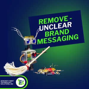
Make sure that your homepage communicates your firm’s specialty in a succinct way, right at the top of the page. Don’t make site visitors guess what you do. They need to know immediately that they are in the right place with the right firm.
Avoid using vague headlines like “Leading Law Firm” or “We Get You Legal Results Fast”.
Instead, opt for more descriptive statements such as “Expertise in Corporate Law For Startups” or “We Take Women Through Every Step Of A Divorce”.
If you can call out your ideal client and how you will help them, you will have great messaging that makes them want to learn more and stay on the site.
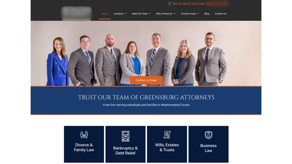
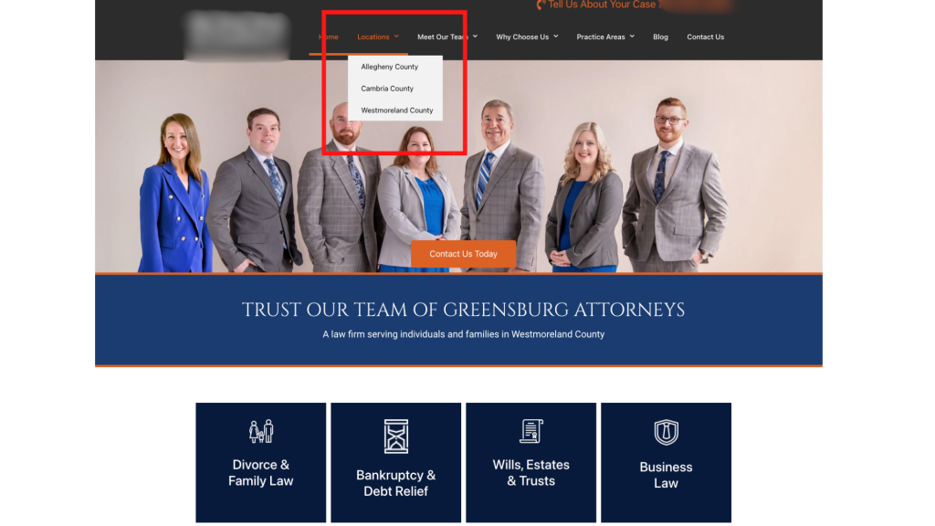
Element 2 To Remove - Ambiguous Navigation Labels
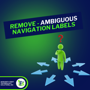
Site visitors need to know where to go on your website intuitively.
Instead of having a page that lists out all of your areas of practice, create one page per practice area. Not only does this make navigation easier, but it helps with your website’s SEO as well by having keywords in the menu.
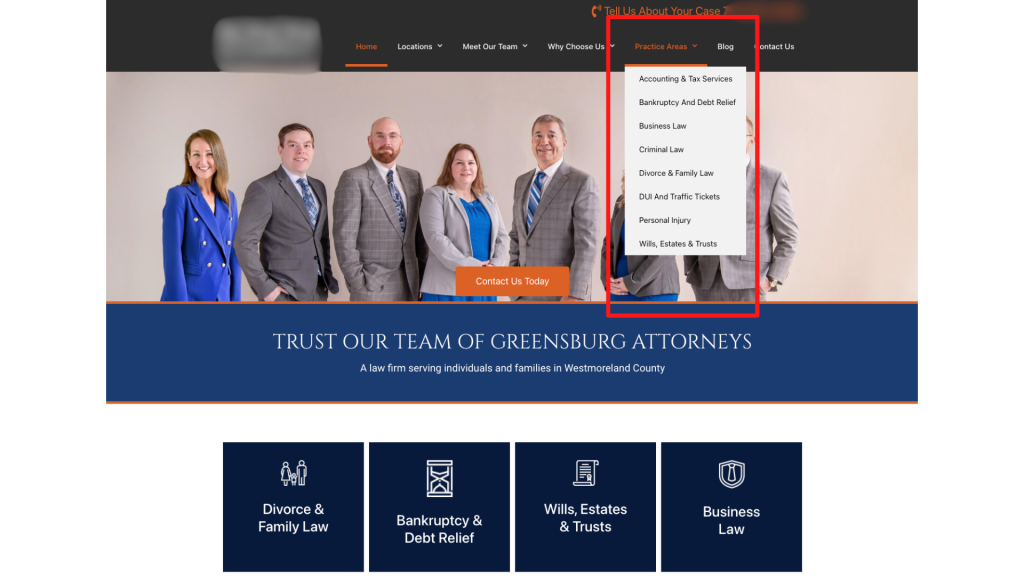
You should also do this with the areas that you serve. Instead of having one page that talks about your service area, create independent pages for each of the cities or towns. This makes it much easier for a site visitor to know that your firm is in his or her area and can help.
Element 3 To Remove - Generic Subheadings On Website Pages
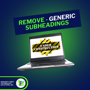
Get the attention of your visitors with specific subheadlines that engage them immediately.
You want them to say “This firm is for me” when they are reading the text on your site.
Instead of using a header like “Our Services”, try something more descriptive like:
- “Comprehensive Family Law Representation”
- “Strategic Criminal Defense Tactics”
- “Starting A Business in 7 Steps”
When you make the subheadings specific, it allows a site visitor to self identify as a potential client.
In addition, more specific subheaders are great for telling the search engines like Google what your firm does and should help with your site rankings.
Element 4 To Remove - Slideshow Overload

Avoid overwhelming your visitors with excessive slideshows with multiple slides.
Streamline your pages to highlight key services or unique selling points effectively. Important information should not be hidden in a slide that someone has to wait for.
Not only that, but slideshows do not do well with accessibility for anyone accessing your site with a disability, so they may not get the information that they need.
Our bodies are hardwired to react to movement, so if you have a moving element on your website, it’s distracting. You never want anything on your website to distract from your messaging and stop someone from hiring you.
Element 5 To Remove - Inauthentic Imagery

Yes, stock images with pretty people and perfect lighting make your website pretty for YOU to look at. Your web designer probably thinks that it is pretty too.
However, it comes across as really inauthentic and boring.
When people are looking for a lawyer, they want to be able to see YOU and your team. People hire people, they don’t hire businesses. They want to make a connection. Stock images make it impossible for a potential client to make a connection.
It doesn’t matter if the lighting is a bit off or you need to lose those extra 5 pounds, an authentic picture comes across as a human that they can trust.
Build trust with potential clients by using authentic images that reflect your firm’s identity. Replace generic stock photos with genuine pictures of your team, office or clients (with consent of course) to convey credibility.
Bonus points if you let them know just a bit about your personal life, like sharing a picture of your dog or you at a local baseball game. You’d be surprised by how many people connect with you in that way.

Element 6 To Remove - Social Media Distractions

Have you ever noticed the websites that have the firm’s social media icons at the top of the page above the menu?
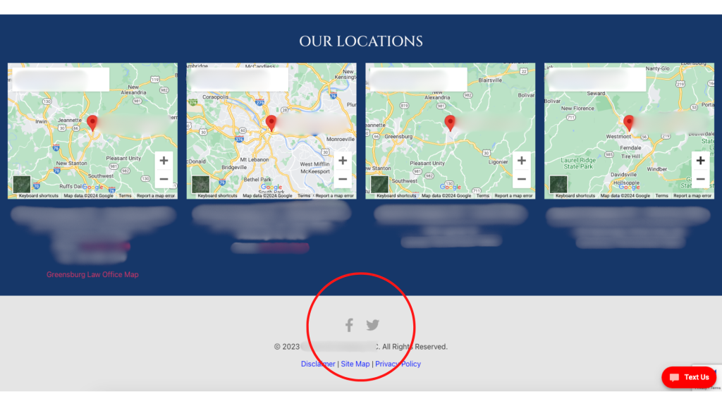
Well, I can guarantee you that they are losing more traffic than they would like.
By putting the social icons at the top of the page, you are just begging your visitors to click off of your page…and get sucked into the attention time sink that is social media. By the time that they are done checking their notifications and seeing the latest Reels, they may have completely forgotten that they started at your website.
Minimize this distraction by moving the social media icons to your footer and on your “Contact Us” page. This prevents visitors from being redirected away from your site and maintains their focus on your legal services. It also puts your social media pages at an easy to find spot.
Element 7 To Remove - Outdated Content
Keep your website relevant by updating or removing outdated content.
If your blog templates have dates on them, remove them. If the date is important, put it in the title or the text.
Most legal articles will be evergreen, so you don’t want people to click away because the article is 10 years old. If it’s still good information, they should read it. Don’t make it easy for them to dismiss.
Element 8 To Remove - Unreadable Content Blocks
Which paragraph looks easier to read?
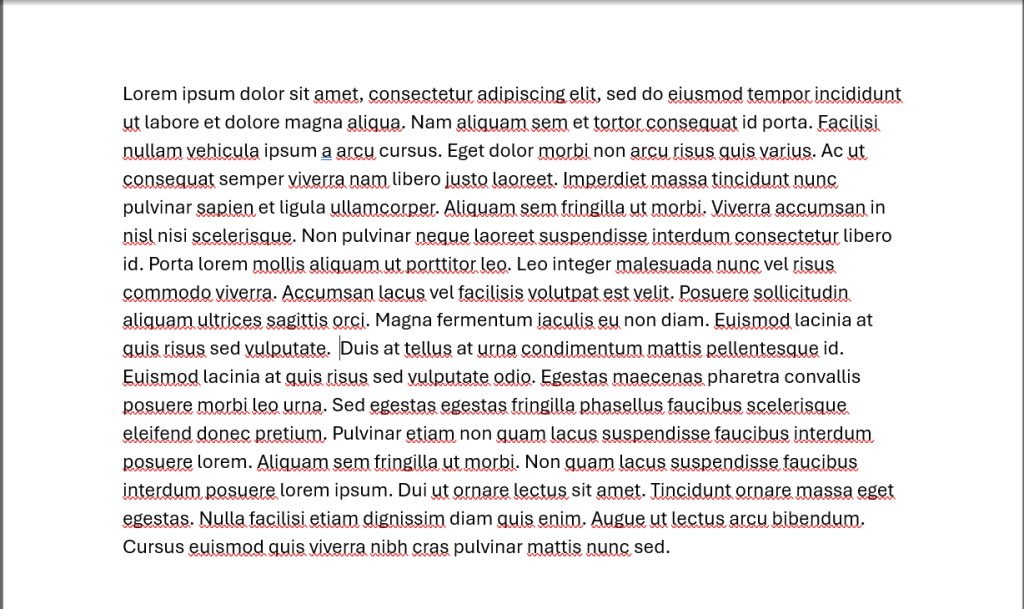
or
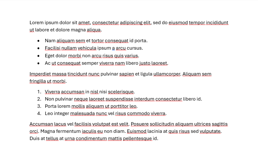
I think that most people would agree that Option 2 is much easier to read than option 1. It has whitespace and gives the eye somewhere to rest.
Improve readability by breaking up dense paragraphs. Some of the ways that you can do this include:
- Shorter sections
- Utilizing bullet points
- Use easy to understand headlines
- Highlight or bold key points that you want to draw the eye to
See what I did above? I just made that easier for you to read by breaking it up into bullet points.
You want to do your best to enhance the user experience by making information more digestible and accessible. 79% of people scan new pages that they come across, so the text needs to be formatted to grab their attention. Blocks of text just won’t work.
Element 9 To Remove - Excessive Legal Jargon
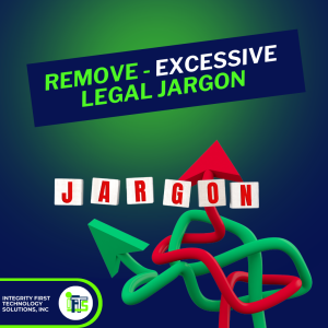
Simplify your website’s language by eliminating excessive legal jargon that may alienate or confuse visitors.
Yes, your content may sound “legal” or impress your colleagues, but that’s not who your website is for.
When writing your content, ask yourself (just like in law school), cui bono, who benefits?
If the answer to your question is not “My potential or current clients”, you know what to do.
Instead of bombarding potential clients with complex legalese, strive for clear and concise communication that everyone can understand. Remove dense paragraphs filled with technical terms and replace them with plain language that resonates with your target audience.
By cutting through the legal mumbo-jumbo, you’ll make your website more accessible and user-friendly, ultimately fostering stronger connections with potential clients through authenticity and trust building.
You can even try a tool like quillbot to rewrite sentences with a certain reading level in mind.
What Is Next For My Firm’s Website?
In conclusion, optimizing your law firm’s website is essential for staying competitive in today’s digital landscape.
By removing outdated elements and enhancing user experience, you can create a more engaging and effective online presence that attracts and converts potential clients.
Let’s recap the nine key areas we’ve discussed:
- Ensure clarity in your brand messaging and homepage headlines.
- Use specific navigation labels to guide visitors effectively.
- Craft engaging subheadings that capture attention and provide value.
- Streamline your homepage to prioritize essential information.
- Opt for authentic imagery that builds trust with potential clients.
- Minimize distractions by strategically placing social media links.
- Keep your website content relevant and up-to-date.
- Enhance readability by breaking up dense paragraphs and utilizing formatting.
- Simplify your language by eliminating excessive legal jargon.
By implementing these changes, you can transform your website into a powerful marketing tool that showcases your expertise and attracts your ideal clients.
Now, it’s time to take action!
Review your website with a critical eye and identify areas for improvement based on the principles outlined in this article. Whether you choose to make small tweaks or undergo a complete overhaul, remember that every change you make contributes to a more user-friendly and effective online presence for your law firm.
Don’t hesitate to reach out to IFTS, Inc. or call for assistance if needed.
Your website is your digital face to the world—it’s time to make it shine. Start implementing these strategies today and watch as your online presence grows and flourishes.
Here’s to a brighter, more successful future for your law firm!