Category: Lead Generation
Step-by-Step Guide: How to Create/Add a Contact Form in GoHighLevel And How To Add Email Automations (Part 1)
When someone submits a form on your site, do you want your website to work for you by contacting that person via automations?
If so you are in the right place. In this article, we’re going to cover:
- how to create a contact form in GoHighLevel
- how to add that form to your website
- how to add a set of email automations that contacts that prospect for you with helpful info about your company.
And don’t worry if your website is not in GoHighLevel …
We will cover how to add a contact form to a GoHighLevel site and to a non-GoHighLevel site.
Creating forms and setting up email automations in GoHighLevel can significantly enhance your marketing efforts. This guide will walk you through the entire process, making it easy for you to embed forms on your website and automate your email responses.
Let’s get started!
Step 1 – Creating A Form In GoHighLevel
The most common form on a website is one where a prospect actually fills out their contact info, and then you get in touch with them. So, that’s the example we’re going to use and create today.
To get started, you’ll need to create a form.
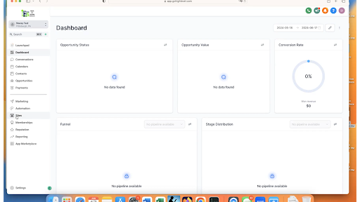
So, log in to GoHighLevel and click on “Sites” in the left main menu.
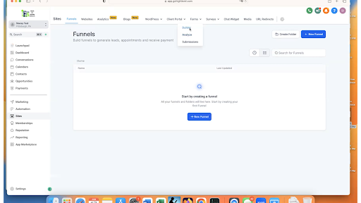
Then, in the top menu, click on Forms > Builder.
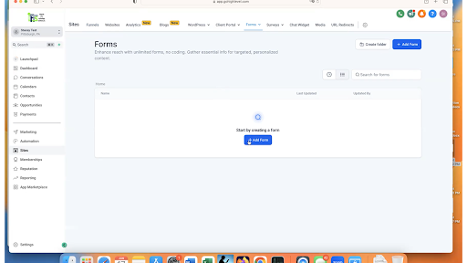
Click on “Create New Form.”
You can see GoHighLevel gives us a starting point with this generic form.
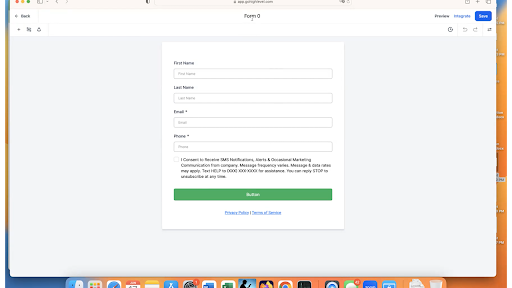
First things first, let’s name the form. You can see it’s currently named “Form 0” at the very top.
For this example, this form is going to be on my contact page of a sample law firm site. So, I’m going to call the form “Contact Form – Website.”
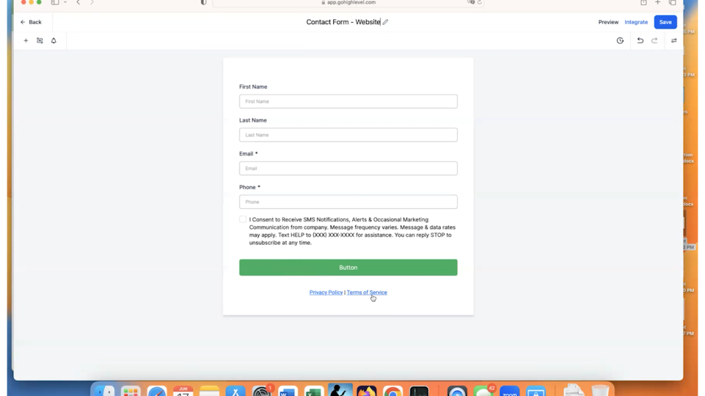
Now, you may choose to use the default fields that GoHighLevel gives you or you can personalize them.
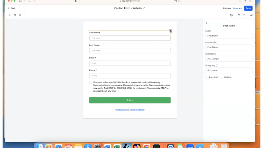
In this case, we are going to personalize them. You have a better chance of someone filling out a shorter form. So, we are going to delete the “First Name” and “Last Name” fields by hovering over them and clicking the “x.”
Then, we will add the “Full Name” field instead.
To do this, click on the “Add Form Element” button. It is the plus sign at the top left of the screen.
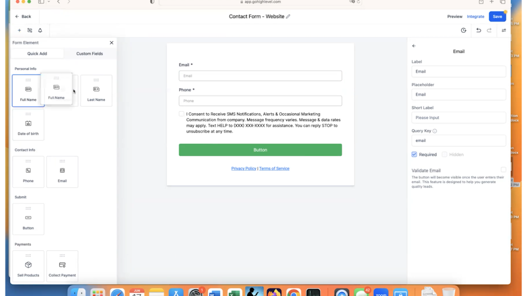
Then, select “Full Name” and drag it on to the form at the top.
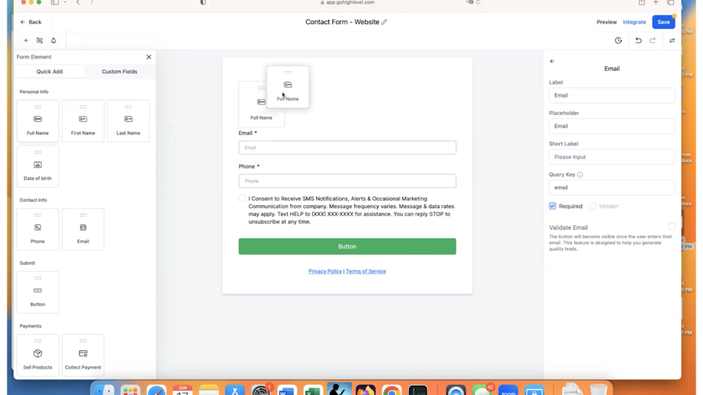
Now, your prospect has to enter their full name, their email, and their phone number.
The Asterisk next to the field name means that it is a required field. So if you want people to enter the field, be sure that you have “Required” checked on the right.
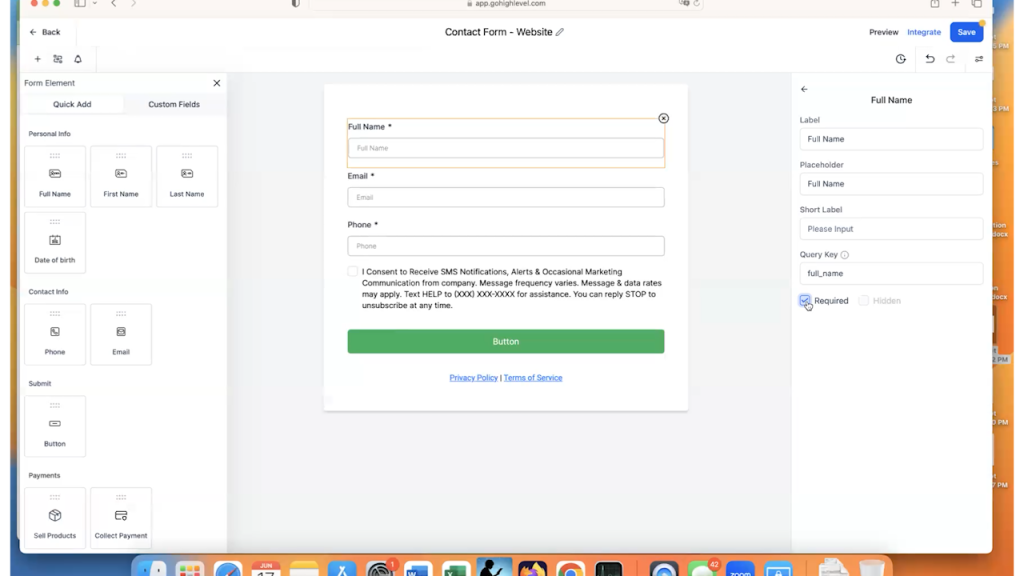
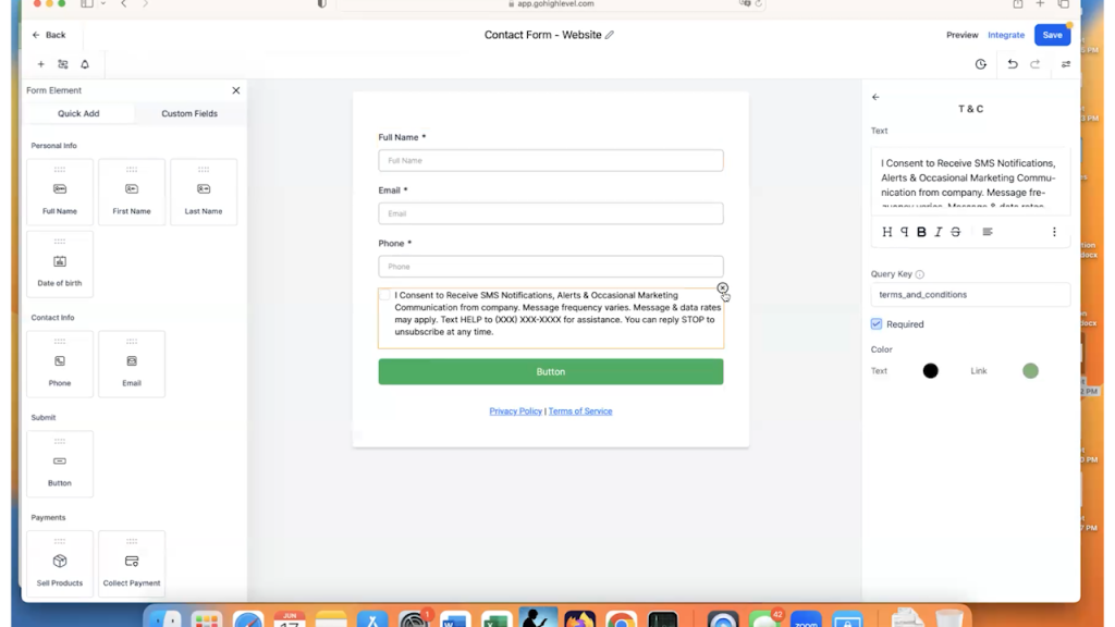
In this example, we are not going to require texts. We just are going to have them enter their phone number, so we can get in touch with them as a prospect. Therefore, we will get rid of the SMS permissions field as well by clicking on the “x” again for this field.
Custom Fields in GoHighLevel
In our example, we want to allow people to write a message when they submit the contact form. Because we are using a sample law firm website, we are going to ask for some information about their case.
To do this, we need to create a Custom Field in GoHighLevel.
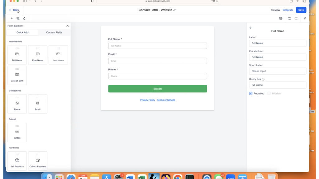
This will require you to save the form and click on the “Back” button in the upper left-hand corner so you can see the main left-hand menu again.
Then, click on “Settings”, which is the last choice of the main menu on the left.
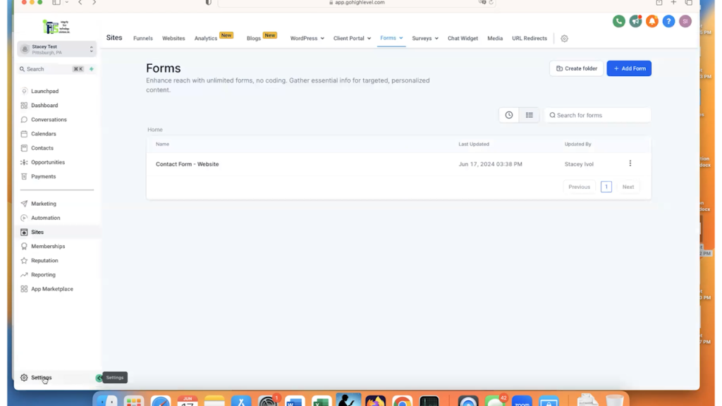
Then, once you are in the “Settings” menu, click on “Custom Fields.”
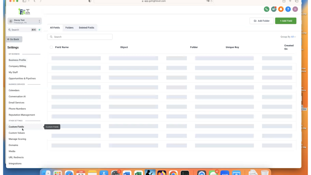
Click on “Add Field” in the upper right-hand corner.
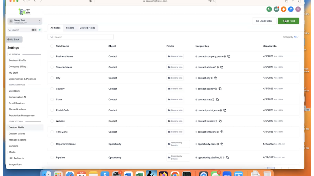
As you can see, you can create almost any type of field, such as dates, times, text etc.
In this example, we are going to choose “Multi-Line.”
You will name your custom field, which is the “Label” of the field on the form. You can also select a default value if you would like for the “Placeholder” field.
In the “Group” field, you will select where you want your custom field to show in the Contact’s profile. I almost always select “Additional Info” so my fields are separated from the default GoHighLevel fields.
Finally, if you expand the “Additional preferences” section, you can see what GoHighLevel is going to name the field within its unique keys. You can add a description of the field here, as well.
For this example, we named the field “Tell Us About Your Case” and selected “Additional Info” for the Group.
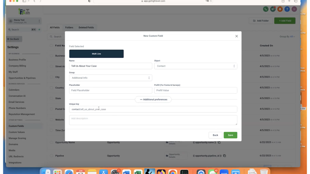
Click Save and your custom GoHighLevel field is live!
Click on “Go Back” to return to the “Form Builder” section and click on your form to open it again.
Now when you look at the available Form Elements, click on the “Custom Fields” tab to see your new field available to add.
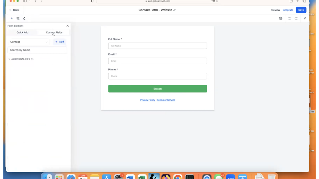
Drag that element onto the form.
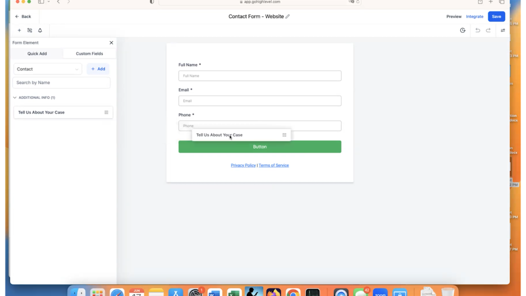
So now we have the full name, the email, the phone number, and tell us about your case.
Do you want to add additional text to the GoHighLevel form?
Maybe add a heading at the top?
Go back to the form elements and scroll to the bottom. This is where the static elements are, like text and images.
For this example, let’s add a title to the form.
Grab the “Text” element and drag it to the top of the form.
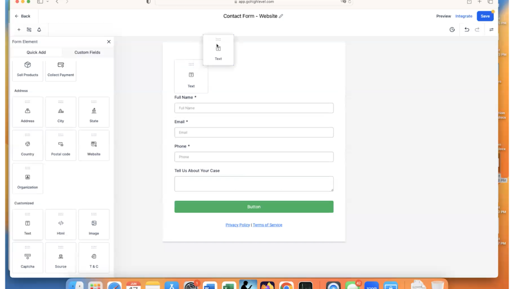
You can add the title text in the settings on the right.
You can also change the font, font weight, color etc. using these settings as well.
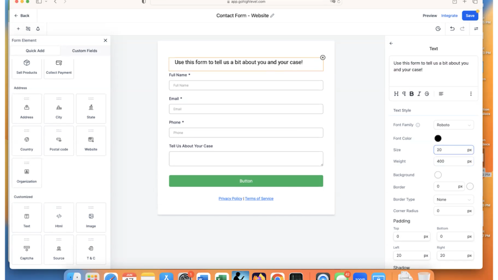
At the bottom of the form, you can see that they by default provide you with a placeholder to put links to your “Privacy Policy” and your “Terms of Service.” You can delete the whole element if you would like to be clicking on that “x” to the right when you hover over the element.
However, because it is a form where people are entering data, for legal reasons, it is a GREAT idea to leave that text there and link to the policies that your website has.
To create that link, make sure that you have the text element selected on the form and highlight the “Privacy Policy” text.
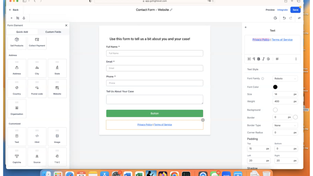
Once it’s highlighted, click on the 3 vertical dots symbol to get more options for the menu and select the symbol for the hyperlink.
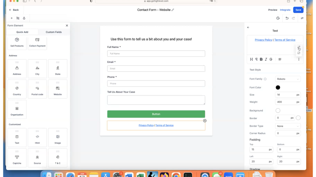
This will trigger a pop-up where you will add the link to your website’s privacy policy and click on “Confirm.”
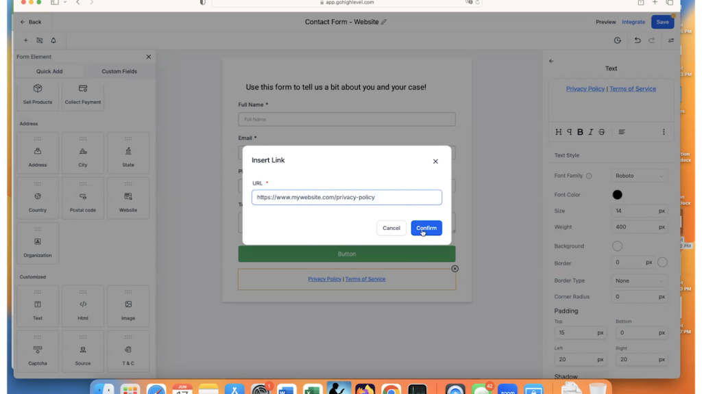
Once you click “Confirm,” you have an active URL.
Repeat this process and add the link to the terms of service. Be sure to click “Save” so all of your hard work is saved!
Now that the form is basically completed, let’s talk about the button, that bright shiny button that you want people to click!
So, you need to click on the button to bring up all of the settings on the right.
First, instead of the word “Button,” change the text to be something that will encourage users to submit their data.
In this example, we are just going to put “Submit Your information.”
In addition, there is an option to add “Sub Text,” which can explain the button’s use a bit more. It’s fairly popular to add a small message about not selling the data that is being submitted, so that is what we will change that text to.
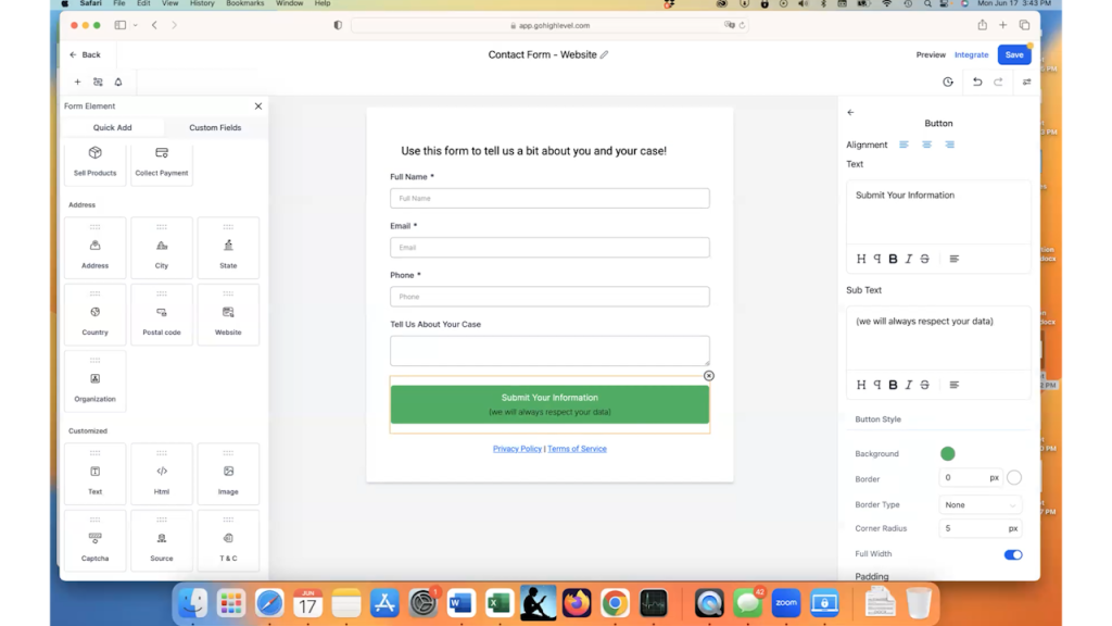
Once you have your text finalized, you will want to change the color of the button and the text so that it goes along with your branding.
Scroll down through the settings and you’ll find the ability to change the background, the text color and the sub text color.
In this example, we are going to change the button to be blue and all of the text to be white.
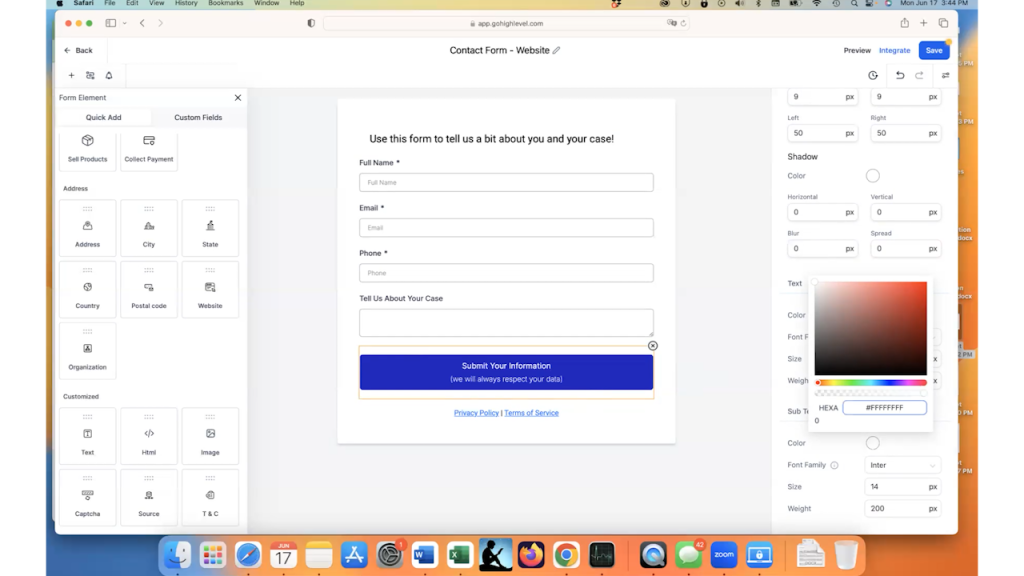
We now have a great looking button that will go within our website. Click Save to finish that part.
Once you have the form fields set up and the button the way you want it, it’s time to complete the general form information to finish the form up.
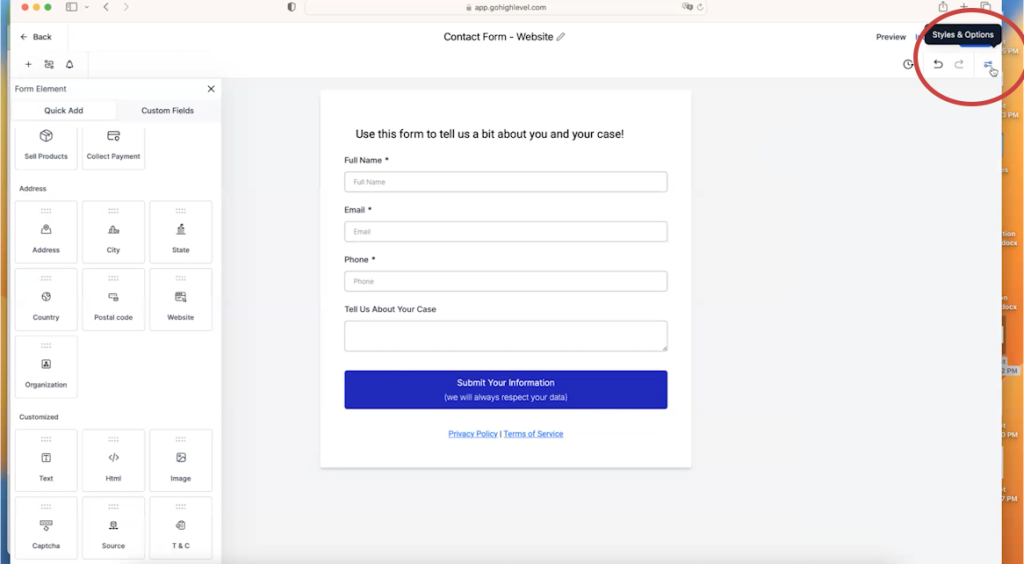
To get to this section called “Styles and Options,” click on the “Styles and Options” icon, which looks like 2 toggles in the upper-right corner of the screen.
If you scroll through everything that is available to you under “Styles,” there are a lot of changes you can make.
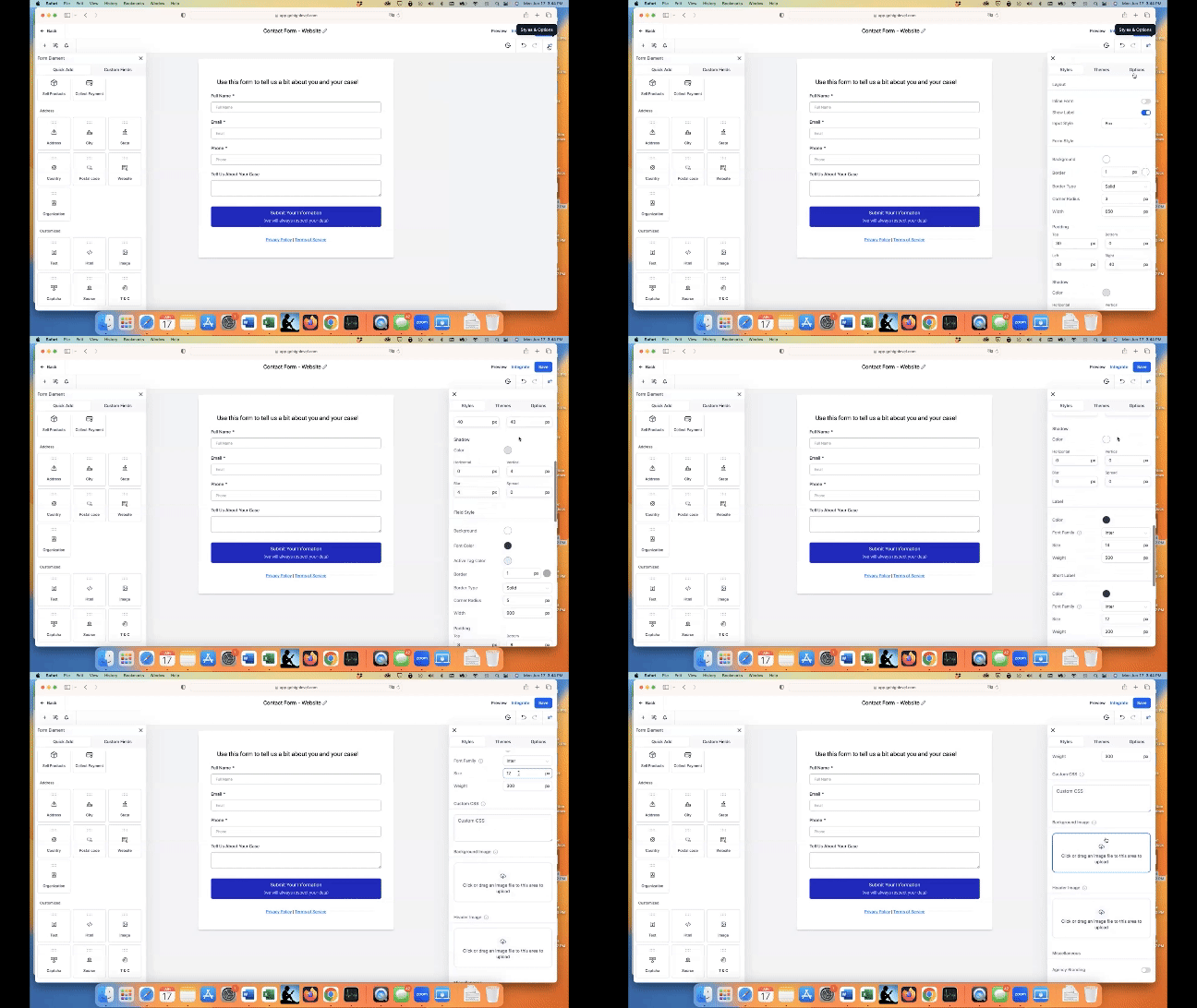
You can toggle agency branding on and off, you add a background image, you can add a header image, you can add custom CSS, etc. Basically, you can change the look of the form to be anything that you want it to be.
These settings are a bit more complicated and will be gone over more thoroughly in an upcoming video. In this example, we are going to leave those alone and go to the “Options” tab.
Whenever a form is submitted, there are two main options (for this example) that can happen. The form can show a message that the form was submitted successfully, or the form can take you to a different URL.
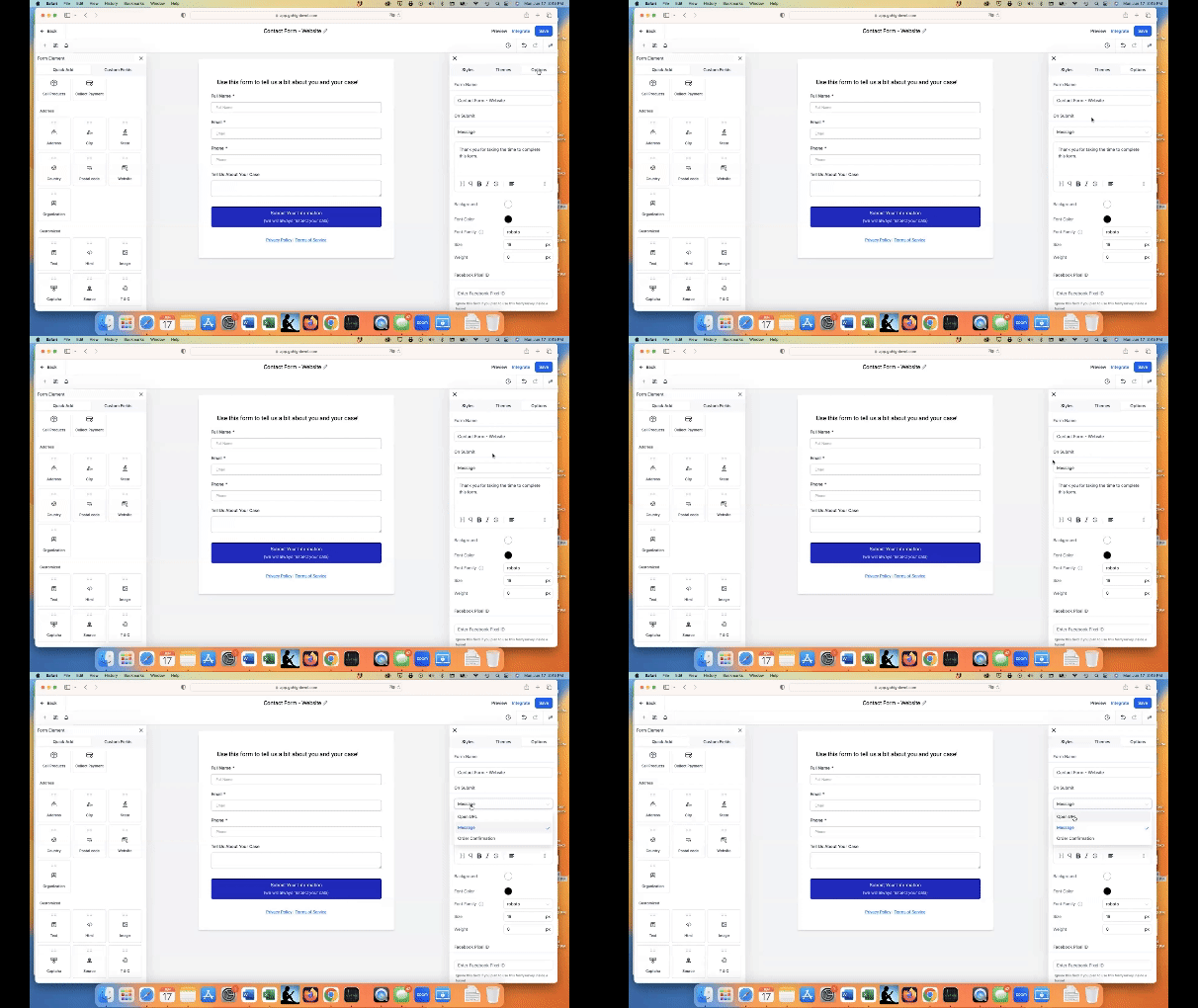
So if you click on “Open URL,” you can actually put a whole new different page on here. A lot of people will choose this option if they are tracking conversions using Google Ads or Facebook Ads.
Since this is a simple example, we are just going to have a success message.
The default success message that the form gives you is “Thank you for taking the time to complete this form.”
This message is fine, but I normally like to add a small bit at the end to customize it to my business tone…so, I added, “We will be in touch as soon as possible.”
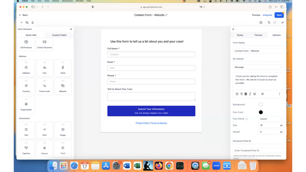
I like to give people a timeline for their submissions. If you want to add a line like this, add a timeline that you are comfortable with. Most service-based businesses will include a message about being in touch within the next 5-15 minutes.
One more thing that is unique to GoHighLevel – “Sticky Contact.”
If you scroll the whole way to the bottom of the “Options” section, you’ll see a toggle for “Sticky Contact” turned off by default. If you turn this on, it will auto-complete the forms for the prospect if they have ever submitted anything else on your website before.
While this speeds up the process a little bit, we generally recommend keeping this turned off for a one-step form to our clients. If there are two steps, two sets of forms to complete, then we recommend turning this on.
For this example, we are leaving it turned off.

Don’t forget to click “Save” when you have completed all of the final steps for the form!
To summarize the entire form, a prospect will fill in their name, email, phone number and hopefully a little bit of information about their case. They will press the submit button and they will see a message thanking them and letting them know that someone will be in touch soon.
Let’s move on to part two, which is adding this form to the website.
Step 2 - How to Add A GoHighLevel Form To A Website
Adding our new form to a GoHighLevel website is fairly straightforward.
In this example, I will be adding the form to the “Contact” page of a sample law firm website.
Go to your GoHighLevel website page that you want to add the form to and click on “Edit.”
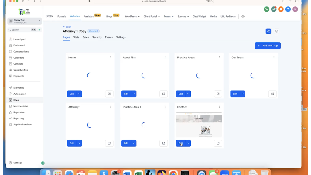
Once we are inside the contact page, you will want to decide where you want to add the form.
Click on “Add Element” where you want the form to be located.
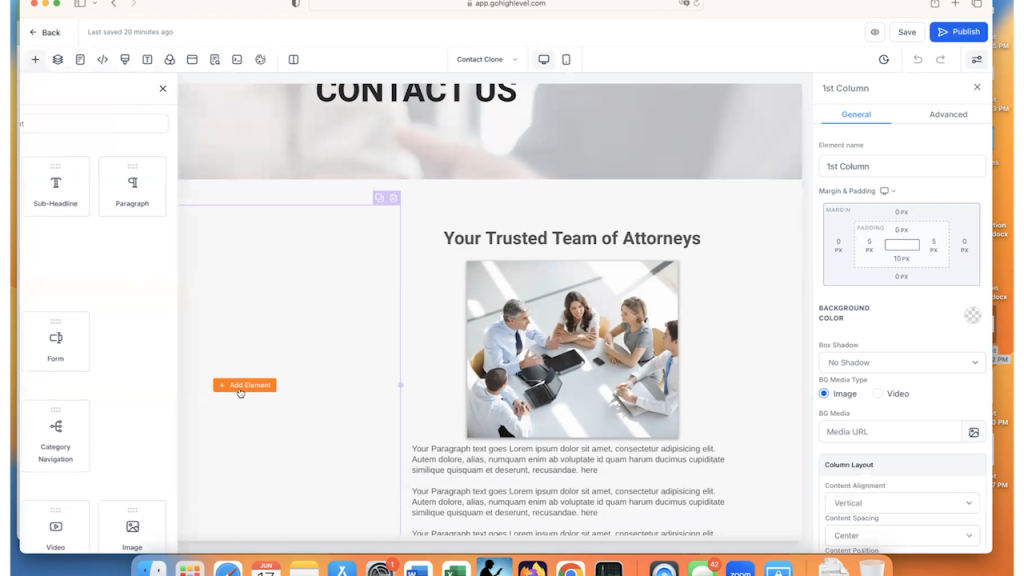
Then, select the “Form” element.
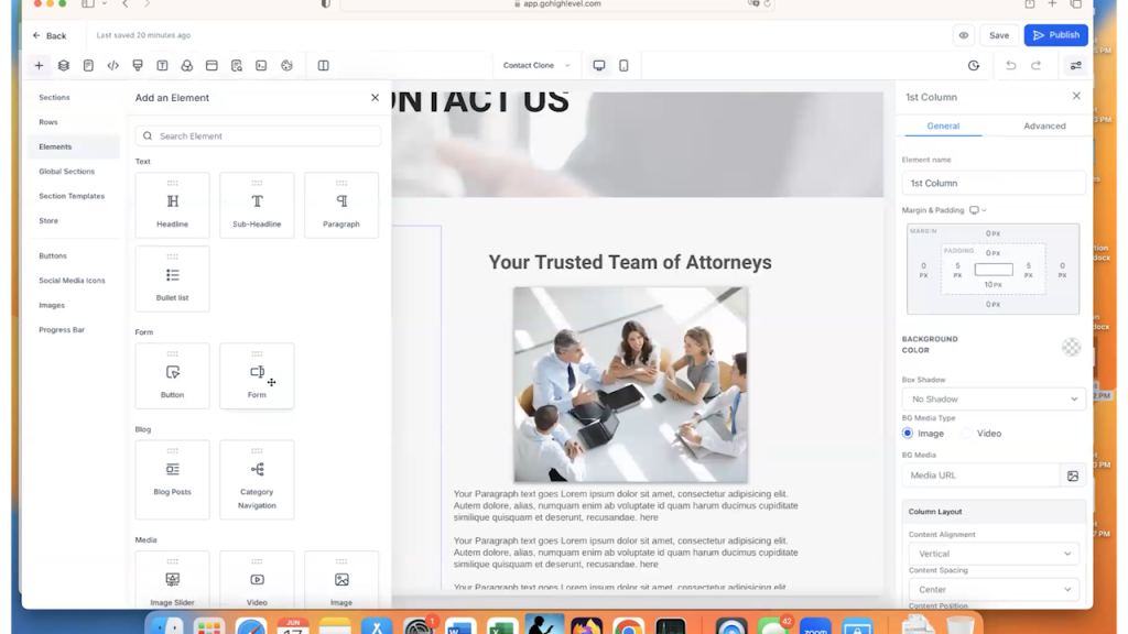
Once you click on the “Form” element, this will bring up a pop-up that has all of your available forms for the website.
Select the form that you just created in Part 1 of this article.
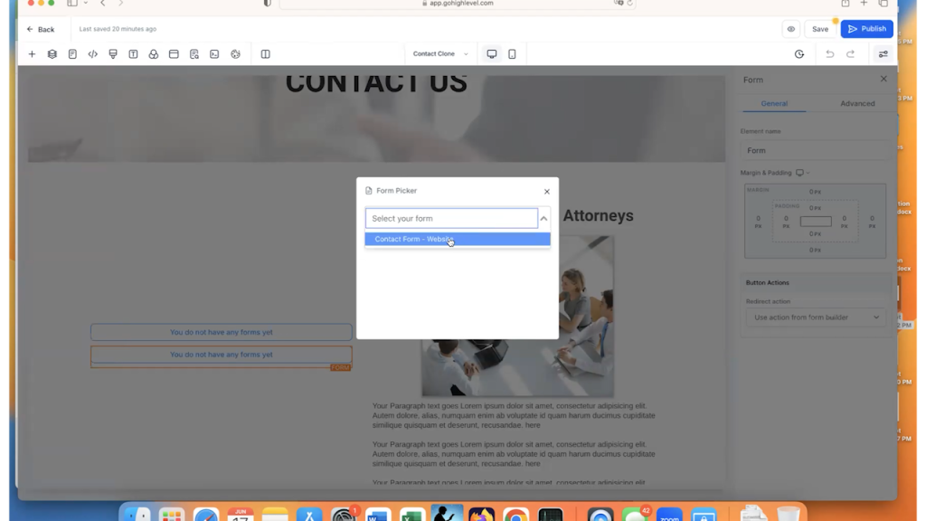
Once the form is selected, the screen will refresh and you should see the form that you created within the webpage.
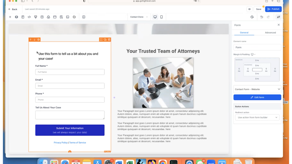
Click “Save” and your form is ready to go for your website.
So, that is a very quick and easy way to add a form to your website using GoHighLevel.
What do you do if you have a website that is NOT in GoHighLevel?
This is fairly easy as well.
Go back to the form that you created in Part 1 and click on the “Integrate button.”
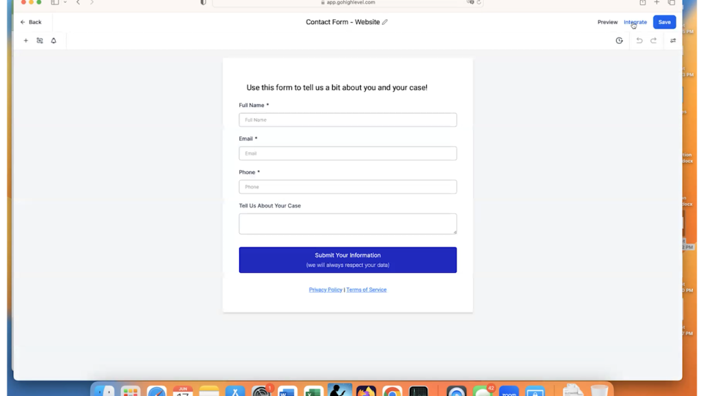
The “Integrate” button gives you a bunch of options for different things that you can do with the form.
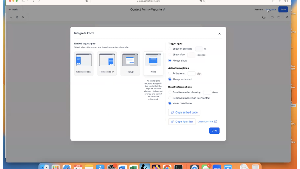
In most cases, people want to embed the form on their website. This means that they are going to choose the “Inline” option, which is the default.
Then, click on the “Copy Embed Code” button.
This button gives you all of the code needed to place your form on any website, no matter what that website is coded in. So, you can use WordPress, Wix, SquareSpace, Drupal etc.
Then, open the website editor where you want the form to be and add an HTML element to it. Once you can add code to the HTML editor, paste the embed code to your editor.
The code will look something like this:
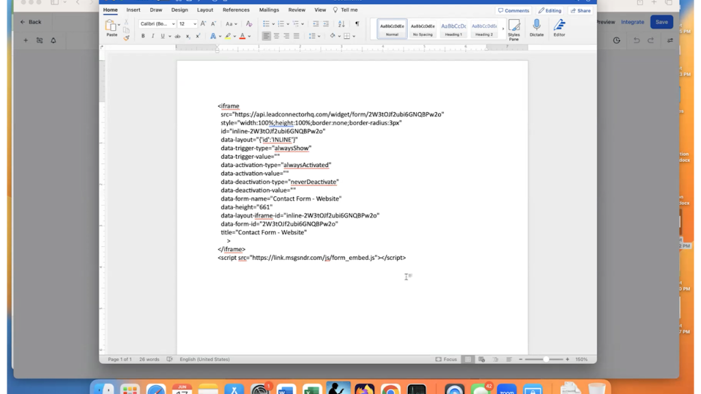
Save the code and you should have a form that looks exactly like the one that you created in GoHighLevel embedded on your website.
Check out Part 2 of this article, which will create the automation set that alerts you to the submission and sends the prospect a set of emails!
Mastering Marketing Terminology: A Guide to Key Concepts for Business Success
Navigating the world of digital marketing can be daunting, especially with the plethora of terms and acronyms that are frequently used.
Whether you’re a seasoned professional or working with an agency in the industry, understanding these key concepts is crucial for optimizing your marketing strategies.
This guide will break down essential marketing terms that you will encounter on our website, in our case studies and throughout our social posts, providing clear definitions and practical examples for working with us or any marketing agency.
ROI (Return on Investment)

Definition: ROI measures the profitability of an investment. It’s calculated by dividing the net profit from an investment by the cost of the investment.
Example: If you spend $1,000 on a marketing campaign and generate $2,000 in sales, your ROI is 100%. This means you’ve doubled your investment.
Retention
Definition: Retention refers to the ability of a company to keep its customers over time.
Example: A subscription service that maintains 95% of its subscribers each month has a high retention rate, indicating customer satisfaction and loyalty. This also indicates that they lose 5% of their subscribers every month.
Churn

Definition: Churn is the rate at which customers stop doing business with a company.
Example: If a company has 100 customers at the start of the month and loses 17 by the end, the churn rate is 17%.
High churn rates suggest there are issues that need to be addressed to improve customer satisfaction.
Conversions
Definition: A conversion occurs when a user completes a desired action, such as making a purchase or filling out a form. You frequently have to define conversions for Google Ads and Google Analytics.
Example: If an e-commerce site gets 600 visitors and 30 of them make a purchase, the conversion rate is 5%.
Call To Action (CTA)

Definition: A CTA is a prompt on a website or ad that encourages the user to take a specific action. It should be simple, direct and easy to understand. It should also be something that stands out, like a brightly colored button.
Example: “Get a Free Quote” or “Sign Up Now” are common CTAs that guide users toward a desired action, such as filling out a form or making a purchase.
Landing Page
Definition: A landing page is a standalone web page created specifically for a marketing or advertising campaign. This is the page that you send ads to, not the home page. Everything on this page has one purpose – get the site visitor to buy your product or service.
Example: A page designed solely to promote a special discount on a product, with a clear CTA to “Buy Now,” serves as a good landing page .
SEO (Search Engine Optimization)
Definition: SEO is the practice of optimizing a website to rank higher in search engine results organically.
Example: Using relevant keywords, creating quality content, and obtaining backlinks are strategies to improve SEO and drive more organic traffic to your website.
Backlink
Definition: A backlink is a link from one website to another, which is important for SEO. For a more in-depth look at backlinks, check out this article from IFTS.
Example: If a popular blog in your space links to your business website, that backlink can improve your site’s authority and search engine ranking.
Citation
Definition: In SEO, a citation is a mention of your business’s name, address, and phone number (NAP) on other websites.
Example: Listings on directories like Yelp or Yellow Pages include citations that can help boost your local SEO by making your business more discoverable in search engines.
NAP (Name, Address, Phone Number)
Definition: NAP consistency refers to having the same business name, address, and phone number across all online platforms. Tools like Yext can help you maintain this easily.
Example: Ensuring your business’s NAP information is identical on your website, social media profiles, and directory listings helps improve local SEO.
Bounce Rate
Definition: The bounce rate is the percentage of visitors who leave a website after viewing only one page.
Example: If 1,000 people visit your website and 500 leave after only viewing the homepage, the bounce rate is 50%.
A high bounce rate may indicate that visitors aren’t finding what they’re looking for on your website.
SEM (Search Engine Marketing)

Definition: SEM involves using paid advertising to increase a website’s visibility on search engines.
Example: Running a Google Ads campaign or a Google Local Services Ad to appear at the top of search results when users search for “best local coffee shop” is an example of SEM.
PPC (Pay Per Click)
Definition: PPC is an advertising model where advertisers pay a fee each time one of their ads is clicked. This is most typically used when referring to a Google Ads campaign.
Example: A business runs a Google Ads campaign and pays $0.55 for each click. If their ad gets 1,000 clicks, they spend $550 in total on the PPC campaign.
Target Audience

Definition: The target audience is the specific group of people most likely to be interested in your product or service. You will want to think about age, location, psychographics, etc when defining your target audience
Example: For an Orlando-based wedding photography business, the target audience would be engaged couples planning their weddings in the Orlando area.
Understanding these fundamental marketing terms will empower you to make informed decisions and effectively communicate your needs and goals.
For more detailed explanations and examples, feel free to reach out to our team or explore our other resources.
Get the Top 3 Social Media Post Templates for Painting Companies to Grow Your Following and Get New Clients
Engage with prospects and save time with your FREE Canva template kit. This kit features the top 3 social media posts for painting companies and directions on how to brand them for your own business in 5 minutes or less.

Enter your email below and get the templates sent directly to your inbox along with an instructional video on how to make personalized edits.

