Posting organic content in today’s world is crucial for social media success. Keeping up with posting daily to your social media sites can be very time consuming – and you don’t want to be spending all of your valuable time creating content that your social media followers might not even see or want to read. This is especially crucial if you, as the painting business owner, are creating this content.
In order to simplify the social media process, we have put together this easy to follow social media post ideas list. These top post ideas will help you stay relevant and engaging on social media while saving you time.
Before you start posting though, you need to get to know your audience!
Discover Your Audience In Depth
Knowing who your audience is will make creating content for your social media THAT much easier!
You’ll want to know your audience’s
- likes and dislikes
- interests
- pain points
- biggest questions
- age
If you are trying to figure out who your target audience is, check out this blog post on how to define your target audience where we walk you through a few steps that will help you identify who is already engaging with your company (and your competitors) and how to utilize that information to establish a clear target group.
To get you started, most painting businesses have an active audience that mainly consists of women 35-65 that live within 20 miles of your location. They are normally the primary decision makers in a household. Also, the household income is in the top 40% in the area.
Now, the age may skew younger or older depending on your location, but this is a good jumping off point.
Top 18 Social Media Post Ideas
When creating your social content, you want to focus on creating a system where you can efficiently produce content.
With social media marketing, there are some concepts you can use to make your social content engaging and unique for consumers. This will, in turn, will improve your brand and get you more customers!
The following social media post ideas will help you quickly make effective social posts. The key to the posts we are going to discuss is that while you are keeping your audience interested, you can get to know your audience better without having to directly ask them anything. It’s like a bit of Jedi magic!
You will gain insight into what your followers like and this will allow you to further develop content ideas that will be relevant to your audience.
Most importantly, you can use these ideas to help you save time when planning social media content.
So, with that in mind, let’s get started.
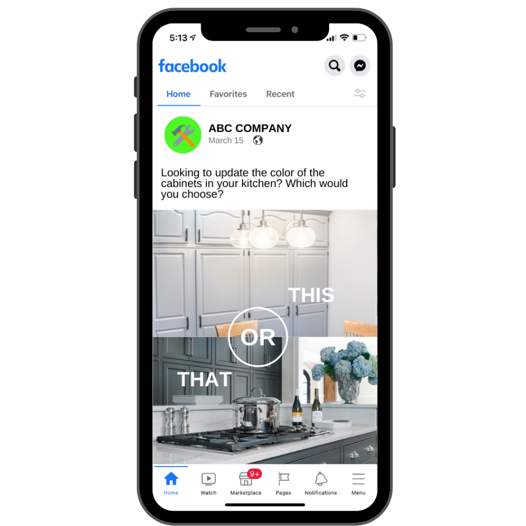
1. This or that
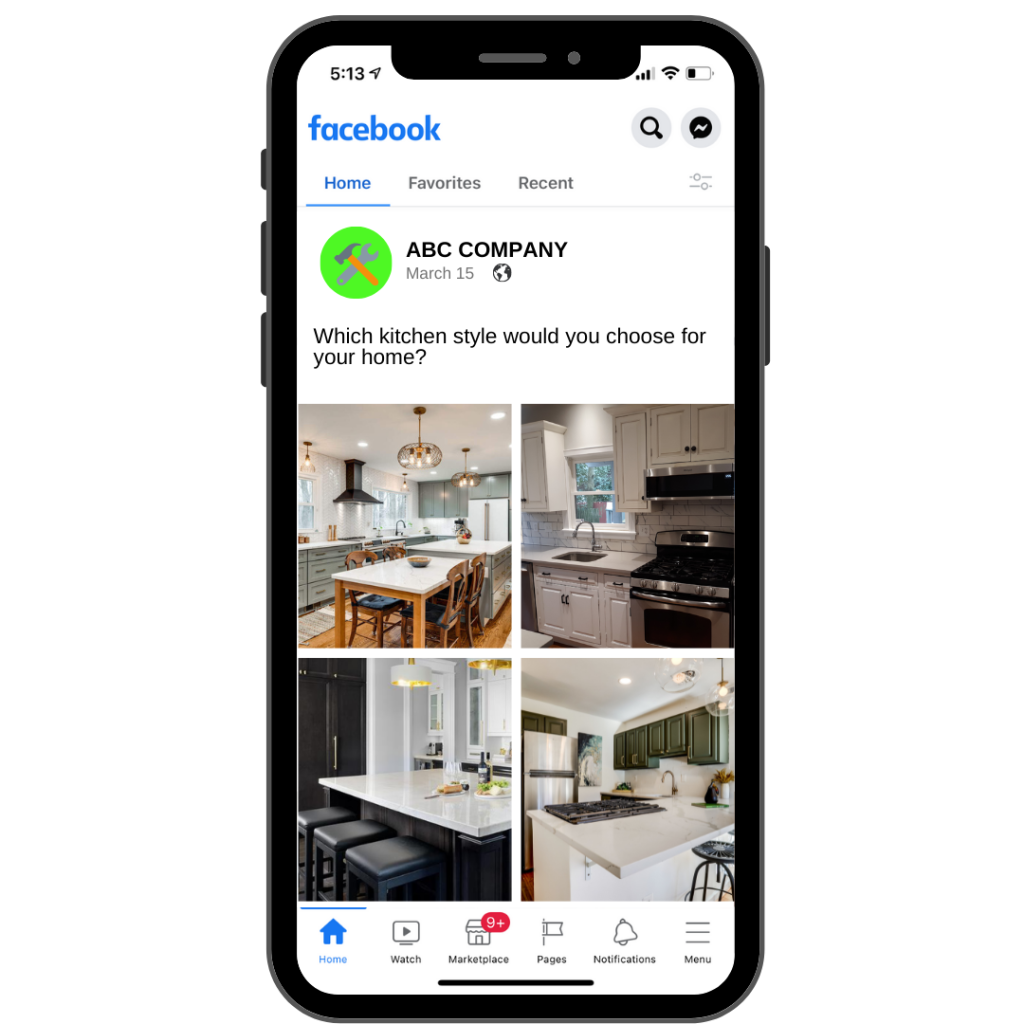
As a painting business, you can ask people what cabinet color they prefer in a kitchen. This dark set or that bright white set.
There are a number of things that you can compare using the “this or that” post option.
2. A, B, C or D
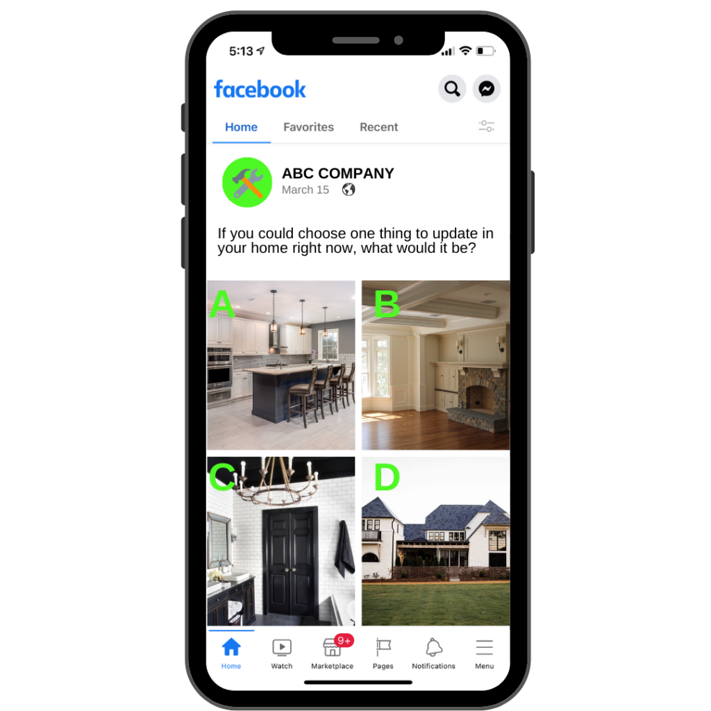
This type of post is similar to “this or that” but instead, you are giving them four different options to choose from. You could post a question such as “If you could choose one thing to update in your home right now, what would it be?”
With this question, post four images such as a new kitchen, interior painting, exterior painting and bathroom remodeling and have them share their feedback. This can help you figure out ads to run and pain points to touch upon in upcoming posts.
3. Customer Review
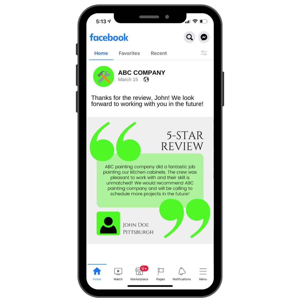
Customer reviews are one of the most impactful posts you can put out there, yet you rarely see it being done by most businesses. This type of post allows you to toot your own horn a bit while letting others know that your previous clients have been absolutely satisfied with your services.
You can showcase reviews that have been left for your company on Facebook, Google, etc., videos that customers have shot on their cellphones, or even emails or text messages that you have received about your work.Does your business not receive many reviews? Here are 10 proven ways to get more online reviews for your business!
4. Story Time
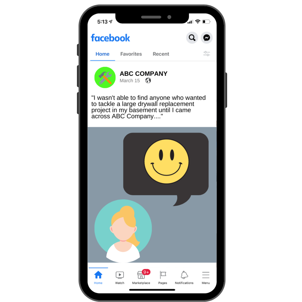
There is nothing more engaging to the human race than storytelling. It goes back to the time of cavemen. So, why not use this to help liven up your social media?
This could be a story about you and how you started your business. It could be a story about one of your clients and their story of how you have made something in their life better through your services. It could even be a story that discusses why a client chose you over someone else to tackle their home project.
The story post allows you to connect with your audience on another level while establishing yourself as a personable brand. It’s a very humanizing post type.
5. Showcasing Styles
If you offer a wide range of choices in your work, let them know! Show off various styles and options within the services you provide. If you are a home remodeling company, show off a few different kitchen styles and ask your audience which they would pick for their own home.
Showcase your abilities to your audience will help them understand exactly what your company is about and the kind of work you do.
6. Transparency
When creating this type of post, you’ll be taking something that isn’t typically discussed in your industry, and share it with your social media audience. You’ll need to make it very clear for the customer to see, such as how your business operates or how you estimate work with integrity. Offer them a deep dive into your processes.
Transparency posts are engaging because they help you build a relationship with your audience. Discuss topics on which your followers are desperate to learn more about.

7. Business Details
If you are a painting company, including business details such as the process of making an estimate or how long it typically takes to complete a project can attract social media followers who are in need of your services. This is a topic that not many companies speak openly about.
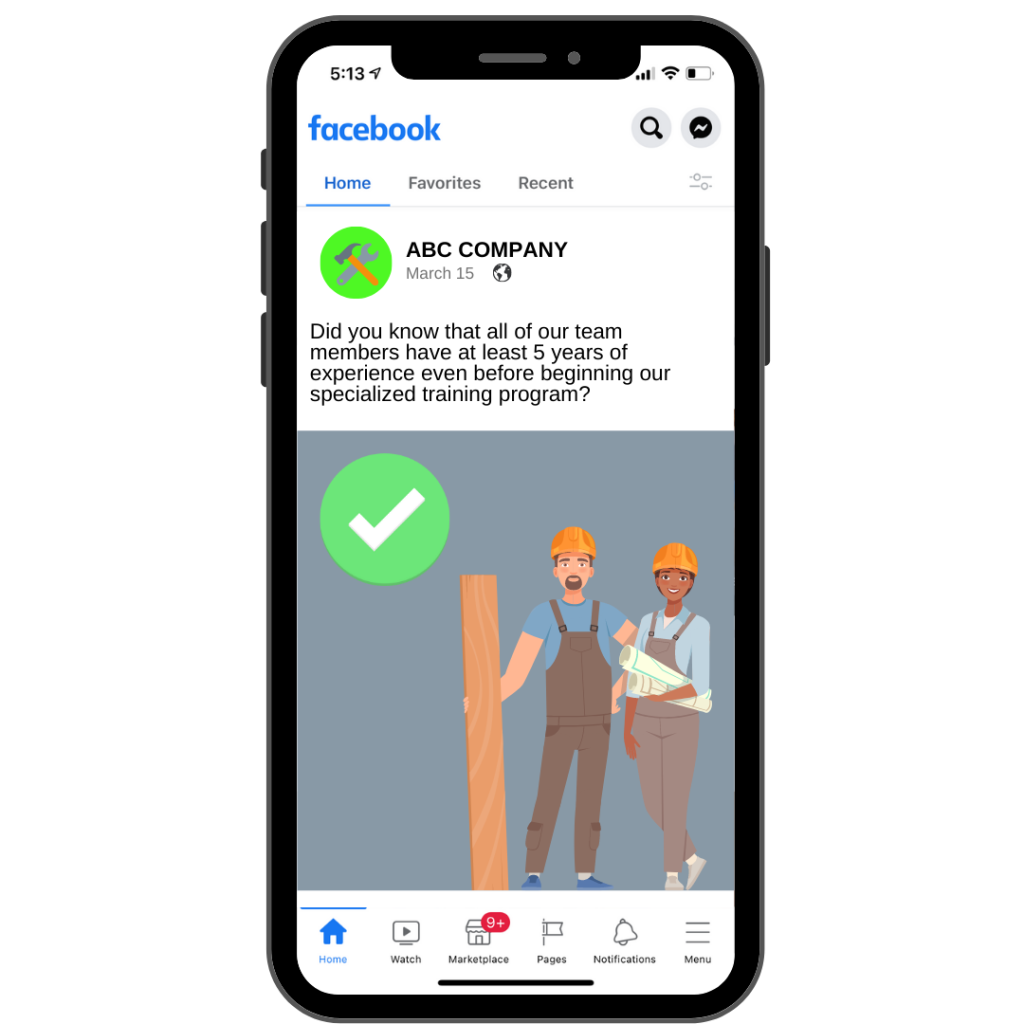
You could also share the training process for your employees and how you only hire experienced professionals. Your followers will be glad to know that there won’t be just any average joe painting their home.
This type of post gives you an opportunity to showcase your professionalism.
8. Customer Spotlight
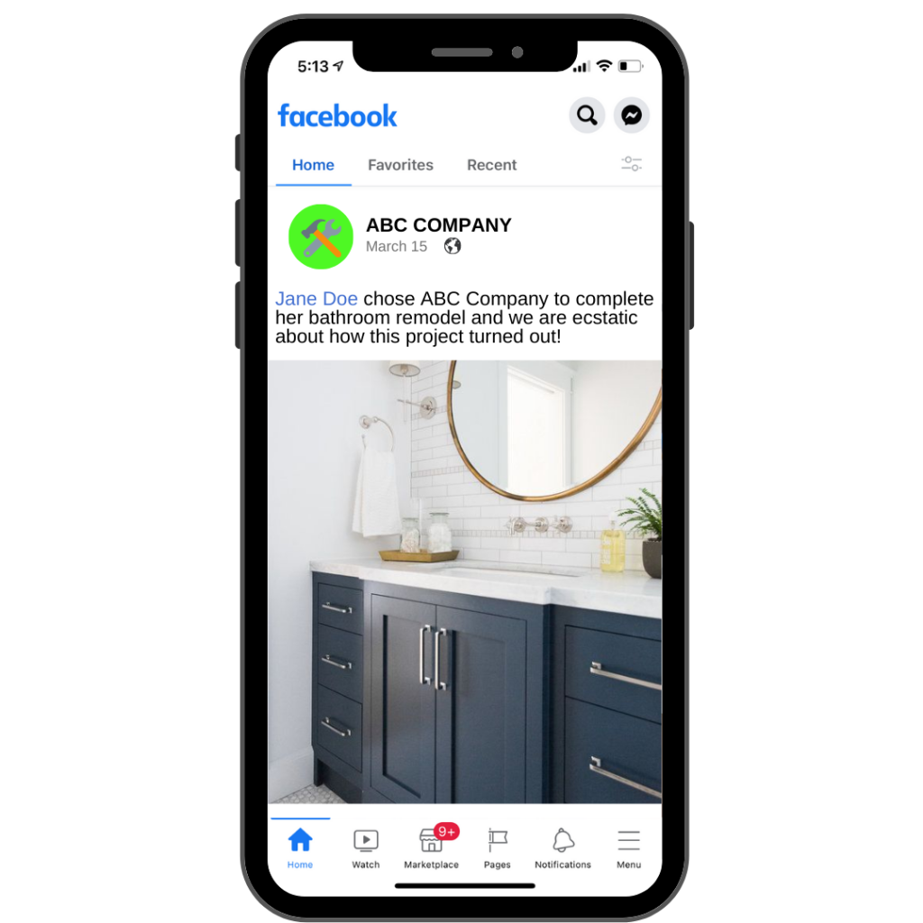
This post can be focused on one of your customers and the project that you helped them with. Shining the light on a customer will make them feel great, and more likely to share your social media post with other potential customers. This is a great way to get your business in front of new eyes. In fact, try to tag the customer that you are highlighting if possible.
This also shows how much you care about your clients and helps them to feel more connected with your company.
9. Quick Tips
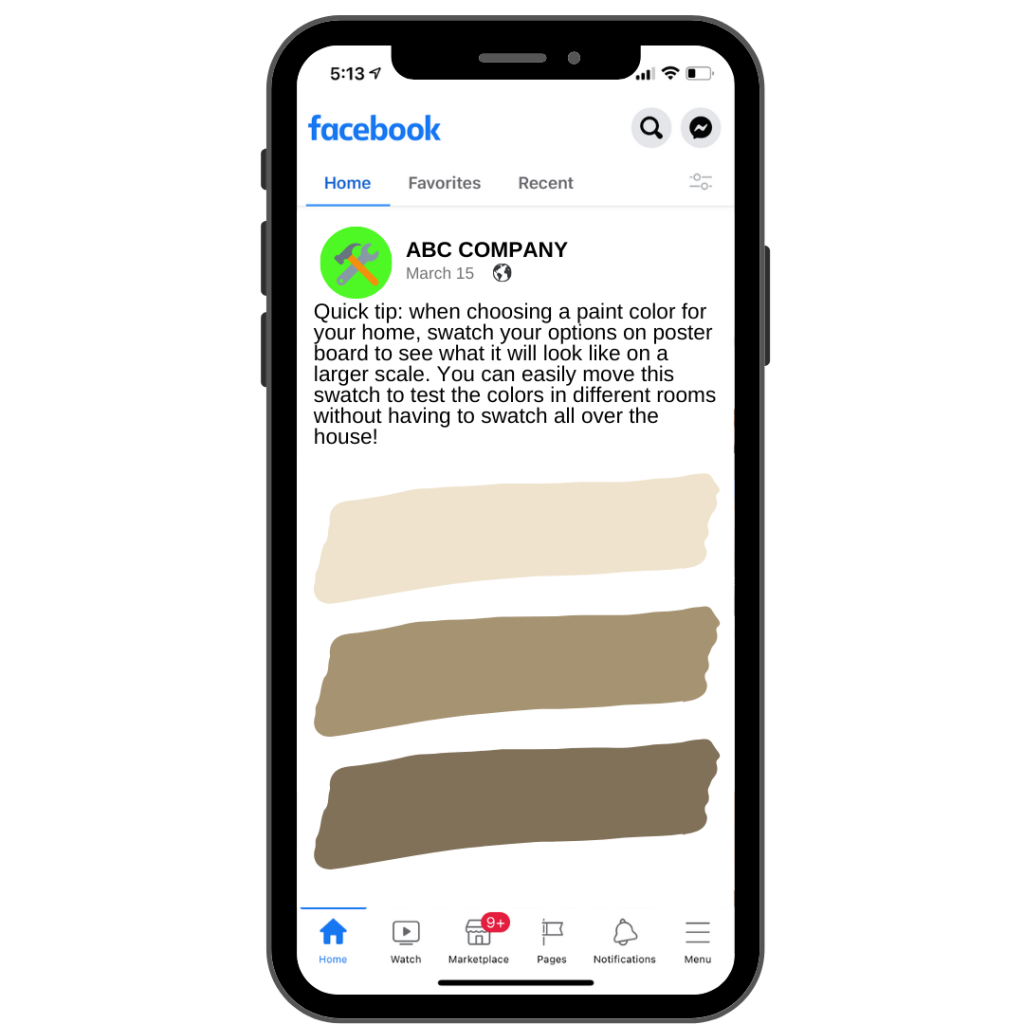
Quick tips are social media posts that showcase a helpful tip or trick for something relevant to your industry. These can be beneficial as they will provide your audience with the knowledge they need to take advantage of a daily situation.
With someone who has as much experience and knowledge in your industry as you do, start sharing some helpful tips! If these valuable tips will help somebody, they are going to think of you every time they use it.
10. Frequently Asked Questions (FAQs)
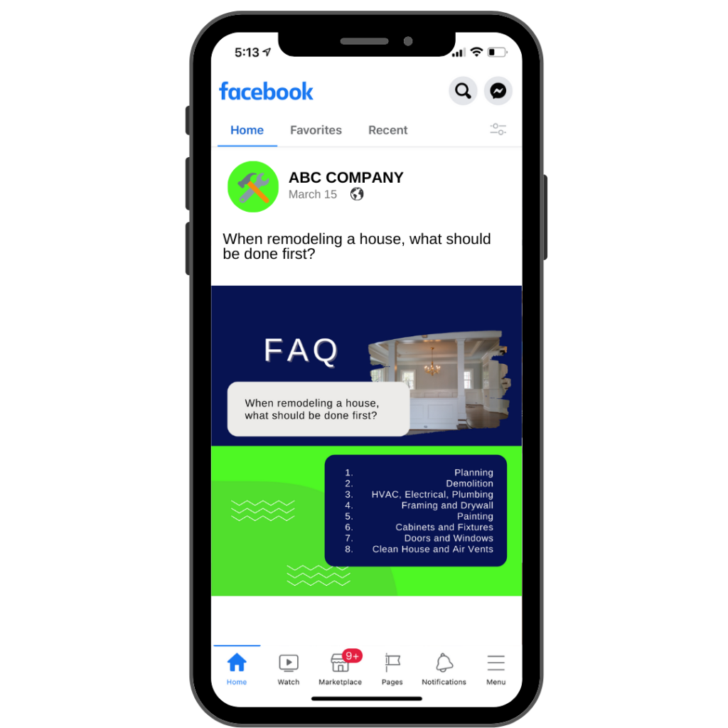
FAQ social media posts are great because they answer the questions you get asked most often! This is perfect for businesses that have social media accounts that get a lot of comments or messages. Instead of replying to each message, share it with your social media audience so everyone can get the answers to their questions without having to ask them.
[Bonus Tip – If a question is really popular, be sure to add it to your website as well to help with your SEO]
Ask your question in the opening line of the content with the answer written out below. This is how you turn frequently asked questions into questions that are no longer asked, saving you time in the long run. These work really well as videos too.
11. Before and After
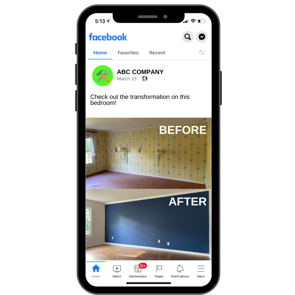
As a home services business, before and after posts are a must! Showing your social media audience the before and after of a project will help them to understand how your services make a difference!
If possible, be sure to use a picture taken from the same angle with similar lighting. Try to use images that have stark contrast, such as going from light paint to dark paint or vice versa.
12. Feature Your Employees
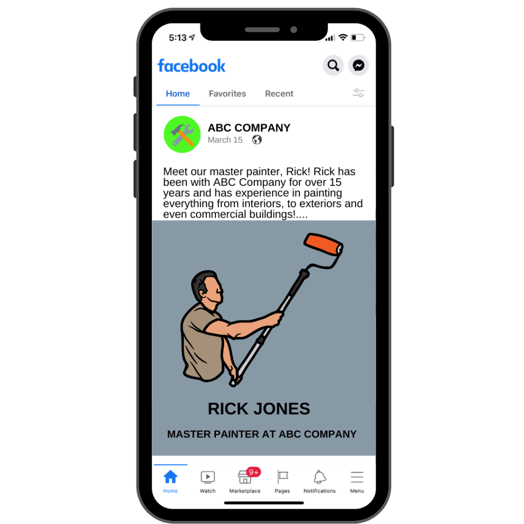
We can guarantee your employees will love the fact that you take the time to showcase them, what they do for you, and how much of an asset they are to your company. When you share social media posts that include the team members, it helps to provide a friendly face behind your business and that will make your audience feel more connected!
People want to do business with people.
13. Comparison
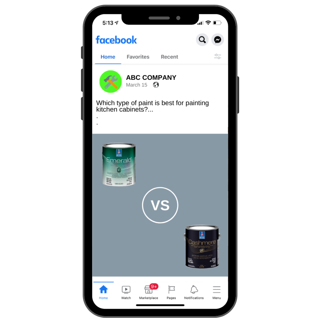
The comparison post can relate to anything within your industry and it simply compares one thing to another. This could be comparing different brands of paint and how they are used, types of flooring, the quality of one painting process vs. another etc.
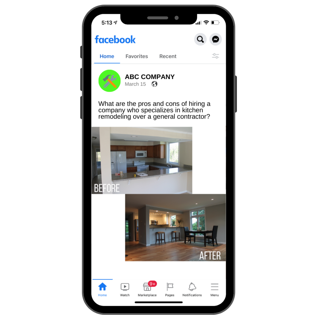
14. Pros and Cons
Anything that relates to your business can be a comparison with benefits and drawbacks. This can be in relation to your industry, your competitors, or things that your customers are doing.
What are the pros and cons of hiring a company who specializes in kitchen remodeling over a general contractor? What about one coat of paint vs two?
Be sure to highlight the situations where your business comes out on top!
15. Customer Generated Content
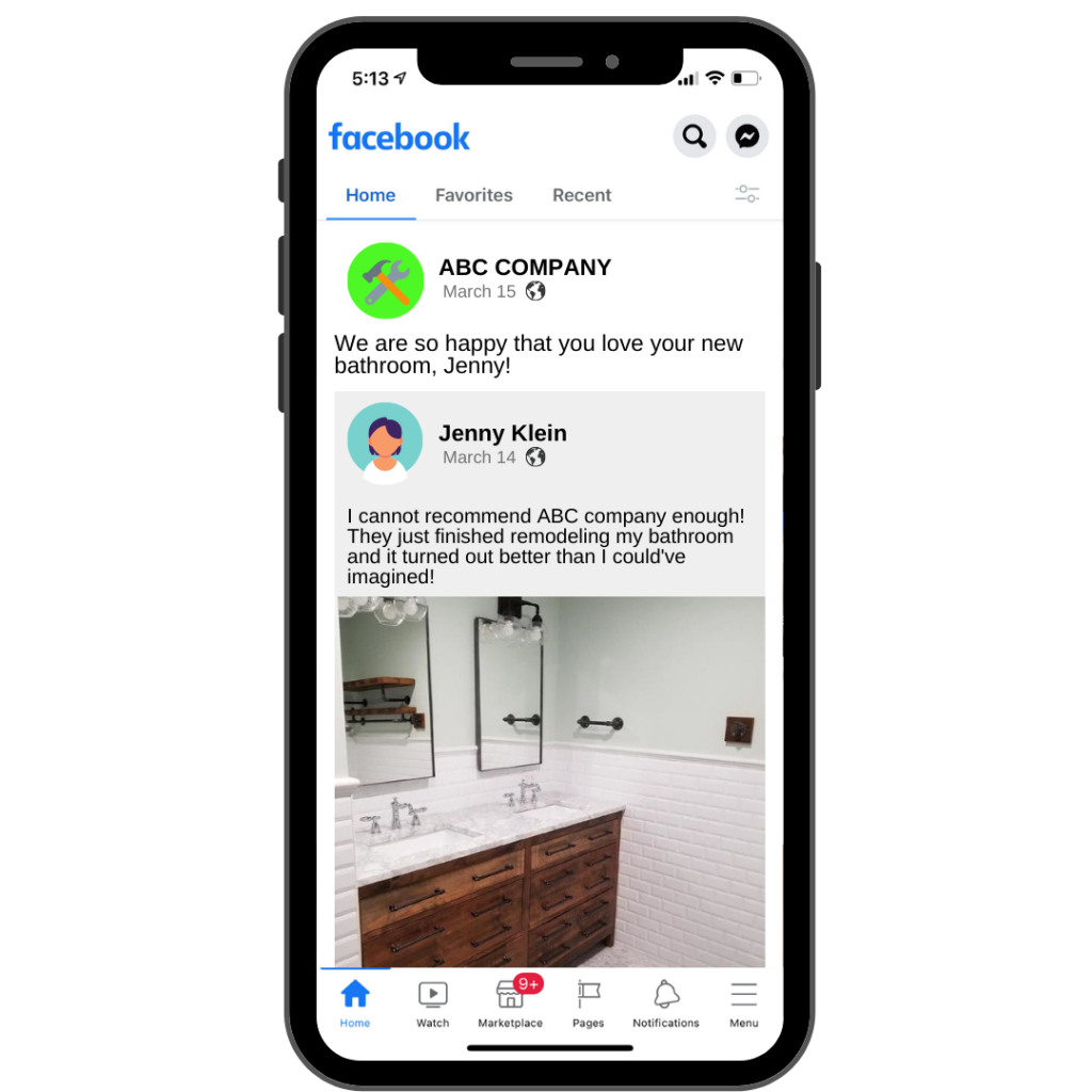
This is a piece of content that was created by someone who has used your services. This could be a photo of them in their new kitchen or a testimonial that they may have written about your business on their personal profile. Anything that is published by one of your customers is customer generated content.
When customers see you sharing their posts about your business, this encourages others to do the same!
16. Talk About Trends
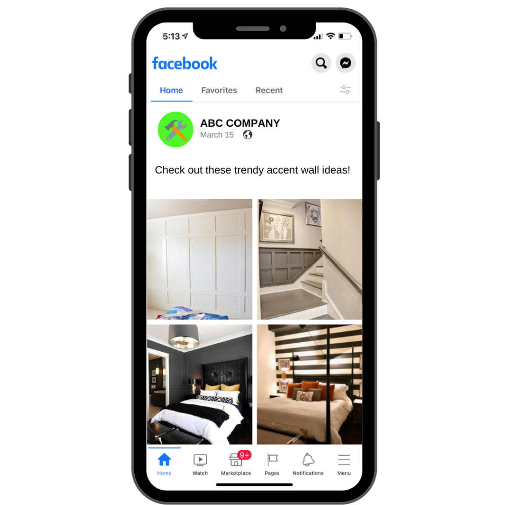
There are trends that are relevant in every industry, which is why social media users are so engaged with content that discusses them. Trends can be anything from popular paint colors to tile and flooring patterns and accent walls.
If you have your finger on the social media pulse, share some of these trends with your audience and provide some insight about them. They may just see something that catches their eye! This also sets you apart as an expert in your area.
17. Long Form Content
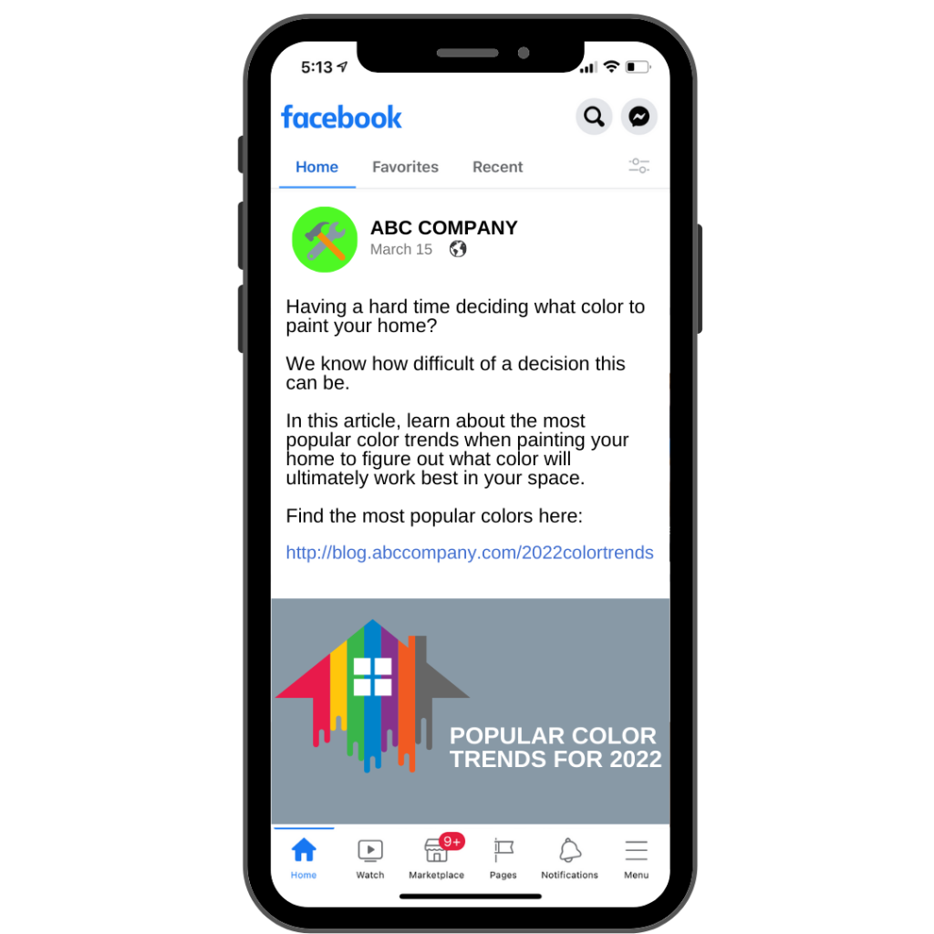
You want to make sure that you are also posting long form content here and there. This consists of longer videos and blog posts that allow you to really share your message. Longer form content can be used when you want to explain something that is beneficial for your social media audience and internet browsers alike!
Some popular long form content topics that we have seen work for painters are as follows:
- Popular color trends for the year
- Tips for painting children’s rooms
- One coat vs two coat
- Warranty explanation
- Pros and cons of certain paints or paint brands
18. Community Related Posts
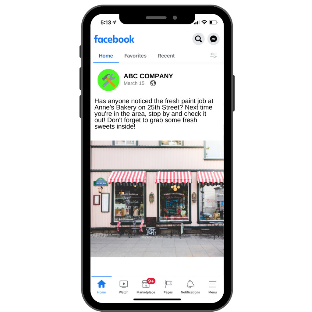
If you are a local business, you should absolutely be talking about community-related activities. For example, you can talk about projects that your business has completed around the community. So, when people see that your company has done work on a common spot around town, they are going to think of you every time they see it!
You should also post about any charity work that your business has done.
Want To Know More?
This is just the start when it comes to creating engaging content that helps get you more clients!
If you need help creating social media content for your business or if you would like it done for you, contact IFTS today at 412-715-6266 to discuss a social media plan that is a good fit for you and your business.
Get the Top 3 Social Media Post Templates for Painting Companies to Grow Your Following and Get New Clients
Engage with prospects and save time with your FREE Canva template kit. This kit features the top 3 social media posts for painting companies and directions on how to brand them for your own business in 5 minutes or less.

Enter your email below and get the templates sent directly to your inbox along with an instructional video on how to make personalized edits.


