fbpx

10 Common Small Business Website Mistakes You Might Be Making in 2024 – Part 1

For small business owners, your website is more than just a digital storefront—it’s the very first handshake with future customers. Ensuring this vital first impression is not only visually appealing but also user-friendly is paramount to your success. 

However, it’s all too easy to fall into pitfalls that could send your visitors running before they’ve even had the chance to browse. 

Let’s explore our first 5 tips on how to keep your digital welcome mat inviting and free from the usual slip-ups that can deter potential business.

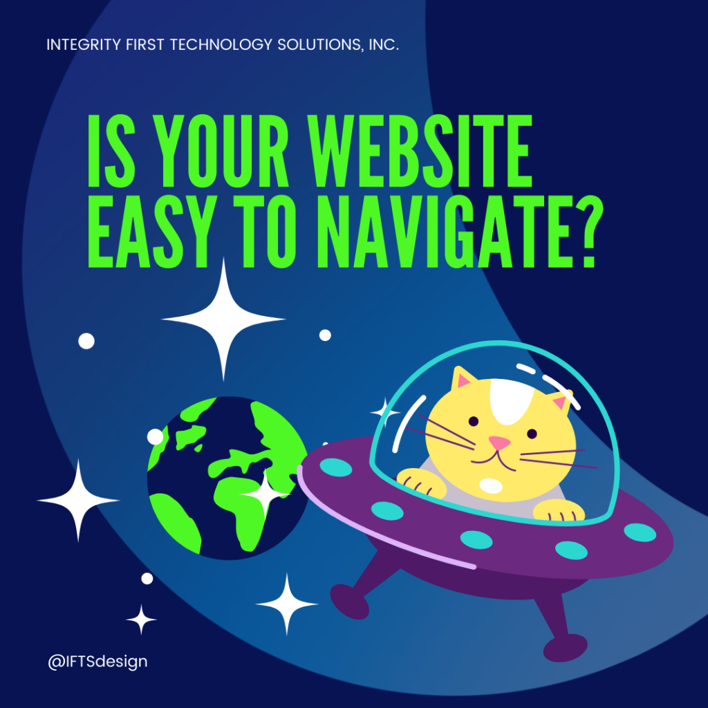
Mistake 1 - Not Having Clear Navigation

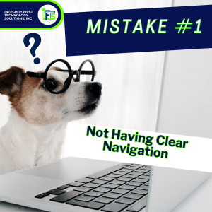
Imagine walking into a vast store with no signs, unclear sections, and a maze-like layout. 

Frustration would likely guide your steps out of the door rather than towards a purchase. This is precisely the effect a website with poor navigation has on your potential customers. Your digital presence needs to be as welcoming and as easy to navigate as a well-organized physical store.

Clear, intuitive navigation ensures that visitors can effortlessly find the information they’re seeking without guesswork or backtracking. This involves having a straightforward menu, logical flow from one page to another, and well-defined sections. 

Consider incorporating breadcrumbs on your pages so users can easily trace their steps back without hitting the dreaded “back” button too many times.

Additionally, a search function becomes invaluable for sites with a lot of content, allowing users to bypass navigation to directly find specific information. Remember, the goal is to reduce the effort required by your visitors to get from point A (arrival) to point B (the information, service or product they’re interested in). 

Making this journey as smooth as possible not only enhances user experience but also significantly increases the likelihood of conversion, be it a sale, a sign-up, or an inquiry.

Mistake 2: The Pop-Up Predicament - Striking the Right Balance

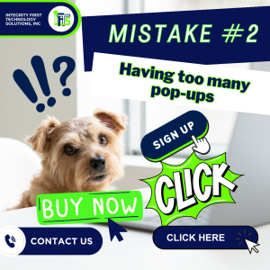
While pop-ups have earned their stripes in the digital marketing world for their ability to capture attention and convert leads, there’s a fine line between being effectively persuasive and annoyingly invasive. 

Overloading your site with pop-ups is akin to a salesperson following your every step in a store, bombarding you with offers before you’ve even had a chance to look around. This overwhelming approach can ruin the user experience, prompting visitors to leave your site.

Pop-ups should be used sparingly and strategically. 

They are most effective when they offer genuine value to the visitor.  Examples of this can include: 

  • exclusive discounts
  • sign-up bonuses
  • timely alerts about promotions

The key is relevance and timing. 

For instance, exit-intent pop-ups, which appear when a user is about to leave your site, can be a last-ditch effort to engage them without disrupting their browsing experience from the get-go.

Moreover, it’s critical to ensure that your pop-ups are mobile-friendly. A pop-up that covers the entire screen on a mobile device, with a tiny, elusive “close” button, is always frustrating to your visitors. Always test your pop-ups across different devices and browsers to ensure they enhance, rather than hinder, the user experience.

By treating your visitors’ attention with respect and using pop-ups judiciously, you can maintain a positive user experience while still leveraging the conversion-boosting power of pop-ups.

Remember, the goal is to make visitors feel welcomed and valued, not overwhelmed.

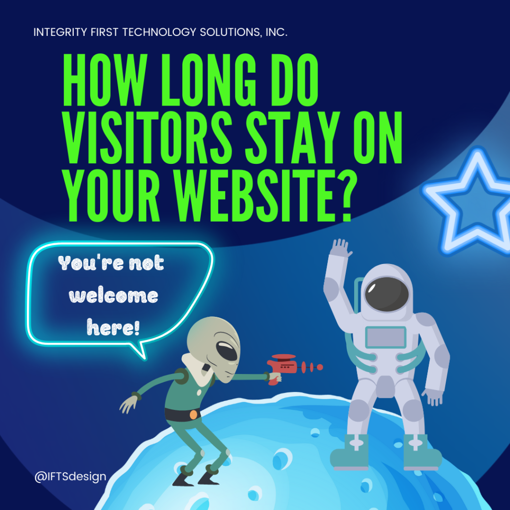
Mistake 3: The Need for Speed - Why Website Load Time Matters

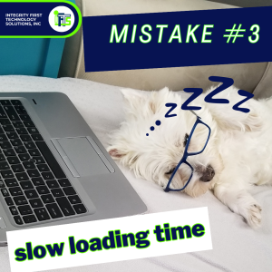
In the fast-paced digital age, time is of the essence, and patience is a dwindling commodity. Your website’s loading speed isn’t just a technical metric; it’s the first impression you make on a visitor. A slow website is like a sluggish greeting at the door, likely to turn guests away before they’ve even had a chance to explore. 

Research shows that visitors expect websites to load in two seconds or less, and with every additional second, the likelihood of them bouncing skyrockets.

A sluggish website doesn’t just frustrate potential customers; it also sends a negative signal to search engines, affecting your site’s search ranking and visibility. This can affect both your traffic and conversion rates, lowering them drastically.

Some easy ways to optimize your website’s speed includes: 

  • compressing images
  • leveraging browser caching
  • minimizing the use of redirect links
  • choosing a reliable hosting service

It’s also wise to regularly test your website’s speed using tools like Google’s PageSpeed Insights to identify and rectify any issues that could be slowing it down.

Remember, your website’s speed reflects your brand’s efficiency and commitment to providing a positive user experience. By ensuring your site loads swiftly, you’re not just keeping your visitors happy; you’re also boosting your chances of ranking higher in search results, leading to more visibility and, ultimately, CUSTOMERS.

Mistake 4: Underestimating the Power of Responsive Design

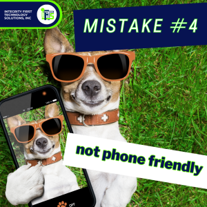
Imagine you’re trying to visit a website on your phone, but everything looks weird or you can’t click on things properly. That’s because the website wasn’t made to work well on phones or tablets, just on bigger computer screens. This mistake is like forgetting to invite half of your friends to your birthday party – you miss out on having them there!

Nowadays, almost everyone uses their phones to go online, so if your website only works on computers, you’re missing out big time. It’s like showing up to a scooter race with a bicycle – you’re just not prepared. About 9 out of 10 websites now make sure they look good on both phones and computers. If yours doesn’t, it’s time to catch up.

Why does this matter so much? 

Well, websites that work well on any device, like phones or tablets, are more likely to make visitors happy. Happy visitors are more likely to do what the website wants, like buy something or sign up for more information. In fact, when websites are easy to use on phones, businesses usually sell more.

A lot of people use their phones to browse the internet. In fact, more than half of the time people spend online is on their phones. But, a lot of people also say they’ve been to websites that were hard to use on their phone. That’s a big no-no because it can make visitors feel like the business doesn’t care about them.

Also, if your website isn’t easy to use on a phone, a lot of people might decide not to come back. Think about it – if you find a cool site that’s hard to use on your phone, you might just go find another site that’s easier to handle.

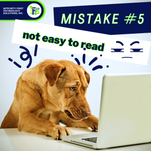
Mistake 5: Talking Like a Textbook Instead of a Friend

Ever talked to someone who sounds like they swallowed a dictionary? 

Not fun, right? 

The same goes for websites. When you’re trying to share what you do or sell, using a bunch of fancy words might seem smart, but it can actually push people away. 

Imagine you’re looking for a lawyer, and you land on a site filled with terms like “litigation,” “jurisprudence,” or “amicus curiae.” You’d probably feel like you need a law degree just to understand what they’re saying!

Here’s the deal: You want your website to be like a friendly chat over coffee, not a lecture. 

Let’s say you’re a lawyer trying to explain your services. 

Instead of saying, “We specialize in the facilitation of amicable resolutions in matrimonial dissolution proceedings”…

You could say, “We help couples go through divorce smoothly and friendly.” 

See the difference? The second one is way easier to understand and feels more personal.

Why does this matter? 

Well, when people visit your website, they’re often looking for help or answers. If they have to pull out a dictionary to understand what you’re saying, they’re likely to leave immediately. But if you talk to them in clear, simple language, they’ll feel more welcome and understood.

Remember, the goal of your website is to connect with your visitors, not to show off how many big words you know. Keep it simple, speak like a human, and you’ll build a stronger connection with your audience.

Stay Tuned for Mistakes 6-10 In Our Next Article!

So take these tips, tweak your digital strategy, and watch as your website becomes your best salesman ever.

Our next article will cover mistakes 6 through 10, which will cover:

  • SEO
  • CTAs
  • Image quality
  • The importance of updates
  • SSLs

Need help implementing any of the tips above?

Contact IFTS to set up a free consultation.  Just send si@iftsdesign.com an email with the subject line “Free Consult”.

How to Optimize Your Google Business Profile Listing

Is your Google Business Profile optimized to the fullest extent?

If not, you could be missing out on amazing clients!

You can build a Google Business Profile listing, but it might not be as potent and dynamic as it could be. That’s because it takes more than just putting up a sign with your company’s name, address, and phone number for people to know who you are.

To be shown in the “Google Map Pack”, which is the set of 3 results that Google shows with the local map, you have to be what Google considers one of the best results for the searcher.

There probably are more than three other companies in your field operating in the immediate area. So, you’ll need to know what to include and how to fully optimize your listing if you want it to appear in the top three slots. The result will be the highest possible placement in relevant searches.

Use the advice below as a guide.

Don’t Forget the Details

Listing information, such as the company’s name, address, and phone number, should be consistent and include all necessary information. Use the full street name, not the abbreviation “Main St.” if your website states that your company is located on Main Street. If you want the same high search engine rankings across the board, it’s important that your name, address, and phone number (NAP) are consistent throughout all directories, including Google.

Don’t lose sight of the big picture when you’re making progress on the little things. The category “Italian Food” will boost the visibility of a restaurant more than the generic “Restaurant” would.  Be specific to attract the right people.

After you’ve mastered the fundamentals, you may shift your attention to the finer points of your profile. Upload your company’s logo, a profile background and a short slogan or tagline. You may increase your internet visibility, your audience, and the likelihood that they’ll become paying customers by maintaining this kind of consistency.

Don’t forget to include a description of your company; doing so will reassure potential clients that you are who they think you are. Don’t forget to use relevant keywords when creating that description; Google will appreciate it and you might even move up in the rankings as a result.  Make sure to use location words, such as the name of your city, as well.

Make Sure Your Website is Worth Visiting

There is more to your Google Business Profile than just the listing itself. Your website is also a part of this.

Listings get a boost when you have a website that is engaging and informative for visitors. Having an interesting website that provides value to readers and has helpful and useful information helps your listing, too. Google prioritizes readability and usefulness above all other ranking elements.

However, Google’s internal algorithm and rankings are also important considerations. To help Google find your site, it is crucial that you make extensive use of keywords and metadata.  Be sure to follow their SEO rules.

You should also work to increase the number of inbound links to your site; Google sees each link as a vote in favor of your site, and a higher number of links improves your position in the search engine results.

Make Sure You’re Mobile and Know How to Use it

Mobile internet search is quickly becoming the norm, and this development cannot be reversed. Today, mobile device usage far outstrips that of desktops, laptops, and tablets combined. Google’s algorithm takes this into account, giving preference in search results to sites that are optimized for mobile use. This highlights the significance of not only making your website mobile-friendly, but also understanding the differences between the search habits of desktop and mobile consumers.

In-the-moment mobile users are more likely to look up practical information like a store’s opening hours and physical location. Desktop and laptop users, on the other hand, are more likely to be looking for detailed product or service information.

Include Images and Videos

Nowadays, people who spend time on the internet prefer to look at video and photos rather than read walls of text. Not only does this visual component apply to your Google Business Profile, but it also has to do with the listing itself.

Your listing will stand out more and attract more attention if you include videos and photos.

At least three videos and six photos should be uploaded to your listing; they don’t need to be professional quality, but they should be of high enough resolution and not too grainy to be easily discerned. This second variety will not only put off potential customers, but will also make your company appear incompetent.

Make sure to add new images on a regular basis.

Use Google Business Profile Posts

Google began including posts in Google Business Profile listings last year, and every business owner should take use of them. Posts to a Google My Business profile are distinct from blog entries. These are miniature advertising that appear directly in your Google Business Profile listing, taking the place of lengthy descriptions. Moreover, they are an excellent method of maximizing the promotional value of these postings.

You can provide information about a corporate event, a sale, a new blog post, freshly arrived products, or seasonal greetings.

This type of article can be used for more than just “talking at” your target audience. There is room for graphics, calls to action, and even external links.

Use the Booking Button Feature

Adding a “book now” button is yet another innovation from Google. This is especially helpful for any business that relies on scheduled client visits, like house painting businesses. Customers can make appointments online with the booking button function, increasing business.

Messaging Feature

Customers can now send you messages right from your Google Business Profile, another new addition. Customers can send you messages whenever they like by clicking the “Chat” icon on your Google Profile.

If someone leaves you a message, you’ll be notified immediately so you may reply. If you choose, you can even set up a pre-recorded message that will be sent to anyone who messages your company.

Questions and Answers

Another Google addition lets clients ask you questions directly from the listing.  Using this function benefits both you and your clientele because of the increased communication it enables.

Remember that if one consumer has a query, there is a strong probability that another customer has the same query.

Be sure to answer these questions quickly and with detail.

Want Some Help?

IFTS specializes in helping companies get found on Google.  For a free consultation on how we can optimize your profile, call us at 412.715.6266.

6 Signs Your Painting Business Website Needs To Be Updated

Remember when it was trendy to have scrolling banners, a website visitors counter, blinking text or Adobe Flash on your website?

Does your website still have those…or does it look like it was designed when boy bands were still cool?

If so, it is definitely time for an update.

Here are 6 more signs that it’s time to redo your website:

✅ Your Website Isn’t Responsive

Does your website look as good or better on a phone than it does on a desktop?

If not, it’s time for an update. 

Your website should adapt and look good on all devices.

Why?

Well, first of all, this could actually be hurting you in the organic search rankings.  Google has started to penalize websites that are not designed for mobile devices because they determine the rankings using the mobile version.  If Google prioritizes a mobile-friendly website, you should, too. Unfortunately, the vast majority of painting businesses actually do the opposite.

Secondly, your customers will think that you don’t care about them having a good experience.  

More of your customers are going to your website using their phones instead of a desktop than ever before.  If they have to pinch, zoom and swipe their way through a non-optimized website, there is a good chance they’ll move on to the next painting company quickly.

If your website was built several years ago, even if it is responsive, it may not be as user-friendly on mobile devices as it could be. There has been a shift in both best practices, loading time acceptability and user expectations. 

In order to determine whether or not your site is mobile-friendly, you can use Google’s own mobile-friendly test tool: https://search.google.com/test/mobile-friendly

✅ Your Website Isn’t Easy For Your Target Market To Navigate

Can your ideal client easily navigate your website?

If not, it’s time for an update.  A client should be able to get to any page they want within 3 clicks.

3 clicks is what the average person finds acceptable while browsing for information.  In this increasingly fast-paced world where attention span is at a premium, prospects should find your website intuitive.

Typically, when business owners prioritize “pretty” websites over functionality and clever wordplay over straightforward descriptions, this is where you can lose people.

Some other common issues that we see:

  • Menu isn’t mobile friendly
  • Too many menu items
  • Too few menu items
  • Inability to navigate back a page or up a level
  • Blogs with no navigation
  • No site menu

If these are a problem on your site as well, you want to start thinking about a change.

✅ Your Website Isn’t Updated Regularly

When was the last time that you updated your website?

If you can’t remember, or if it was more than 3-4 years ago, it’s time for an update.  You want to make the best first impression you can, and that includes what people think of your online properties as well.  In fact, most people will judge a website within the first .05 seconds of seeing it.

An updated website is important for many reasons.

  • Aesthetic trends change, so a layout or graphic scheme that was popular before may not be popular now.  This can date your website.
  • Security protocols will update or change, which may leave you vulnerable to hacking.
  • Embedded code protocols from third parties (like YouTube or Rumble) will change as well, which could break the functionality on your website.

One way to evaluate your website is to compare it to your competition.  Look at the websites of 5 local competitors.  If all of them have nicer looking websites, it’s time to update yours.

Remember, people make assumptions about you based on what your website looks like.  If it looks old or sloppy with broken functionality, they may assume that’s how your business is run as well.

You might not give much thought to an out-of-date website, but it’s the digital equivalent of a high end boutique with bad lighting or a law office with holes in the waiting room upholstery. Putting in no effort to the appearance suggests that you don’t care about how you come across to others.

Customers and prospects want to be cared about.

✅ Your Website Doesn’t Convert Visitors Into Clients

When someone visits your website, do they normally become a client?

If you don’t convert a decent percentage of website visitors into clients, it is time for a website update.

Having a website is essential for any business today. However, merely existing online is not enough. Your website’s purpose is to promote your company.  It should be your BEST (and easiest to control) salesman.

A few ways that you can improve your conversion rate:

  • Be sure to have clear calls to action that stand out on every page
  • Be consistent in your messaging across all platforms
  • Provide helpful content about your business as well as why someone should work with you
  • Add your phone number and email address at the top of the website and make sure they are clickable
  • Adding a chat bot makes it easy to ask questions and helps a prospect decide to go with your services on the spot
  • A scheduler widget that allows a prospect to create their own appointment with you to accommodate a busy schedule
  • Ask for only a small amount of information so it’s easy for a prospect to fill out a form and submit.  The key is for you to get in touch quickly after the submission.

A good metric to look at if you have Google Analytics installed on your site is called Bounce Rate.

Bounce Rate tracks the percentage of first-time visitors that depart your webpage without navigating any further. While it’s normal for some pages to have a larger bounce rate than others, consistently high rates across the board indicate that something is wrong with your website.

✅ Your Website Doesn’t Follow Google’s Rules To Rank Well

Does your website play by Google’s SEO (search engine optimization) rules?

If you haven’t optimized your website in the past year or two, it’s time for an update.  Google constantly is changing/adding to their SEO rules.

SEO lays the foundation for having your website rank well and show up on the first page of results.  For more in depth information on SEO, check out this article from IFTS on “SEO for House Painting Companies”.

A few of the most important SEO rules:

  • Your website should have an SSL certificate
  • Load time for the site should be under 3 seconds
  • Popular keywords associated with your business should be used in the URL, page titles and headers
  • The meta description and page title field should be filled in
  • There are no bugs in the website code
  • There are no security vulnerabilities

While it is true that sometimes a combination of different approaches might solve these issues, if your website is more than a few years old, it is usually best to start from scratch. There is a limit to how many times you can fix a broken website by applying temporary fixes.

✅ Your Website Doesn’t Have Multiple Ways For People To Contact You

If I go to your website, are there multiple ways to get in touch with your business?

If you don’t have a phone number, a contact form and an email address easily available, it is time for an update.  Because people communicate and learn in different ways, it’s important to make it easy to contact you using multiple methods.

A great first step is to add the phone number, email address and social media property links to the top of your header.  These will be easily accessible no matter what page of the website a prospective customer is visiting.

A chat bot can be a valuable tool as well.  The easier you make it for prospects to get their questions answered and any fears allayed, the better chance you have of getting that person as a client.

Finally, a contact form on your website that can be navigated to easily (one click) makes the perfect trifecta of website communication.

🤔Thinking That Your Website Is Ready For An Update?

After reading this list, you may be convinced that a website redesign is in order and you are probably right!

Want help?

Using the newest responsive design trends, search engine optimization (SEO), and other cutting-edge features, our developers will craft a unique website for your company.  Call IFTS today at 412.715.6266 to get started!