fbpx

How to Create a Landing Page on Your Website For Your Painting Business

Spending money on digital advertising but not receiving the desired results – more leads?

This issue can sometimes be caused by problems with your Landing Page.  A landing page is the webpage that you direct people to after clicking on your advertisements. 

If you want to generate more leads for your painting business, you need to create a well-designed landing page with laser focus. In this article, we’ll discuss the fundamentals of what a landing page is and offer advice on how to improve each element to boost conversions.

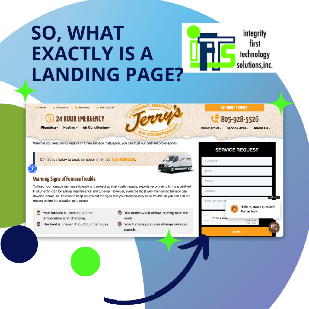
So, What Exactly Is A Landing Page?

A landing page is a dedicated web page built for the sole purpose of receiving visitors from advertising campaigns. When someone clicks on one of your digital ads, they will “land” here.

This is a single page that explains to potential clients why they should hire you for a certain project and how to get started. There should be only ONE action that they are able to take on the page.
What Conversion Factors Should Be Considered When Creating A Landing Page?

Although homepages are still crucial, they are often meant to cover all that you do. They’re also made to let site users dig deeper into your company in various ways.

With a landing page, you are able to control how visitors arrive on your site and direct them to do ONE THING.  When someone is searching for an exterior painter and clicks on an ad, they should be directed to a page that details the exterior painting services that your company offers. If an ad for handyman services is clicked, the user should be sent to a page with detailed information about handyman services. 

If you want a greater lead conversion rate, sending visitors to a landing page is your best bet.

Here are seven best practices for developing a conversion-optimized landing page for your painting company.

#1 - Have Only One Call-To-Action (or CTA for short)

Simply put, your call to action (CTA) is the desired next step for your site’s users. You should make the CTA highly visible immediately by placing it at the top of the page. 

PRO TIP: For optimal results, have your CTAs be buttons of a consistent color throughout your landing page. Each button’s text must be an EXACT replica of the others.  These buttons should stand out, so make sure that they are a contrasting color to your site color scheme.

If you want a visitor to take action after clicking on your ad and getting on your page, don’t overwhelm them with options. Make sure the goal is crystal clear and easy to understand.

Make sure that your landing page consistently encourages your target action, whether that be a phone call, a scheduled consultation, or a subscription to your newsletter. Try to narrow your attention to a single step that they should take. Having too many options available can make decision making more challenging.

Be sure to provide a call to action (CTA) at the conclusion of each paragraph to help direct readers to take the next step. You shouldn’t leave your audience looking for what to do.
#2 - Make Your Ad Wording Match The Wording On Your Landing Page

Landing Pages require that you be consistent. Obviously, your ad must have interested the visitor enough to click on it. People will click on an ad because it addresses an issue they’ve been thinking about or because it came up at just the right time. 

The term for this is “Ad Congruity.”

PRO TIP: Google will decrease your cost per click if the advertisements you’re running are relevant and consistent with the landing page.

Inconsistency between advertising and website content can turn off potential customers. For example, offering a free consultation for interior painting services in an ad but only discussing cabinet painting on the landing page. If your landing page is not perfectly tailored to your ad, you risk losing more visitors and leads than you gain.

#3 - Emphasize Value

Everyone who lands on your page is thinking about hiring your painting firm. They’ll decide if they think you can really help them out. This is where you need to focus on your clients’ problems and not yourself.

To get a conversion, you need to provide your site visitors something they really want.

There is a limited window of opportunity to persuade site visitors that they have arrived at the answer to their problems. Do your best to focus on what’s in it for them as you try to sway them into working with you. Describe in detail how you will manage their project stress-free from start to finish.

You need to prove your worth as a house painting business to them.

PRO TIP: reframe the conversation so that it’s about the client. Use “you” and “your” in place of “we” as much as possible.
#4 - Landing Page Length Matters

How long your landing page is will depend on what you want to achieve. Do you want people to fill out a form when they visit your site? You want them to call you? Or just to teach them something in a download?

For example, if you want a visitor to call you instead of downloading a house painting brochure, you may need more content. This is because It takes a lot more work to pick up the phone and make an appointment for an estimate than it does to send an email address to find out more. So, you’ll need to give them more information to show them why your company is the best choice and that you are deserving of their time.

#5 - Use A Video For Extra Persuasion

This study shows that having a persuasive video on your landing page can help increase conversions by 86%.
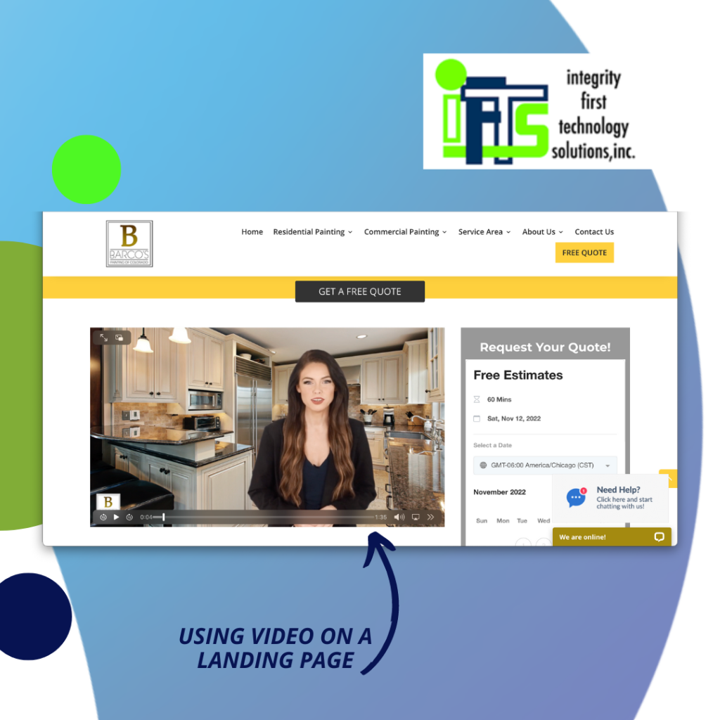
Now, putting any old video on your landing page won’t help you get ahead faster. Adding video can be a real power move, but it could also keep people from clicking on your CTA. This video needs to go with the rest of your landing page and tie everything together. Keep it short and to the point, but don’t make it your landing page’s main focus.

The best place for a video is in the middle of the page, above the fold. Here, it won’t take away from your call to action or value proposition, but it will show that you have more to offer as the visitor scrolls down the page.

#6 - Feature Social Proof

Your clients will be the best source of social proof. Include quotes and testimonials from real customers who talk about their experiences with your business. When you talk about yourself, it’s usually seen as marketing fluff, but when someone else does it, it’s more powerful.

Did you know that 79% of consumers trust online reviews as much as a personal recommendation from a friend or family member? Putting these reviews on your landing page will give potential painting clients the proof they are looking for.

PRO TIP: Use reviews from third-party, trustworthy sites like Google or Facebook. These look a lot better than just using text from a client on your website.
#7 - Optimize Your Forms For Conversions

Conversion rates can be made or broken by how many fields are needed. You need to get as much information as possible from a potential client so that you can follow up with them. However, if you ask for too much information, it will hurt your conversions.  People don’t want to fill out a lot of fields.

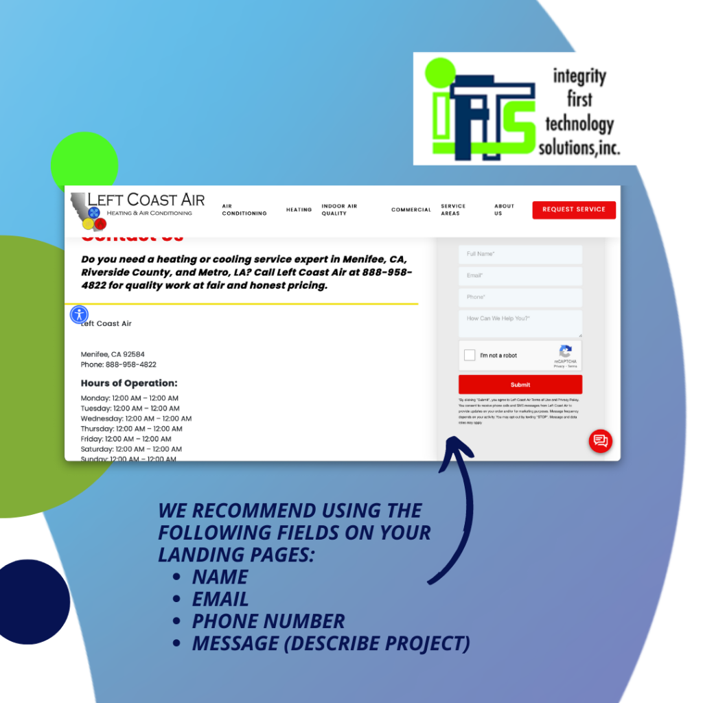
We recommend using the following fields on your landing pages:

  • Name

  • Email

  • Phone number

  • Message (describe project)

By giving visitors the option to leave a message, they can talk about their project and get in touch with the person who will be in charge of it. This will give you a chance to get ahead of the game and find out what they want before you set up an estimate.

Landing pages are the best way to turn as many visitors as possible from online advertising campaigns into customers, and you now know everything you need to know to get started!

Still not sure where to begin? Let us help you. Send me (Stacey Ivol) an email at si@iftsdesign.com or give IFTS, Inc. a call 412.715.6266 for a FREE consultation.

How to Create a Brand Style Guide for Your Business

Are you making a good first impression with your potential customers?

As your business grows, you’ll have more and more opportunities to make a good first impression. People should have the same experience with your business, whether they see your logo on your company vehicle or go to your website to learn more about your services. 

Your brand is more than just a logo and color combination, though. It’s what people expect from your company and how they talk about you when referring others to your business. 

-And making a brand style guide is a great way to help you stay on track!

What a Brand Style Guide is and Why You Need One

A brand style guide is a document that outlines the specific fonts, colors, images, and styles that you want to use for all of your marketing materials. It can help to create a cohesive look across all of your branding, and it will make your company’s overall look more professional. 

Creating a brand style guide can seem like a daunting task, but it doesn’t have to be!

If your business doesn’t have a mission statement already, you should think about what makes it unique and take the time to put it on paper.

What’s your company’s voice and personality? 

Who is your customer? 

What would they expect when interacting with you?

Answering these questions is a great place to start shaping what the heart and soul of your company looks like visually. Then, choosing the right design elements will help you achieve that goal. 

Remember, the intent is to create a guide that will help you maintain a consistent look and represent your brand’s voice and personality. So, don’t be afraid to get creative and have fun with it!

How to Create a Brand Style Guide

When deciding on the overall tone and voice of your brand, here are a few tips to get you started:

1. Start by creating a mood board. This can be as simple as cutting out images from magazines that reflect the look and feel you want for your brand, or you can create a digital mood board using Pinterest or another online tool. 

It may seem unnecessary, but having this in place first is a helpful way to keep your thoughts and ideas organized.  It also gives you a visual representation that may help you make connections you wouldn’t otherwise have seen.

2. Once you have a good idea of the overall style you’re going for, it’s time to start thinking about specific elements like colors and fonts. Make a list of 3-5 colors and choose 2-3 fonts that you’ll use for all of your marketing materials. Don’t forget to do your research on color and font associations and continue to go back to your mood board for inspiration. 

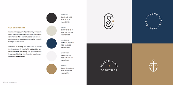
You’ll want to include things like the color names, CMYK swatches, and hex codes (the HTML version of color names) in your guide. 

Also, be sure to find out if there is a cost associated with the use of the font or images you use in your marketing. Some fonts and images have specific copyright rules, and you will want to make sure that you are following their guidelines.

3. Your logo is one of the main things that people picture when they think of your business, and it should make it easier for them to remember your brand. It’s a good idea to put your logo and a description of what it stands for in your brand style guide. 

You can put as many different versions of your logo as you want in your style guide, but make sure that each one has a purpose. Outline as many parameters as you’d like, including dimensions and color selection that show exactly how your logo can and cannot be used.

If you haven’t put much thought into your logo design, you will want to check out why that’s so important in our previous blog post.

4. Now you are ready to create your brand guide to keep on hand or as a digital file that you can easily share with others. 

Include all of your chosen colors, fonts, and any other elements like photos, images, or wording that you want to use and circumstances or exceptions for any changes and a detailed list of those examples.

5. Finally, make sure to review and update your brand style guide on a regular basis. As your business grows and changes, so too will your branding. 

By keeping your style guide up-to-date, your branding efforts will always reflect your business in the best light.

Examples of Brand Style Guides

This page, taken from Scrimshaw Coffee’s brand guide, is a great example of how to showcase different colors and logos and how they can be used in marketing.

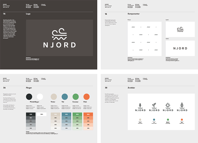
Njord Organic Restaurant shows just how detailed a brand style guide can be.

To see a wide range of the types of brand style guides different companies use, visit issuu.com.  

Saving You Time and Money

Your company’s style guide should be created early on in the branding process and updated as needed. Having this document on hand will make putting together promotional materials much easier.  It should also make it easier to bring in an outside marketing team if you get to that point.

With a list of your preferred fonts, colors, and styles, you’ll be able to save time, energy, and money by ensuring that everyone on your team is on the same page when it comes to your design standards. 

Again, the importance of making your business more memorable to customers, and therefore building more trust and customer loyalty, can’t be stressed enough.

If you’re ready to create a branding style guide for your business, our team at IFTS Inc. can help! Contact us today for a free consultation at 412-715-6266!

Is your website ready for the next Google SSL update and how will it impact your business?

Does your website start with “http://” or “https://”?

If it is the former rather than the latter, your website visitors (and your business) may have a large surprise starting October 1, 2017!

According to Google, “Starting October 2017, Chrome (version 62) will show a “NOT SECURE” warning when users enter text in a form on an HTTP page, and for all HTTP pages in Incognito mode.”

More simply put, if your site does not have an SSL certificate on October 1, 2017, Google Chrome will mark it as “NOT SECURE” if there are any text fields.

What does an SSL do for me?

SSL (Secure Sockets Layer) Certificates encrypt the connection between the web browser and the server where the website resides. This makes it much harder for someone to intercept the traffic and steal the information, which in turn leads to a safer browsing experience for the average web user.

This is the second step in Google’s plan to force users to employ an SSL certificate. Step one was implemented in January of this year. It marked sites as “NOT SECURE” if they did not have an SSL certificate and accepted personal data, like credit cards or PayPal. This step, implemented October 1, will mark any site with text fields as “NOT SECURE” without an SSL. The final step, planned to roll out soon, is to mark any site as “NOT SECURE” that does not have an SSL certificate.

Because it is so much more secure, Google would prefer to have all websites protected by an SSL certificate. They have reinforced this notion in their ranking algorithm as well, with SSL protected websites ranking more highly.

What does this mean for you?

Your business and your website traffic are at risk with no SSL certificate!

What should I do to avoid this situation?

Talk to your webmaster or the person that handles your website hosting about adding an SSL.

Don’t have an SSL or not sure where to start?

Contact Integrity First Technology Solutions, Inc. (412.559.7177 or si@iftsdesign.com) and let them take care of it for you.

Don’t miss this opportunity to upgrade your website. Protect your clients and your website’s reputation!