Last time, we talked about how to get your local SEO and business listings right.
In this post, we will discuss blogging for SEO, link building and citations and the importance of reviews.
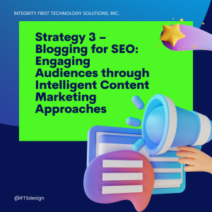
Strategy 3 – Blogging for SEO: Engaging Audiences through Intelligent Content Marketing Approaches
For local painting businesses looking to increase their online presence and attract new customers, blogging can be a very effective tool.
By creating informative content that aligns with your industry expertise, you’ll position yourself as a thought leader in the eyes of potential clients. With proper execution, this strategy will improve both your search engine rankings and overall digital marketing efforts.
SEO Blogging Tips and Tricks
As a painting business owner, you understand the importance of staying up to date with current events in your area and industry trends. You will want to create specific content that targets local areas and is still engaging for readers.
How can you do this?
- Use relevant keywords targeted at your location
- Solve a problem that your potential client may have
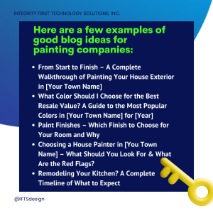
Here are a few examples of good blog ideas for painting companies:
- From Start to Finish – A Complete Walkthrough of Painting Your House Exterior in [Your Town Name]
- What Color Should I Choose for the Best Resale Value? A Guide to the Most Popular Colors in [Your Town Name] for [Year]
- Paint Finishes – Which Finish to Choose for Your Room and Why
- Choosing a House Painter in [You Town Name] – What Should You Look For & What Are the Red Flags?
- Remodeling Your Kitchen? A Complete Timeline of What to Expect
Blogging for Brand Awareness
Blogging extends beyond mere search engine optimization for your website. Through crafting content on industry-relevant subjects, you can connect with a broader audience in your target market and cultivate credibility for your brand.
By offering valuable and insightful articles, you foster customer loyalty and amplify recognition of your corporate identity. This way, when someone in your area is ready to paint, they already know who to choose – YOU!
Get the Top 3 Social Media Post Templates for Painting Companies to Grow Your Following and Get New Clients
Engage with prospects and save time with your FREE Canva template kit. This kit features the top 3 social media posts for painting companies and directions on how to brand them for your own business in 5 minutes or less.

Enter your email below and get the templates sent directly to your inbox along with an instructional video on how to make personalized edits.
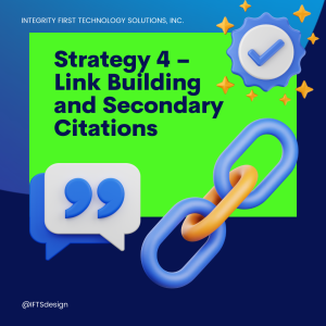
Strategy 4 – Link Building and Secondary Citations
Google’s ranking algorithm considers numerous factors to determine the order in which websites appear in search results. While the exact details of the algorithm are closely guarded, one key element when determining rankings is backlinks and citations.
Building Backlinks
The number and quality of links from other reputable websites to your site, known as backlinks, plays a crucial role. Google views these as a vote of confidence in your content’s credibility and authority. The more quality backlinks your website has, the more relevant it will be seen by the search engines.
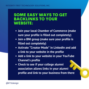
Some easy ways to get backlinks to your website:
- Join your local Chamber of Commerce (make sure your profile is filled out completely)
- Join a BNI group (make sure your profile is filled out completely)
- Activate “Creator Mode” in LinkedIn and add a link to your website in the profile
- Add a link to your website in your YouTube Channel’s profile
- Check to see if your college alumni association allows links in your alumni profile and link to your business from there
Building Citations
Citations are an essential component of local search optimization. They involve mentioning your business name, address or phone number on third party websites without linking directly to it.
While citations may not have the same impact as links, they still play a crucial role in improving rankings by increasing brand awareness and credibility among customers and other businesses alike.
One tool that can help you build your citations is called Yext. You input your information once and it distributes this information to over 75 different directories. IFTS is currently running a special on this service for $50/month.
Interested? Contact si@iftsdesign.com to get started.
Strategy 5 – Reviews: Improve Your Reputation By Getting More Positive Reviews

Though the exact number is not known, reviews are estimated to account for about 40% of Google’s local ranking algorithm. This makes reviews extremely important to your painting company, or any local service business!
The more positive reviews that you have, the more favorably Google should look upon your Google Business Profile listing. Typically, people like to see a company have a 4-star reputation or higher.
Obviously, the best way to get reviews is to do the best job for your clients, so they are positively bursting to tell others how amazing you are.
Sometimes, it’s not that easy. So, setting up processes to get reviews is a good idea.
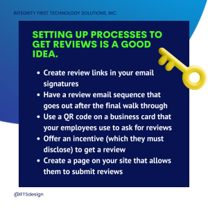
A few processes that you can put in place:
- Create review links in your email signatures
- Have a review email sequence that goes out after the final walk through
- Use a QR code on a business card that your employees use to ask for reviews
- Offer an incentive (which they must disclose) to get a review
- Create a page on your site that allows them to submit reviews
To see a step-by-step guide of how to set up a review process, check out this blog post from IFTS.
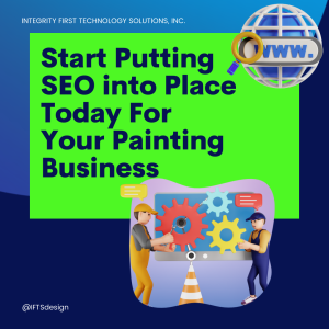
Conclusion – Start Putting SEO into Place Today For Your Painting Business
The rise in internet usage has made it crucial for local businesses to invest in quality SEO services and market their brand within their area.
With more people turning online when searching for products or services, this is no longer an option but a necessity if you want your house painting company to thrive.
To remain competitive in today’s digital landscape, implementing an effective local SEO strategy is crucial for businesses. This approach will attract more customers and give you the edge over your competition. Don’t miss out on this opportunity to grow, so start today!
Need help getting started with this?
Let us handle the heavy lifting so you can focus on running a successful painting company! Email si@iftsdesign.com to find out more!
Get the Top 3 Social Media Post Templates for Painting Companies to Grow Your Following and Get New Clients
Engage with prospects and save time with your FREE Canva template kit. This kit features the top 3 social media posts for painting companies and directions on how to brand them for your own business in 5 minutes or less.
Enter your email below and get the templates sent directly to your inbox along with an instructional video on how to make personalized edits.